 Design
Interface design
The details that make an interface read as finished. These notes cover type, hierarchy, forms, empty and error states, motion, and the screens a product is used through.
Start here
Design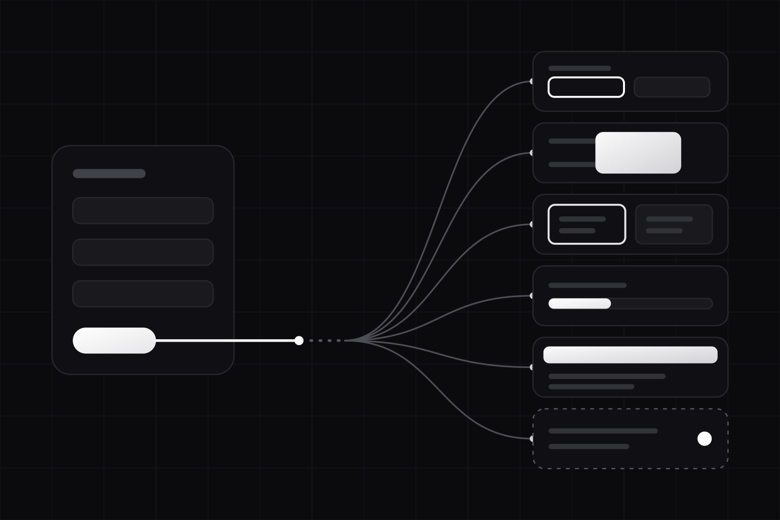 Design
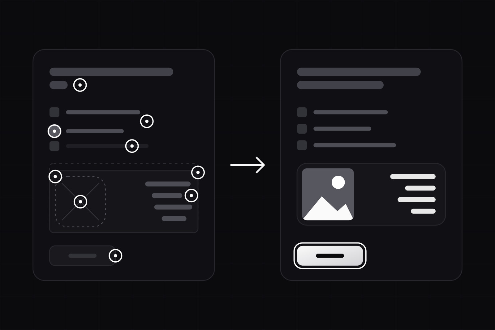
Error state UX design: what to show when a request fails
A request can fail six ways, from a rejected field to a dropped connection. What each needs on screen, how to make retry safe, and the copy to write. Design
Border vs shadow in UI: when each wins, and when a fill does
Shadows vanish in forced colors mode and fade in dark themes, input borders need 3:1 under WCAG 1.4.11. When to separate UI regions with border, shadow or fill.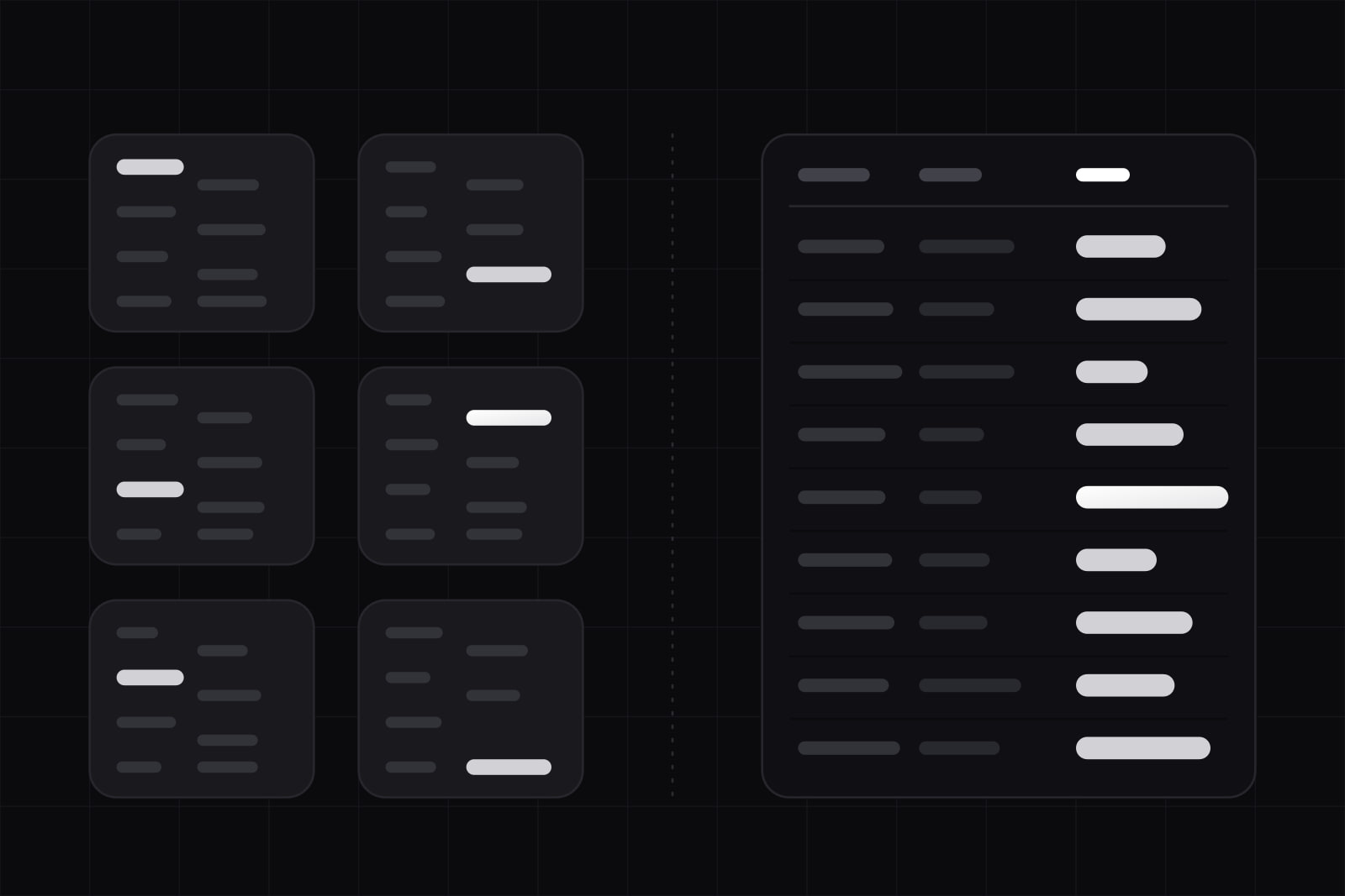 Design
Data table vs card layout: when a table beats a card grid
In a table people compare records without holding values in memory; cards make them reorient at every card. Five questions decide what a screen needs. Design
EAA enforcement: 6 reasons compliant-on-paper products fail audits
WebAIM found WCAG failures on 95.9% of top home pages in 2026. Six ways an EAA statement, a Lighthouse 100 and an overlay still fail an accessibility audit.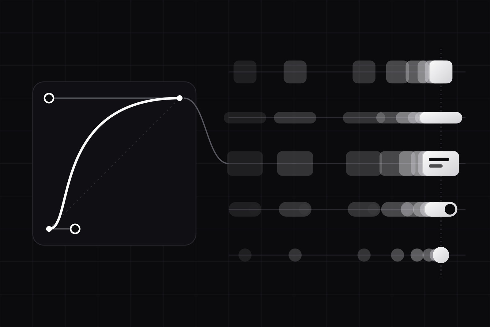 Design
Brand motion design: how one easing curve sets a product's tone
Material 3 eases on cubic-bezier(0.2, 0, 0, 1), Carbon splits productive from expressive. How to pick one signature curve, test it and ship it as tokens.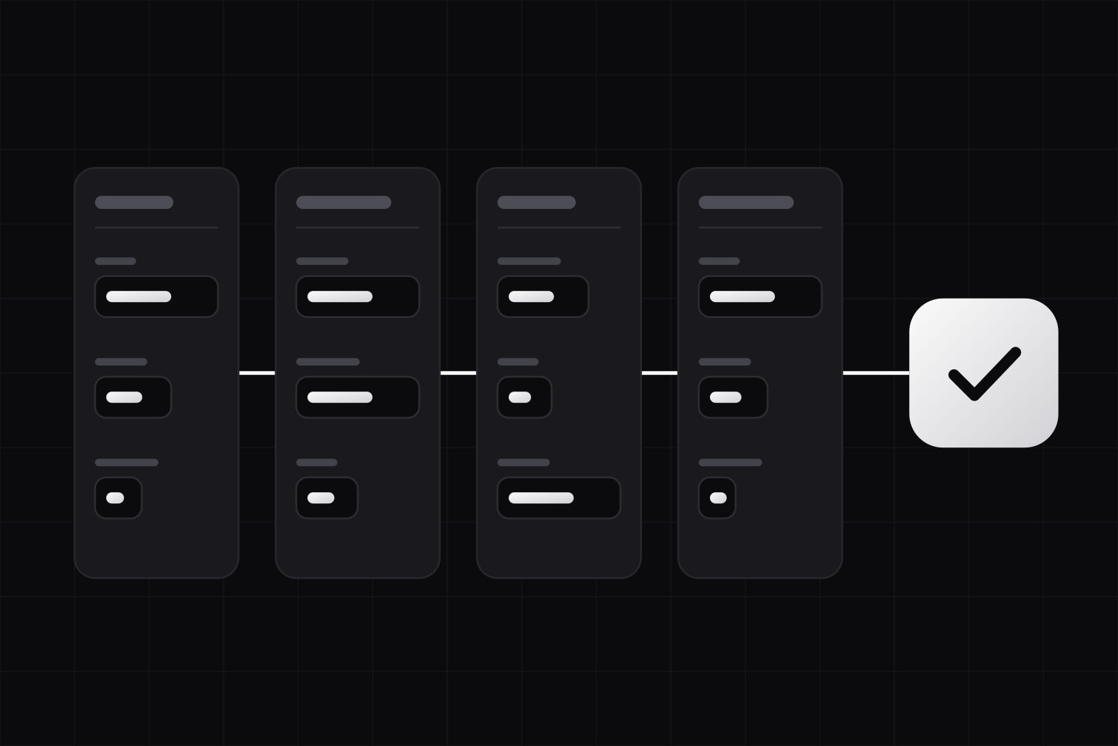 Design
Long form UX best practices: 12 rules for forms people finish
The average checkout asks for 11.3 fields when 8 would do. Twelve rules for long forms: what to cut, how to split pages, when to validate, what to save.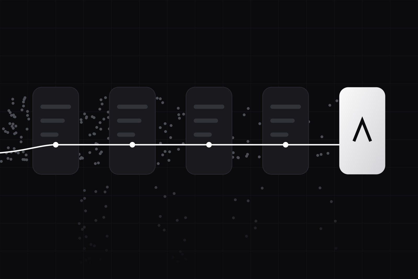 Business
Neobank UX agency: what a real partner delivers in 2026
Digital banks hold 19% of accounts and 5% of revenues, and 67% of digital applications get abandoned. What a neobank UX partner owns in 2026.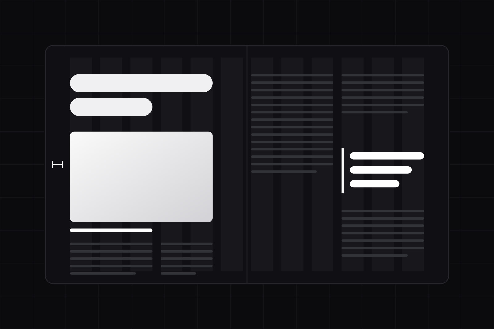 Design
Editorial web layout: 5 magazine devices that work on screen
Five print devices that survive on screen: a real grid, scale contrast, captions, margins and pull quotes. Plus the CSS that carries them in 2026.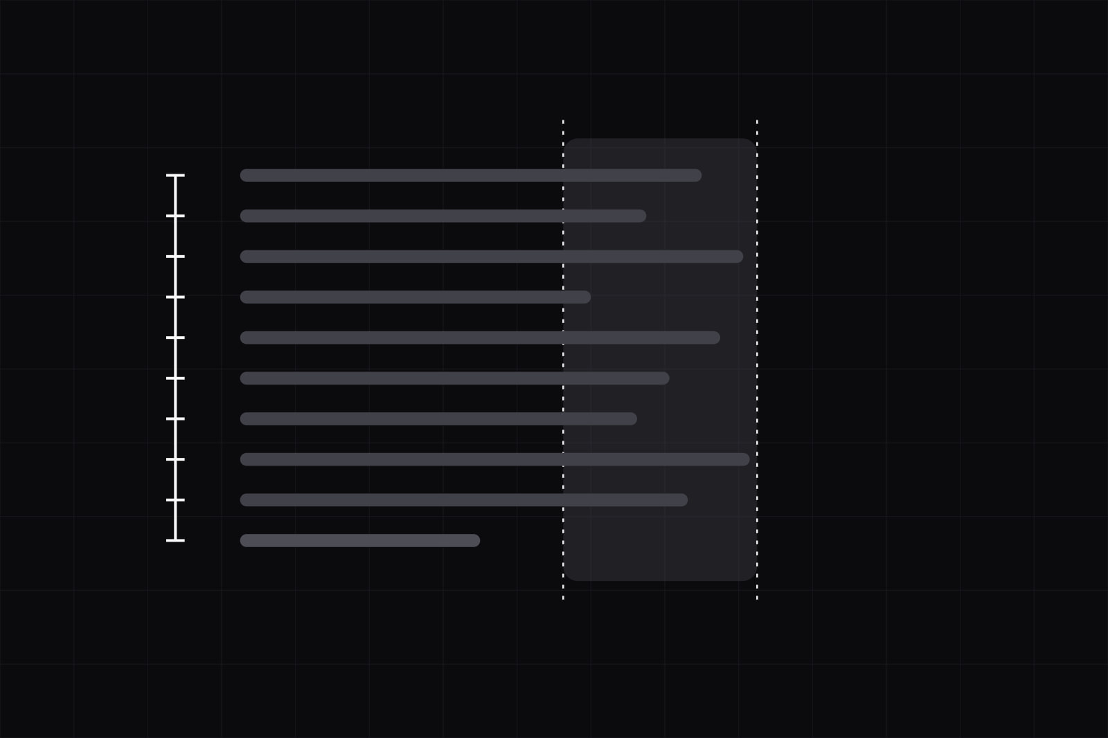 Design
Optimal line length and line height: 6 steps to set both
Body text reads best at 50 to 75 characters per line. Here is how to set measure and leading in CSS, with the numbers, the WCAG floor, and real browser support.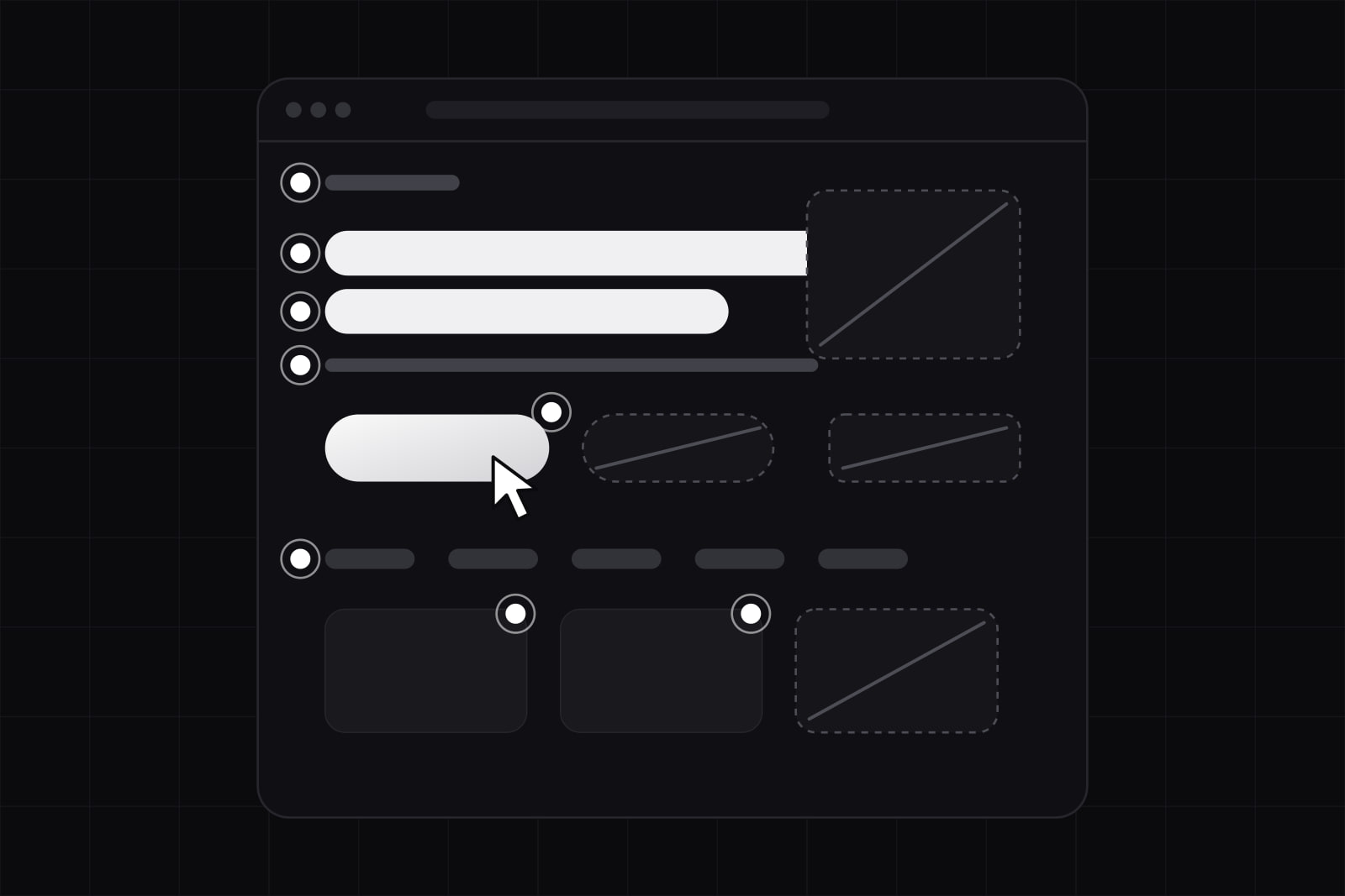 Design
What makes a landing page convert: 8 factors and 4 killers
Median landing page conversion sits at 6.6%, SaaS at 3.8%. The top quartile wins on message match, load time and form friction, then on design.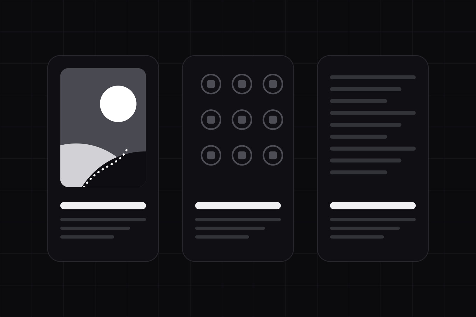 Design
Illustration systems: when to draw, when to buy, when to skip
Custom product illustrations run $300 to $1,200 each. Here is how we decide which screens earn one, which take a library set, and which need none.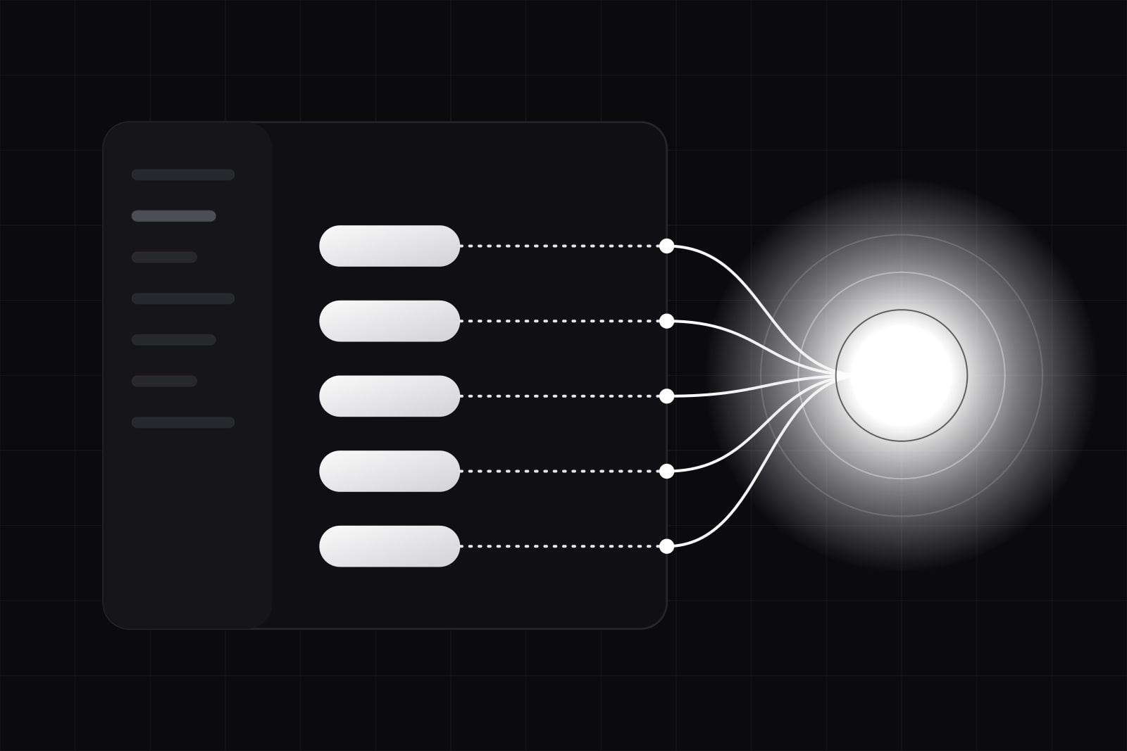 AI
AIWebMCP in 2026: the browser API that lets agents use your SaaS UI
WebMCP lets a web page register tools that browser AI agents call directly. Chrome 149 runs it as an origin trial. What it changes for SaaS interfaces.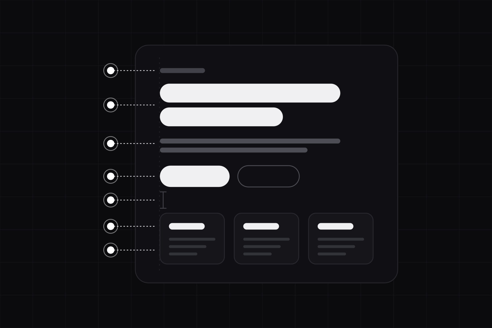 Design
Visual hierarchy without color: 7 tools that replace the accent
Two greys can carry a whole interface. Size, weight, spacing and value do the work an accent color takes credit for, in the order that actually works.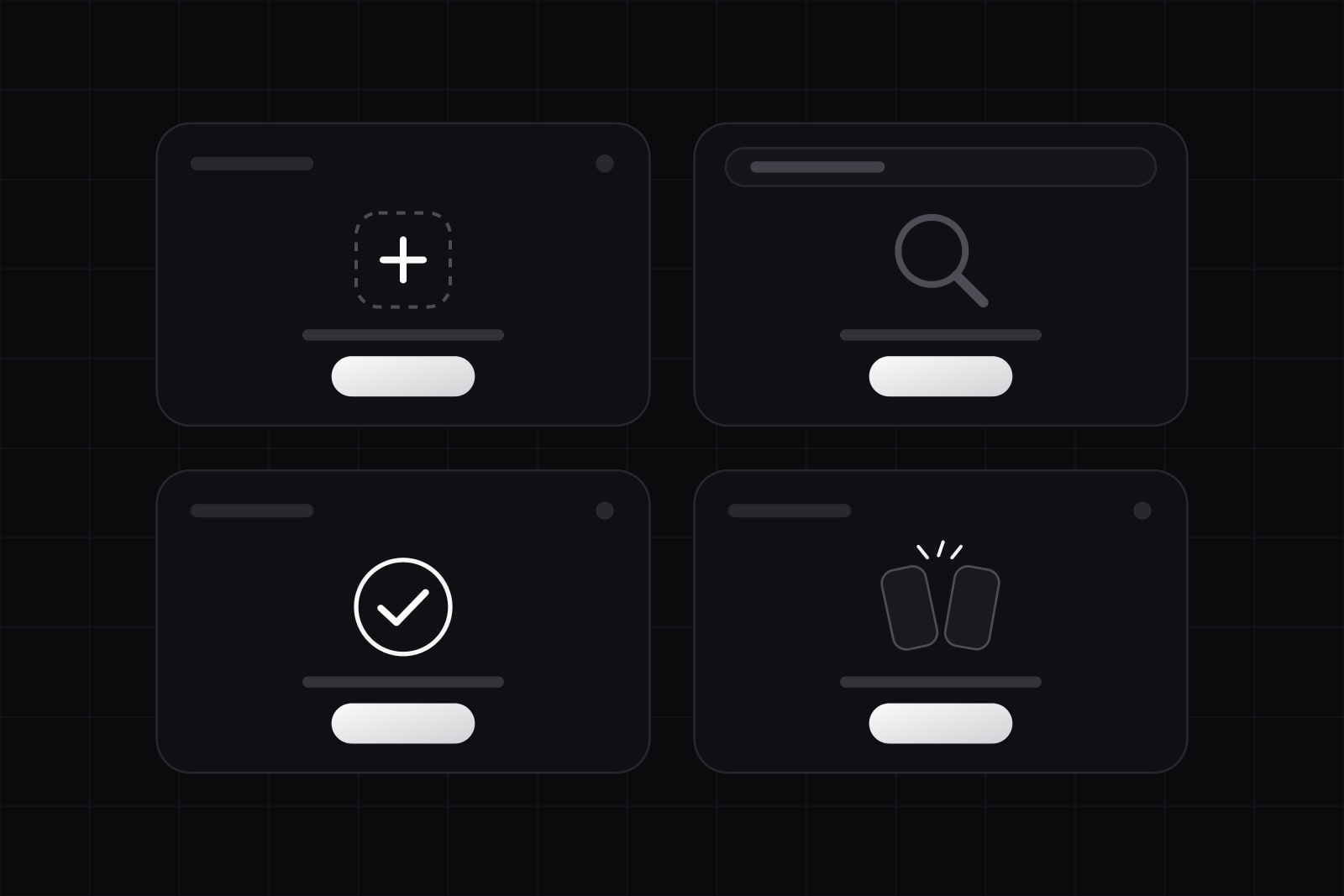 Design
Empty state design: the 4 states every screen needs
A screen needs four empty states: first use, no results, cleared, and error. Baymard finds close to half of sites leave the no-results screen a dead end.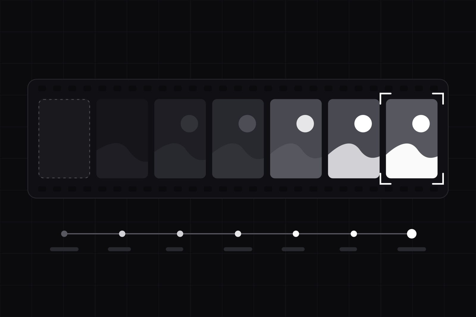 Design
Website photography for software: the 7-step shot list
Software has no object to photograph, so most product sites default to stock. The 7 steps we use to pick, grade and ship a set of 8 to 12 images.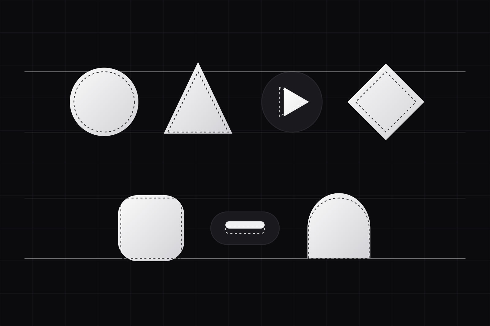 Design
Optical alignment in UI: 7 spacing fixes math gets wrong
Round letters overshoot flat ones by 1% to 3% of cap height, and UI inherits the same problem. Seven optical fixes, and what CSS now handles for you.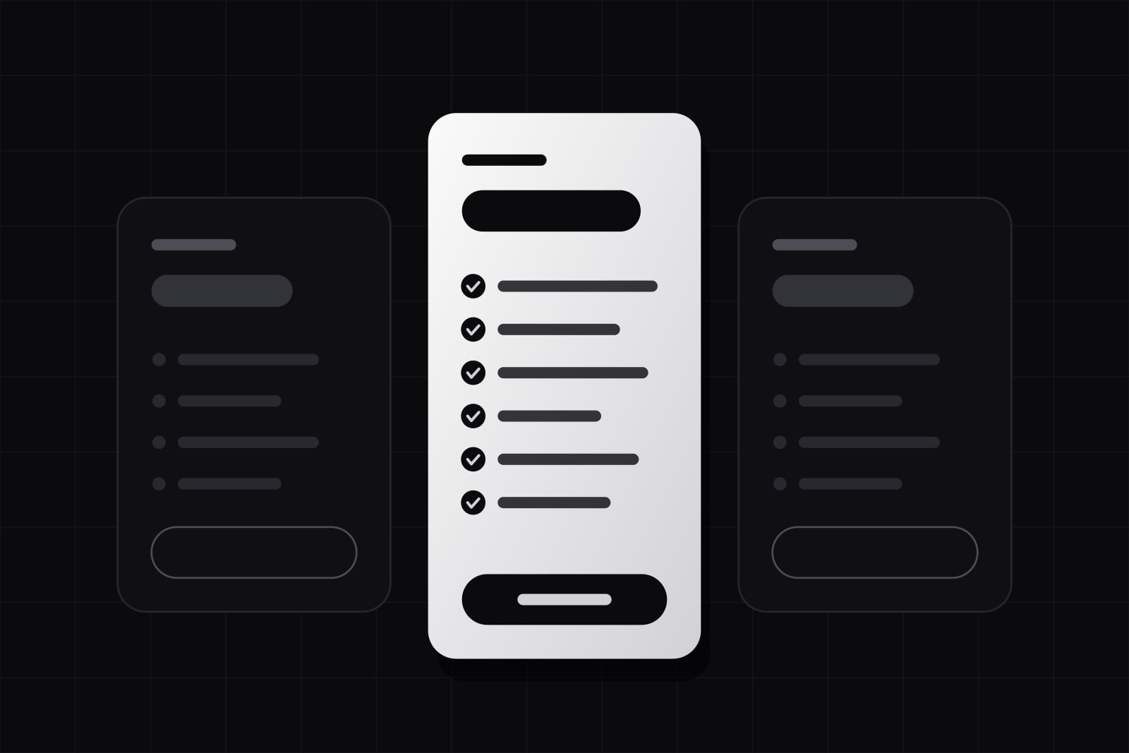 Design
SaaS pricing page design: 6 fixes that stop losing deals
Gartner puts 67% of B2B buyers on a rep-free path, and rep-free buyers report 23% more purchase regret. Six fixes that make a pricing page decide. Design
SaaS Art Direction: How a Product Stops Looking Like a Template
SaaS art direction is the deliberate visual point of view that separates a product from the template it launched on. Here is where to push and where to leave the conventions alone. Design
Typographic scale for product UI: sizes that hold on every screen
Build a product type scale of 7 to 9 sizes, named as tokens, that holds from a 320px phone to a 1440px monitor and survives 200% zoom. The exact numbers and the floors.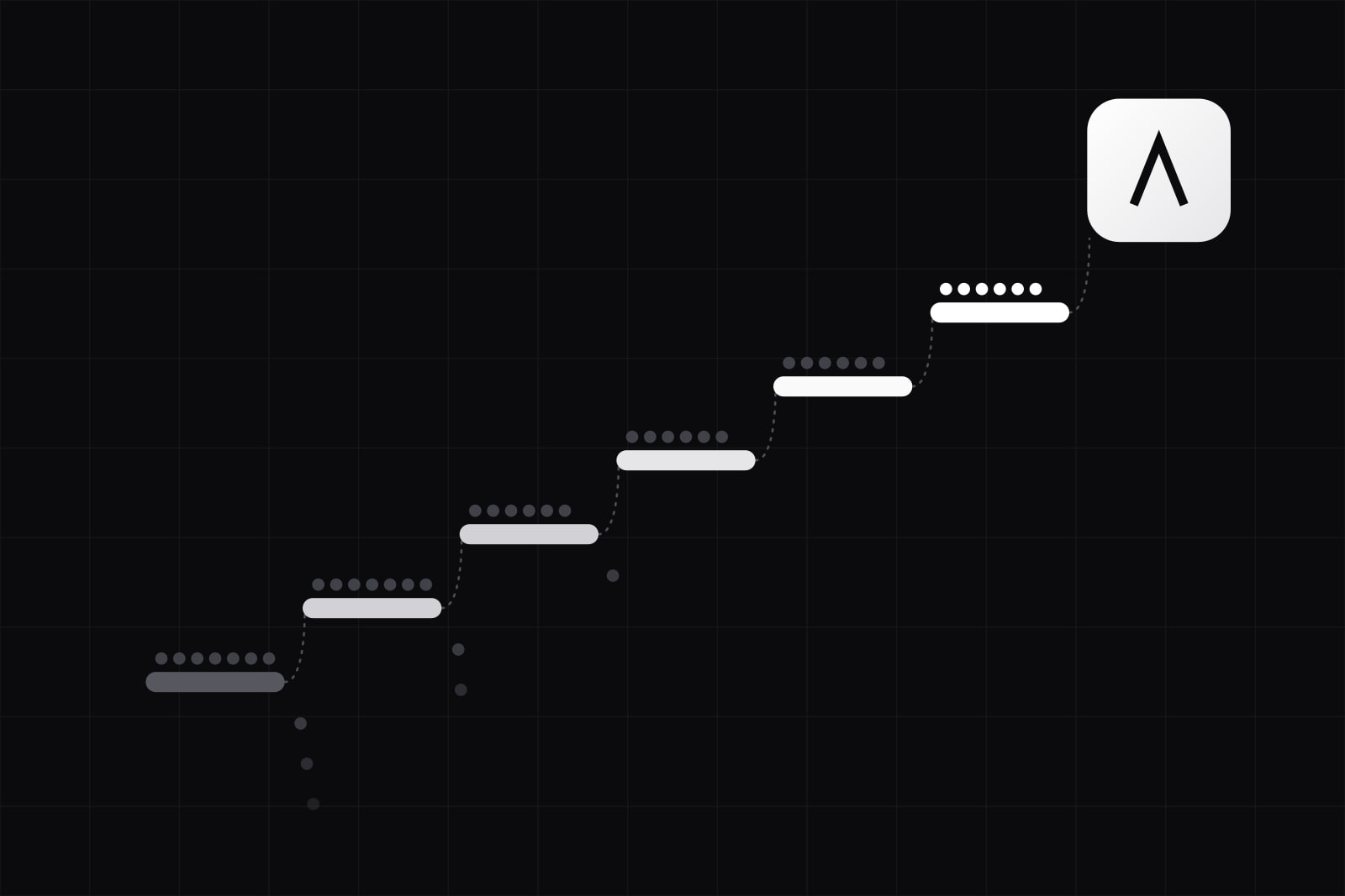 Design
SaaS onboarding UX patterns that cut first-week churn
Median SaaS activation sits at 37.5%. Six onboarding patterns, from empty states to role-based checklists, move new users to first value faster. Design
Hybrid craft: the AI-and-human design workflow in 2026
Figma's 2026 survey puts generative AI in 72% of design workflows. Hybrid craft splits the work: AI drafts, humans own taste, brand, and the final finish.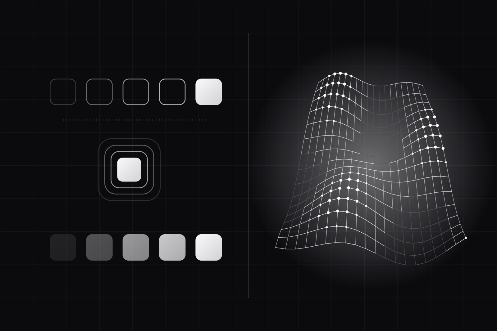 Web
WebWebGL vs CSS animation: when to use each (2026)
CSS animates transform and opacity off the main thread for free. WebGL hands you the raw GPU. Here is the line between them, with the bundle and battery costs.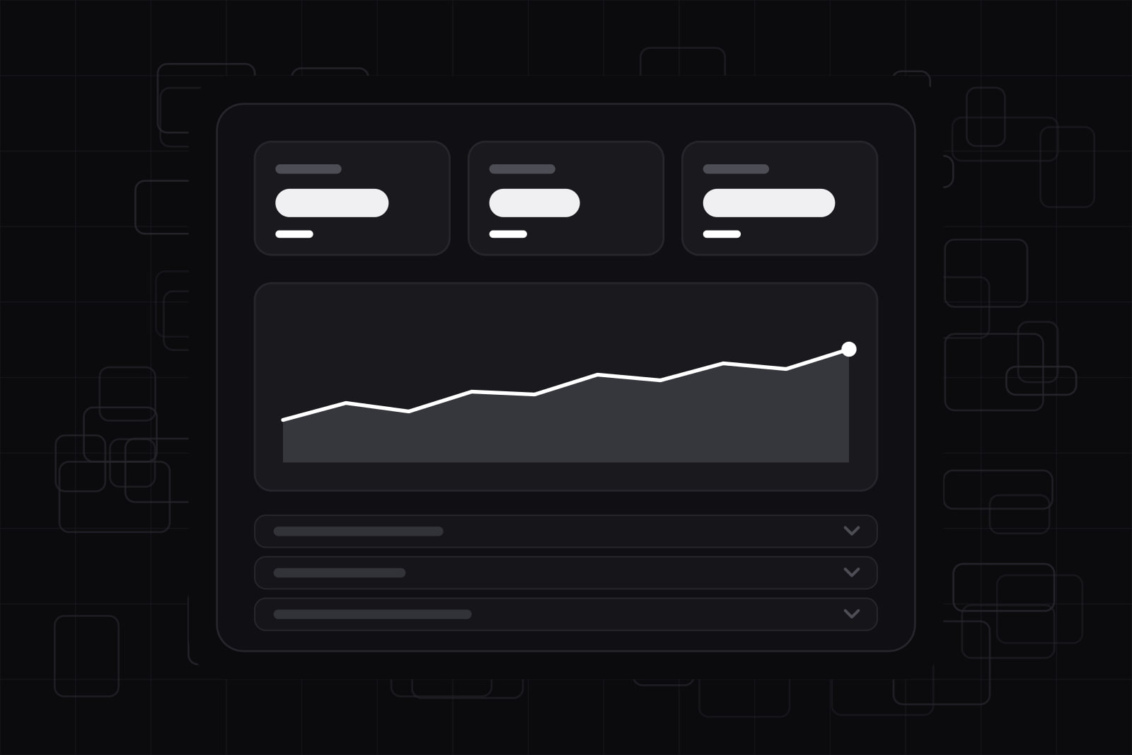 Design
SaaS dashboard design: show data without drowning users
Most SaaS dashboards fail by showing everything at once. Here is the summary-first layout, the widget limit, and progressive disclosure that keeps users oriented.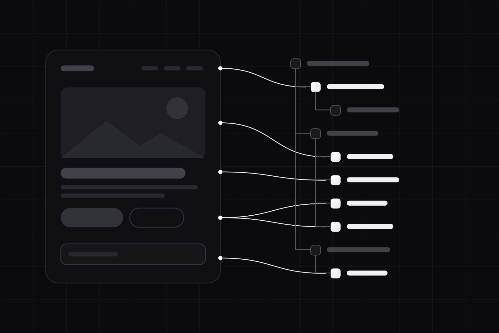 AI
AIDesigning for AI agents: building a UI the non-human user can read
AI agents read your site through the accessibility tree, the structure screen readers use. In a 2026 study, agent task success fell from 78% to 42% on a degraded one.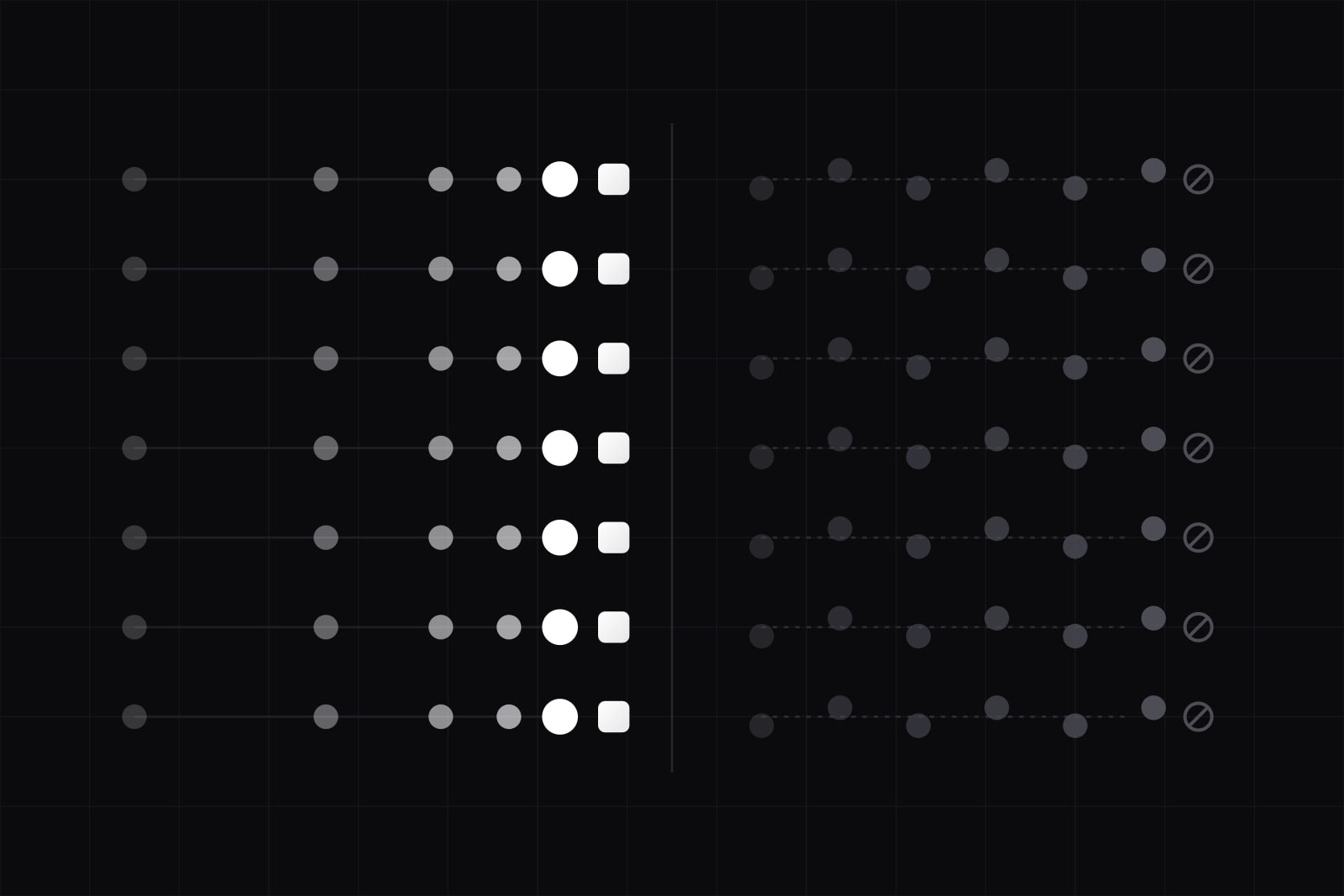 Design
Functional UI animation in 2026: the checklist before it ships
The 7 do, 7 don't checklist we apply on every product we ship: durations from 100 to 500ms, opacity and transform only, prefers-reduced-motion honored at the root.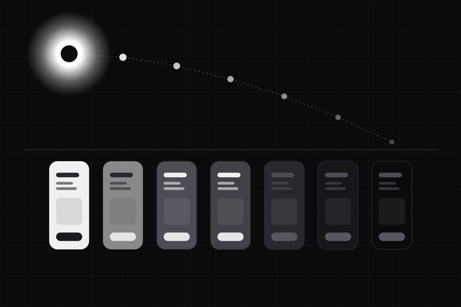 Design
Dark mode is not a toggle: context-aware theming in 2026
Dark mode adoption hit 82% on mobile in 2025, but a header toggle still ignores ambient light, time of day, and task. Here is the fix.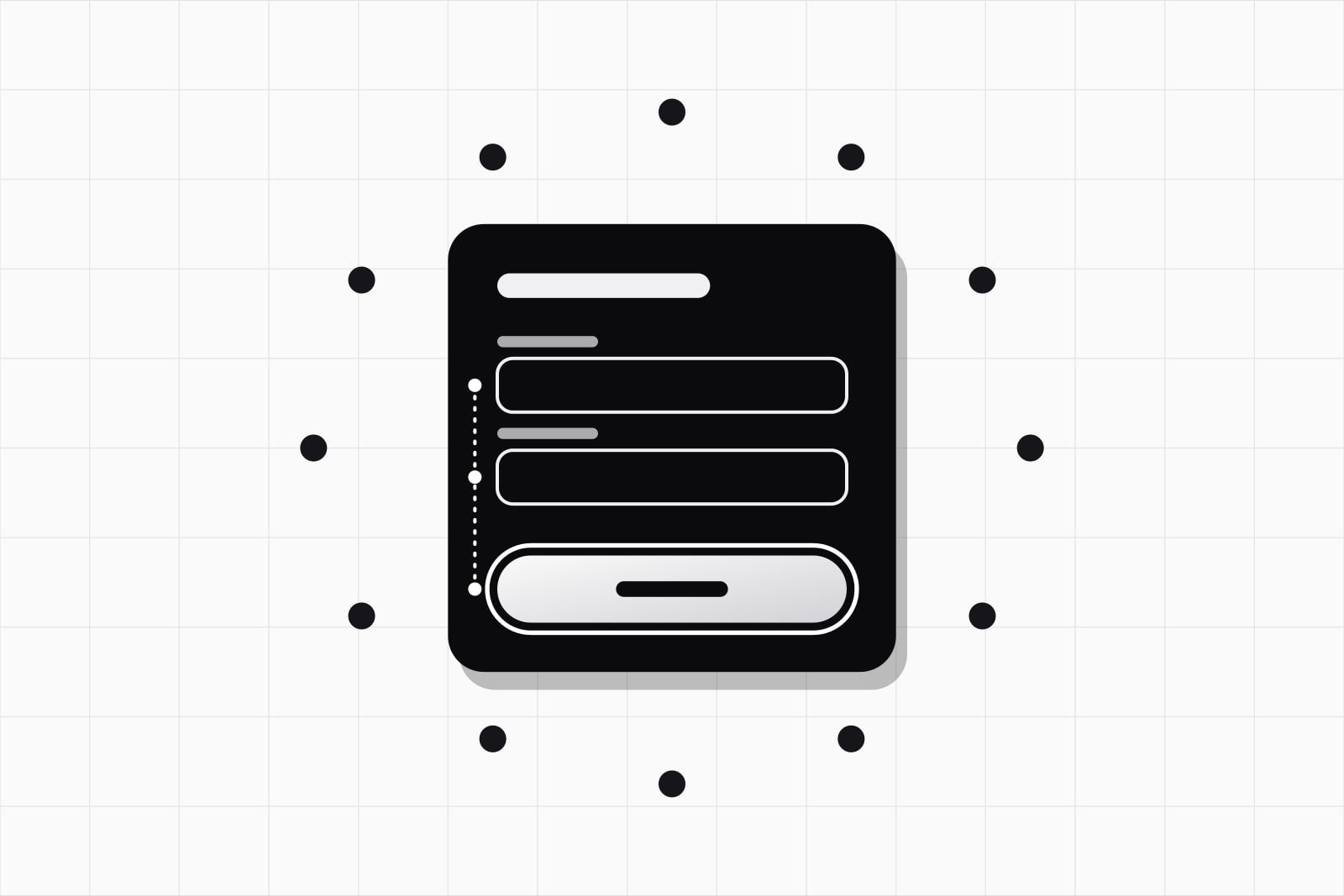 Design
Accessibility-first design after the EU Accessibility Act
The EAA became enforceable on 28 June 2025. Here is what changes for product teams shipping to the EU and what accessibility-first design actually means.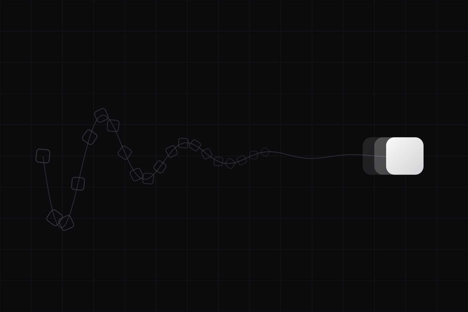 Design