SaaS Art Direction: How a Product Stops Looking Like a Template
SaaS art direction is the deliberate visual point of view that separates a product from the template it launched on. Here is where to push and where to leave the conventions alone.
In this piece
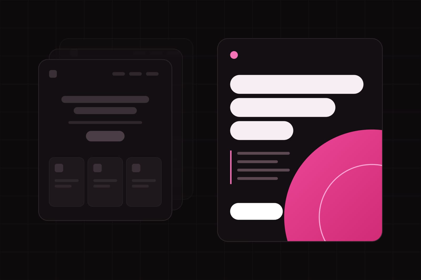
SaaS art direction is the deliberate visual point of view that separates a product from the template it launched on: the color world, the typographic voice, the imagery, and the motion that make one product legible as itself and not as a category default. It is not decoration applied at the end. It is a set of decisions about how the brand shows up on every screen, made before the first section ships.
Most products skip those decisions. They start from a Framer, Webflow, or React starter kit, and the kit arrives with a built-in look: a gradient hero, a three-column feature grid, a soft blue-to-purple palette, a friendly illustration of people at laptops, a "trusted by" logo bar. Open ten B2B SaaS homepages and you see the same page ten times. The template got validated, copied, and became the default, and now differentiation starts at zero.
Why sameness costs you before the pitch
Visual judgment is fast and it is sticky. In the study that put a number on it, people formed a stable opinion of a web page's visual appeal in about 50 milliseconds, and that snap judgment correlated with their considered rating seconds later (Lindgaard et al., 2006). A positive first impression also triggers a halo: the same product is then read as more useful, its flaws downplayed and its strengths exaggerated.
For a B2B buyer comparing four vendors in a tab-switching session, brand is the first filter. If your product reads as interchangeable in the first half-second, you spend the rest of the evaluation climbing out of a hole you dug before anyone read a word. Sameness is not a taste problem. It is a conversion problem that lands before the copy does.
Why "just look different" is the wrong fix
The instinct is to escape the template by breaking it: unusual navigation, a novel layout, an experimental color scheme, motion everywhere. That fix backfires, and there is research explaining why.
Google's work on first impressions found that two things drive early aesthetic judgment: low visual complexity and high prototypicality, which is how closely a design matches what people expect from its category (Reinecke et al., Google Research). A shopping-cart icon in the top right, a settings gear, a primary button that looks clickable: familiarity reads as trustworthy and easy. Push complexity up or prototypicality down and the same users rate the page as less appealing, even when it is objectively well made.
So there are two forces pulling in opposite directions. Differentiation says be distinct. Prototypicality says be familiar. Resolve it the wrong way and you either blend in or alienate people.
The resolution: most advanced yet acceptable
The industrial designer Raymond Loewy named the sweet spot decades ago. His MAYA principle, "most advanced yet acceptable," says a design should stretch a category as far as it can while staying recognizable as a member of it (Interaction Design Foundation). Too novel and people tune you out. Too familiar and they look right past you. Hits live at the edge of acceptable, not past it.
Applied to SaaS, MAYA gives a clean rule: keep the interaction conventions, push the brand surface. Separate the two layers and the tension dissolves.
- Interaction layer (stay prototypical): where the nav lives, what a button looks like when it is clickable, how a form reports an error, where the account menu sits, how a table sorts. This is muscle memory. Novelty here is friction, not personality.
- Brand layer (push into open territory): color, typography, photographic and illustrative style, editorial voice, the character of motion. This is where a product earns a face without making anyone relearn how to use it.
What actually moves art direction
Four levers carry almost all of the perceived distinctiveness. You do not need to break navigation to use any of them.
Color beyond the default blue
The blue-to-purple gradient is the most crowded territory in software. A committed, slightly unexpected palette (a warm neutral base, a single sharp accent, a real dark mode rather than an inverted one) does more for recognition than any layout trick. Pick a color system you can defend and apply it with discipline across every surface, not just the marketing site.
Typography with a point of view
Type is the cheapest, highest-leverage differentiator most teams ignore. The default is a safe geometric sans at every weight. One distinctive display face for headings, paired with a workhorse text face and held to a real typographic scale, changes the entire character of a product without touching a single interaction.
Imagery that only your product could use
Stock photos of diverse teams high-fiving and abstract 3D blobs are the visual equivalent of filler words. Replace them with something specific to what the product does: real screenshots art-directed as hero objects, a consistent illustration system, data visualizations rendered in the brand palette. The test is simple: could a competitor paste this image onto their site unchanged? If yes, it is not art direction.
Motion as tone, not decoration
One easing curve, applied consistently, sets the emotional register of a product the way a soundtrack sets a film's. Calm, quick, and confident reads differently from bouncy and playful. Pick the register on purpose and let a single motion language carry it. This is tone, not spectacle, and it should never slow a task down.
Find the open territory before you decorate
Art direction starts with a category scan, not a moodboard. Put the ten closest competitors on one screen and catalogue what they share: the same palette family, the same hero shape, the same illustration style, the same font class. That shared center is the prototypical zone you keep for usability. The empty edges around it are where your brand can live.
The point is not to be the strangest product in the category. It is to hold one clear conviction about how the category looks tired and what should replace it, then apply that conviction consistently at every touchpoint. A product that commits to a warm editorial look, or a dense terminal-inspired aesthetic, or a stark monochrome system, is remembered. A product that samples a little of everything is forgotten the moment the tab closes.
What this looks like in practice
Take a analytics dashboard built on a standard admin template. The interaction layer stays exactly where users expect it: left-hand nav, filters top-right, a sortable table, a primary action button in the corner. Nothing to relearn. The brand layer gets rebuilt: the palette moves from default blue to a warm charcoal-and-amber system, the headings adopt a single confident serif against a clean grotesque for data, the empty states use a custom illustration set instead of a shrugging stock character, and every transition runs on one 200ms ease. The product is instantly recognizable as itself in a lineup, and no user has to think about where anything is. That is the MAYA line: advanced on the surface, acceptable in the hand.
Art direction done this way is not a coat of paint over a finished build. It is a decision made early about which conventions are load-bearing and which are just inherited defaults. Keep the first set. Rebuild the second. The product stops looking like the template it came from, and it does so without asking a single user to learn anything new.
Sources
Frequently asked questions
Is art direction just branding for a SaaS product?+
They overlap but are not the same. Branding defines the identity (name, logo, values, positioning). Art direction is how that identity is expressed visually and consistently across the actual product and site: color application, typographic voice, imagery style, and motion. A brand can exist on paper and still have no art direction inside the product, which is exactly why so many funded SaaS tools ship with a strong logo and a generic template underneath it.
Will a distinctive visual style hurt usability or conversion?+
Not if you separate the two layers. The Google first-impression research shows familiarity drives usability perception, so keep the interaction conventions people already know: nav position, button affordances, form behavior. Push distinctiveness onto the brand layer instead (color, type, imagery, motion), where novelty adds character without adding friction. The MAYA principle is the guardrail: advanced on the surface, acceptable in the hand.
When in a project should art direction be decided?+
Before the interface is built, not after. Art direction is a set of upfront decisions about which conventions are load-bearing and which are inherited template defaults you can rebuild. Deciding it late means retrofitting color, type, and imagery onto a finished product, which is more expensive and usually produces a thin coat of paint rather than a coherent visual system. The category scan (cataloguing what competitors share) is the cheapest first step and can happen before a single screen is designed.
Related services
Studio
Start a project.
We write about what we build. Tell us what you want to build.