Icon set consistency rests on grid, stroke, corners and fill
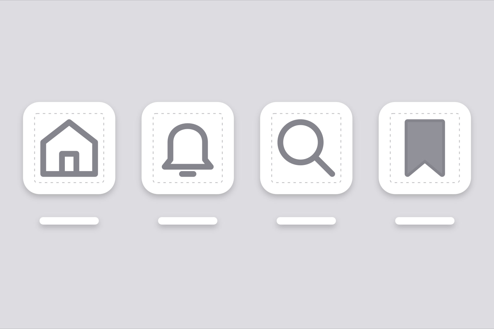
Icon set consistency is the property of a product's icons sharing one grid, one stroke width, one corner and cap style, and one fill rule, so that any two icons placed side by side read as drawn by the same hand. It is an art direction decision taken once, written down as a few numbers, and checked every time a new icon enters the product.
Who needs it: any product team whose interface carries more than a handful of icons, which is every SaaS with a sidebar. When it matters: the day a second icon library comes in for a glyph the first one lacks, or the day a designer draws a custom icon for a new feature. Getting it right is invisible. Getting it wrong produces a screen people describe as slightly off without being able to say why.
Why mismatched icons show at 24 pixels
Icons sit next to text at 16 to 24 pixels, where half a pixel is a large share of the drawing. Two popular open-source sets show the gap. Lucide's design guide requires a 2 px stroke on a 24 × 24 canvas. Heroicons draws its 24 px outline set at a 1.5 px stroke. Put a Lucide bell beside a Heroicons gear and the bell's lines are a third heavier. Nobody measures it. Everybody sees it.
The same happens with quieter specs. One set rounds every corner, another keeps them sharp. One leaves 1 px of padding inside the box, another leaves 2. One marks the active tab with a filled icon, another with a heavier outline. Each choice holds up on its own. Two of them in one interface read as two products stitched together, the same family of problem as the small details in why a UI looks unprofessional.
What are the four specs an icon set has to share?
1. The grid and its live area
The grid fixes the canvas size and how much of it the drawing may use. Material's system icons sit on a 24 × 24 dp grid with a 20 × 20 dp live area and 2 dp of padding around it. Lucide asks for at least 1 px of padding. That difference changes the optical size: two icons rendered in the same 24 px box look like two sizes when one drawing spans 22 px and the other 20 px. Pick one grid and one padding, and draw or import against them.
2. The stroke width
The stroke is the spec readers notice first. Lucide fixes it at 2 px and tells contributors never to mix stroke widths. Heroicons outline uses 1.5 px. Material Symbols exposes it as a variable weight axis from 100 (thin) to 700 (bold), with 400 as the default. A product gets one value per display size, written as a token next to the type scale.
3. Corners, joins and caps
Lucide uses round joins and round caps, and rounds almost every sharp corner. Material builds its icons from keyline shapes with set corner radii. A set with round caps beside a set with square caps shows at the end of every line. Choose one corner radius and one cap style, and treat an icon that breaks them as a bug.
4. The fill rule
Outline and filled icons carry different weight, so the switch between them should mean one thing. Material Symbols puts fill on its own axis, from 0 to 1, and Google's guide suggests using it for state transitions: the outline icon is the resting tab, the filled one the selected tab. A product that uses filled icons in one menu and outline icons in the next, for no reason, has spent the signal before it needs it.
Why does an icon look heavier at 48 px than at 24 px?
An SVG stroke scales with the icon. A 2 px stroke drawn for 24 px becomes 1.33 px at 16 px and 4 px at 48 px, so the same icon reads thin in a dense table and heavy in an empty state. There are three fixes, in order of effort.
- Hold the stroke constant. Lucide's React package has a
nonScalingStrokeprop that keeps the stroke at 2 px on screen whatever the icon size (Lucide docs). It is the cheapest fix and suits outline sets. - Use optical sizes. Material Symbols has an optical size axis from 20 to 48 dp that adjusts the stroke as the icon grows, so the image keeps the same weight at each size.
- Ship a drawing per size. Heroicons ships four sets: 24 px outline, 24 px solid, 20 px solid and 16 px solid. Apple's SF Symbols come in nine weights and three scales.
Whichever route a team takes, an icon is checked at every size it ships at, starting with the smallest.
How should icons match the text beside them?
An icon almost always sits beside a label, so the label sets its weight. Apple designs SF Symbols to match its system font: each symbol weight pairs with a text weight, and symbols are centred vertically on the font's cap height. Material Symbols has a grade axis that can follow the grade of the text, and Google's guide suggests a low grade such as -25 for a light symbol on a dark background, to reduce glare.
Outside Apple's platforms the pairing is done by eye. We set it once per pairing: the body text size and weight, the icon stroke beside it, and the vertical offset that centres the icon on the label's cap height. Three values, written in the design system, checked in a screenshot with text and icon on one line.
Colour is a separate decision with a hard floor. An icon a user needs in order to understand or operate a control falls under WCAG 1.4.11 Non-text Contrast, which asks for a 3:1 ratio against adjacent colours. A light grey 1.5 px stroke fails that sooner than the same grey set as text, because there is less ink to carry it.
What do you do when the library has no icon for the feature?
This is where an icon set loses its consistency, if it is going to. The fast route is a second library with the missing glyph. The lasting route is to draw the icon on the first library's spec. Lucide publishes its rules precisely enough to draw against: a 24 px canvas, 1 px of padding, a 2 px stroke, round joins and caps, and at least 2 px of space between distinct elements. Phosphor ships six weights (thin, light, regular, bold, fill and duotone), so a custom icon in a Phosphor product is drawn once per weight in use.
A custom icon drawn that way costs a few hours of drawing and review. A second library costs nothing on day one and shows on every screen that carries icons from both. When drawing is out of reach, the closest existing icon in the current set, with a clear label, reads better than a glyph from another hand.
Brand icons are the exception. A GitHub or Slack logo keeps its owner's drawing and sits in its own place, an integrations list or a sign-in button, where people read it as a logo. The rules above cover the interface icons around it. The same logic runs through the rest of a product's visual language, as in illustration systems and SaaS art direction: one hand, one set of rules.
A ten-minute icon audit
- Export every icon the product uses into one row, at 24 px, on a visible grid.
- Check the stroke: one value, or one value per display size.
- Check the ends of lines: one cap style, one join style, one corner radius.
- Check the padding: every drawing stops at the same live area.
- Check fill: filled icons appear only where the fill means something, such as a selected state.
- Render the row again at 16 px and on the dark theme, and look for the icon that gets louder or fainter than its neighbours.
- Write down each icon's source library. More than one name on that list, brand logos aside, is the first fix.
What this looks like on one screen
Take a settings page with a Lucide sidebar, a notification bell from Heroicons, and a filled Material icon on the billing tab. That is three sets, three strokes (2 px, 1.5 px and Material's weight 400), two corner styles, and a filled icon that signals nothing. The fix takes an afternoon. Replace the bell with Lucide's. Replace the billing icon with its Lucide outline. Mark the selected sidebar item with a background and the label's weight, since Lucide ships outline icons only. Set nonScalingStroke where the sidebar collapses to 16 px icons. Users will not name what changed. The screenshots in support tickets stop looking like two products.
Sources
Frequently asked questions
You can, and the difference will show. Lucide draws at a 2 px stroke and Heroicons outline at 1.5 px, so the Lucide icons read a third heavier at 24 px. Setting Lucide's strokeWidth to 1.5 brings the strokes together, but padding, corner rounding and the level of detail still differ between the two sets. Pick one set for interface icons and draw the missing glyphs on its spec.
Pick one as the default and give the other a single meaning. Outline icons are lighter and sit well next to regular-weight text in navigation and toolbars. Filled icons carry more weight, which suits a selected state or a very small size. Material Symbols treats fill as an axis from 0 to 1 and recommends it for state changes, which is a good rule to borrow even outside Material.
Sixteen, 20 and 24 px cover almost every interface use: 16 in dense tables and inline text, 20 in compact controls, 24 in navigation and toolbars. The clickable area is a separate number from the drawing. WCAG 2.2 criterion 2.5.8 asks for targets of at least 24 by 24 CSS pixels at level AA, and Material pairs a 24 dp icon with a 48 dp touch target. Draw the icon for its display size and pad the button around it.
Related articles
September 12, 2026 · 8 min read
April 25, 2026 · 8 min read
September 8, 2026 · 8 min read