

4pt vs 8pt grid: why line height decides the spacing unit
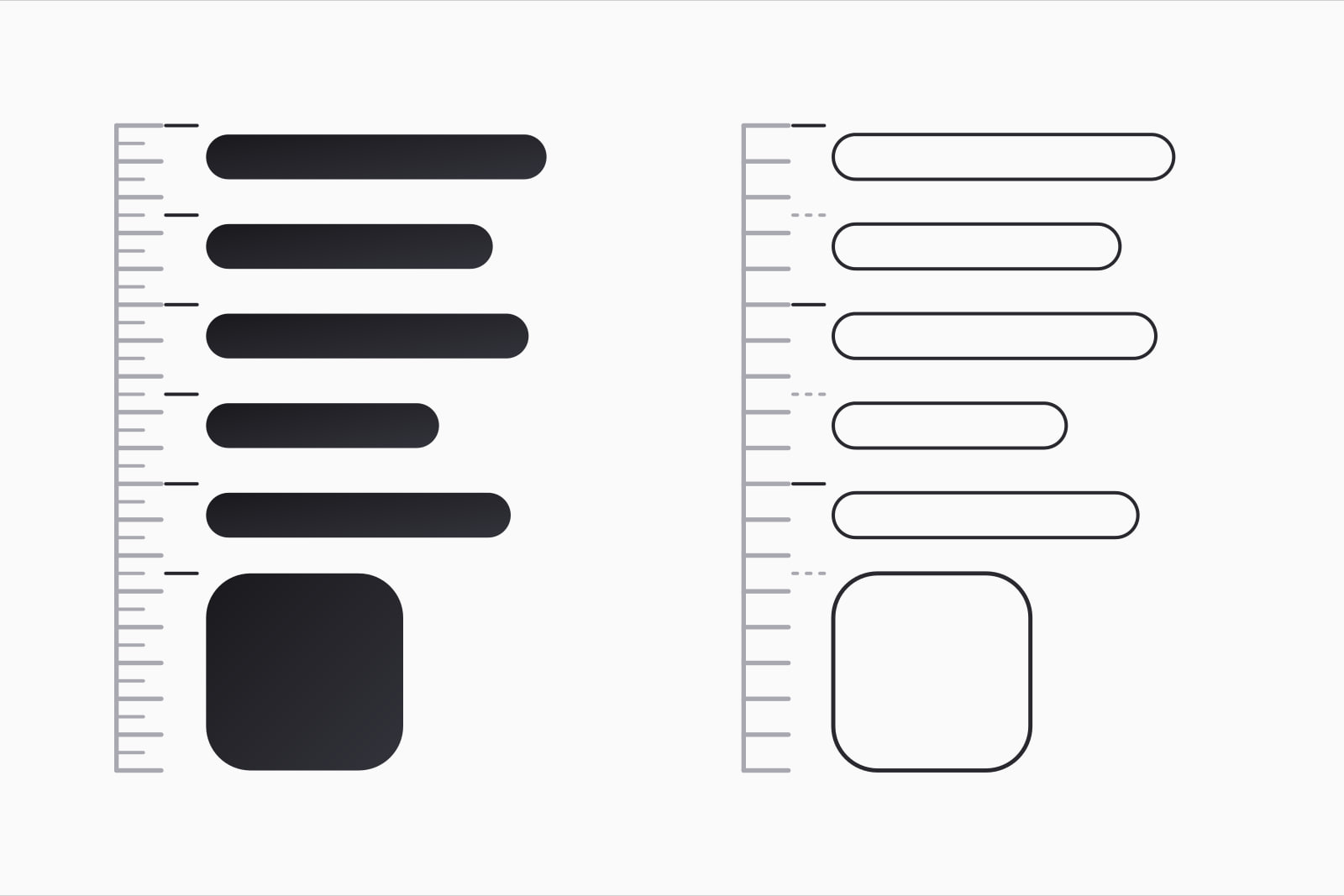
A spacing grid is a rule that sizes every margin, padding, gap and component height as a multiple of one base unit, usually 4 or 8 pixels. The 4pt vs 8pt grid choice gets argued as taste. Two numbers settle it: the line height of your body text and the size of your smallest touch target. And many interfaces that call themselves 8pt already run on 4 underneath.
The question shows up when a team writes its first spacing values, or when a designer and a developer notice that Figma says 20 and the CSS says 24. Pick the wrong unit and the first paragraph of text breaks the grid, then every exception after it.
What is the short answer?
Use 4px as the unit every value resolves to, and use multiples of 8 for the gaps between components. Pure 8pt holds up on sparse marketing pages with large type. It struggles in product UI, where 14px body text wants a 20px line, data rows want 36px and accessible targets want 44px. None of those three numbers is a multiple of 8.
4pt vs 8pt grid at a glance
- Values up to 48px: a 4pt grid offers 12 (4, 8, 12 and so on); an 8pt grid offers 6 (8, 16, 24, 32, 40, 48).
- Line heights it can hold: 4pt holds 16, 20, 24, 28 and 32; 8pt holds 16, 24 and 32.
- Table row heights: 4pt allows 32, 36, 40 and 44; 8pt allows 32, 40 and 48.
- A 44px touch target: legal on 4pt (4 × 11); on 8pt it has to become 40 or 48.
- Decisions per value: 8pt asks for fewer, which is its real strength; 4pt asks for twice as many unless the scale skips steps.
Why does line height decide the grid?
Text is the largest thing on most product screens, and its line box is what you stack. Google's Material 3 type scale sets Body Medium at 14px on a 20px line, Body Large at 16px on 24px and Label Small at 11px on 16px (Material 3, type scale tokens). Two of those three line heights sit on 8. The one used for most body copy, 20, does not.
A strict 8pt grid leaves two ways out. Set 14px text on a 24px line, a ratio of 1.71 that reads loose in a dense interface. Or set it on 16px, a ratio of 1.14 that lets descenders touch the next line's capitals. Both trade reading comfort for arithmetic. On a 4pt grid, 20 is a legal value and nothing bends.
Material itself never ran on pure 8. Its layout guidance puts components and spacing on 8dp, then lets icons, type and some elements inside components align to a 4dp grid, with type on a 4dp baseline (Material Design, Understanding layout). The 8 is the rhythm of the page. The 4 is the unit underneath it. If you are still choosing sizes, settle the typographic scale for product UI first, then round each line height to the nearest 4.
Where does the 8pt grid win?
The 8pt grid spread as a plain rule: use multiples of 8 for the dimensions, padding and margins of every element (Spec, 8-Point Grid). Its strength is restraint. Up to 48px there are six legal values instead of twelve, so two designers working apart land on the same gap more often, and a reviewer spots a wrong value at a glance.
- Marketing and landing pages. Type runs at 18px and above, line heights land on 28 or 32, and sections step through 32, 64, 96 and 128.
- Spacing between components. Gaps of 16, 24, 32 and 48 read as clear steps. A 20 next to a 24 reads as a mistake.
- Teams writing spacing rules for the first time. Fewer choices, fewer arguments in review.
The cost arrives the first time a table, a form or a toolbar has to fit more on one screen.
Where does the 4pt grid win?
Dense product screens need the steps in between. Take a table of 50 rows. At 40px a row it is 2,000px tall; at 36px it is 1,800px, so five more rows fit in the same window. At 32px, a row with a second line of metadata looks cramped. The 36px row many admin tools settle on exists only on a 4pt grid. The same holds for a 12px gap between a label and its input, and for a 20px icon beside 14px text. Our comparison of data tables and card grids covers why density matters on those screens in the first place.
Webflow moved its product to a 4-point grid and described the change as a way to make collaboration between design and engineering faster and easier (Webflow, Why we're using a 4-point grid). Tailwind CSS made the same unit its default: the spacing scale hangs on one spacing variable of 0.25rem, 4px at the browser's default root size, and utilities such as p-4 or gap-6 are multiples of it (Tailwind CSS, Theme variables). A team writing Tailwind is on a 4pt grid whether or not anyone decided it.
What about touch targets?
Accessibility puts two numbers on the table. WCAG 2.2 success criterion 2.5.8, level AA, asks for pointer targets of at least 24 by 24 CSS pixels, or enough space around smaller ones (W3C, Understanding SC 2.5.8). Criterion 2.5.5, level AAA, asks for 44 by 44 (W3C, Understanding SC 2.5.5). Apple's Human Interface Guidelines set 44 by 44 points as the minimum size for controls on iOS and iPadOS (Apple, Accessibility).
24 sits on both grids. 44 sits only on 4. On an 8pt grid the 44px button becomes 40, below the AAA line and Apple's minimum, or 48, which makes every toolbar and list row taller. For a product that has to meet 44, that one number settles the grid.
What we use
We set 4px as the unit and build a scale that skips steps as it grows: 4, 8, 12, 16, 20, 24, 32, 40, 48, 64, 80, 96 and 128, plus a 2px half step for hairline offsets. Inside a component the 4-steps do the fine work: 12px between an icon and its label, 20px line heights, 36px rows. Between components only the multiples of 8 appear, so a page still reads in clear steps. IBM's Carbon lands close by, with 13 spacing tokens from 2px to 160px that mix multiples of 2, 4 and 8 (Carbon, Spacing).
The skipped steps matter as much as the unit. A scale with every multiple of 4 up to 128 has 32 values and no opinion. One with 13 values gives designers the density they need at the small end and forces a real decision at the large end.
We write every value in rem. 4px is 0.25rem, so spacing grows with the reader's font size setting together with the text, and the proportions hold.
How do you move an existing product onto a 4pt grid?
- List every spacing value in the CSS. A search for padding, margin, gap and height turns up the strays: 5, 6, 10, 14, 15, 18.
- Map each one to the nearest step. 5 and 6 go to 4 or 8, 10 to 8 or 12, 14 and 15 to 16, 18 to 16 or 20. Decide each on the real screen, never in a spreadsheet.
- Replace raw values with named steps. Once a value has a name, a lint rule can refuse anything outside the scale.
- Keep the optical corrections. A 1px nudge that centres an icon for the eye stays where it is. Our piece on optical alignment lists the cases where the math is wrong on purpose.
Line heights come last. Round each one to the nearest multiple of 4, then read paragraphs at their real width; the guide to line length and line height covers the ratios that hold up. Once text, rows and targets all sit on 4, the 8s between components do the rest.
Sources
- Material 3: Type scale tokens
- Material Design: Understanding layout
- Spec: 8-Point Grid
- Webflow: Why we're using a 4-point grid in Webflow
- Tailwind CSS: Theme variables
- W3C: Understanding SC 2.5.8 Target Size (Minimum)
- W3C: Understanding SC 2.5.5 Target Size (Enhanced)
- Apple Human Interface Guidelines: Accessibility
- Carbon Design System: Spacing
Frequently asked questions
As the rhythm between components, yes: gaps of 16, 24, 32 and 48 read as clear steps on any screen. As the only unit in a product interface, it runs into 20px line heights, 36px table rows and 44px touch targets, none of which is a multiple of 8. Material has always paired its 8dp layout grid with a 4dp grid for icons and type, and Tailwind's default spacing unit is 4px. A marketing site with large type can stay on pure 8 without trouble.
No, and forcing them makes the type scale worse. Font sizes come from the type scale, and common product sizes such as 11px and 14px are not multiples of 4. What sits on the grid is the line height, because the line box is what stacks next to other elements: Material 3 sets 14px text on a 20px line and 11px text on a 16px line. Pick the font size for reading, then round its line height to the nearest multiple of 4.
Only if the border is added outside the box. With box-sizing set to border-box, a 40px button with a 1px border is still 40px tall, because the border is drawn inside the height. With the browser's default content-box it grows to 42px and the rows around it drift off the grid. Tailwind's base styles set border-box on every element for this reason. Where a box has to stay exactly on its size, an inset box-shadow draws the same line without touching the layout.
4pt, for one reason: the 44 by 44 point minimum that Apple sets for controls and that WCAG 2.5.5 asks for at level AAA. 44 is a multiple of 4 and not of 8, so an 8pt app has to round its targets to 40, below the line, or to 48, which costs vertical space on a small screen. Android's Material guidance already mixes an 8dp layout with a 4dp grid for icons and type. Keep the gaps between components on multiples of 8 and the app still reads in clear steps.
Related articles
September 12, 2026 · 8 min read
October 8, 2026 · 10 min read
August 25, 2026 · 8 min read