

 Design
Data table vs card layout: when a table beats a card grid
In a table people compare records without holding values in memory; cards make them reorient at every card. Five questions decide what a screen needs.
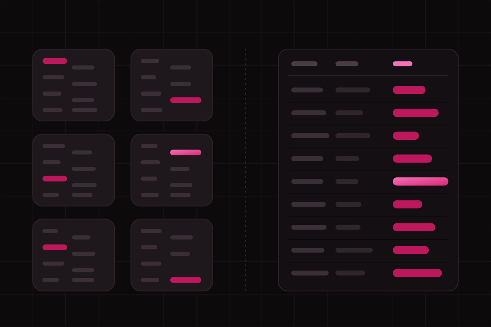
Choosing between a data table and a card layout is an information-density decision: it sets how many records a person sees at once, how many attributes they can compare, and how much effort each comparison costs. Every list screen in a B2B tool, an admin area or a catalogue faces it, usually in the first week of design, and the choice stays until someone redesigns the screen.
The task decides. Nielsen Norman Group's research on data tables names the reason tables win at comparison: two adjacent values can be read together, while a card-based presentation makes people spatially reorient each time they move from one card to the next, which turns comparison into slow, effortful work. Cards win elsewhere, and most of this article is about where.
The short answer
Use a table when people compare records on the same attributes, scan a column for an outlier, sort, filter, or act on many rows at once. Use cards when each record looks different, when a picture decides the choice, or when the screen is a doorway into a few detail pages. If nobody can name the main task of the screen, the layout question comes too early: answer the task first.
How do a table and a card grid compare?
Eight axes settle most cases. On each one, the layout that fits better comes first.
- Records on one screen: table. On a 1440 by 900 laptop, with about 720 px left for the list under the header and toolbar, a table at the 40 px default row height of IBM's Carbon design system shows 18 records. Three cards across at 280 px tall show six whole records, with a third row cut by the fold.
- Comparing one attribute across records: table. The values sit in a column, so the eye moves in a straight line.
- Records with different shapes: cards. Cards accept a different height and a different mix of content on each record. Fixed columns cannot.
- Images that carry the decision: cards. A product photo or a template preview needs an area a table row does not have.
- Sorting and filtering: table. Column headers are where sort controls belong, and a filtered column shows its effect at a glance.
- Bulk actions: table. Row checkboxes and a batch-action bar are a standard pattern, shipped as a variant of Carbon's data table.
- Touch targets: cards. The whole card can be one link, a larger target that NN/g ties to Fitts's law.
- Assistive technology: table, when it is a real table. The W3C tables tutorial explains that header cells marked up as
thgive screen readers the context for each value. A grid ofdivelements gives them none.
When does a table beat a card grid?
A table wins when the screen serves the four tasks NN/g identifies for data tables: finding records that fit criteria, comparing data, viewing or editing a single row, and taking action on records. Most operational screens in a SaaS product do exactly that: invoices, orders, users, tickets, deployments, leads.
The attributes repeat on every record
Every invoice has a number, a customer, an amount, a due date and a status. When the attributes repeat, the column header states each label once and the rows carry only values. A card repeats the label on every record, or drops it and leaves the reader to guess. Five attributes across 50 invoices is 250 values: in a table the reader also meets five labels, in a card grid up to 250.
People look for the exception
The question behind most list screens is a comparison. Which order is late, which customer owes the most, which deploy failed. A column of amounts can be scanned top to bottom in one pass. The same amounts spread across a grid, each in its own card, have to be found one at a time.
The list grows
NN/g puts scalability first among the advantages of tables: rows and columns can both be added when the dataset changes. A card designed around four attributes needs a redesign at the seventh. A table needs one more column and a decision about where it goes.
People act on many records at once
Archiving 30 tickets, exporting a month of orders, reassigning a batch of leads. Selecting across rows, with a running count and a bar of actions, is a table pattern. Cards can be made selectable, but the checkbox competes with the click that opens the card.
When does a card grid beat a table?
NN/g defines a card as a container for a few short, related pieces of information, a linked, short representation of one concept. The definition already draws the territory: few attributes, a link to more, one concept per card.
Each record looks different
A project feed where one item has a cover image, the next a quote and the third a chart. A table would force them into the same columns and leave most cells empty. Cards keep a fixed width and let the height follow the content.
The picture decides
Templates, themes, products, properties, people. When the user chooses by looking, the image is the main attribute, and a 40 px row cannot show it. A thumbnail column works for recognition, finding a file you already know. It fails for selection, picking one you have never seen.
The screen is a doorway
A dashboard home, a list of workspaces, a set of courses. A handful of records, each one opened rather than compared. The card's job is to give enough information to earn the click, and its whole area can be the target.
What happens to a table on a phone?
The common reflex is to turn every row into a stacked card below a breakpoint. It solves the width and removes the comparison the table existed for. Accessibility does not demand it. WCAG 2.2 success criterion 1.4.10, Reflow, asks content to fit a 320 CSS px width without scrolling in two directions, and names data tables among the content that needs a two-dimensional layout and may scroll both ways. Each cell still has to reflow.
NN/g's guidance on mobile tables keeps the table and makes it work: columns wide enough to read (only two wordy columns may fit on a narrow screen, more when the values are numbers), sticky column headers, a sticky first column, a visible cue that more columns sit off screen, and a way for users to pick the columns they want. Stack rows into cards only when the phone task is a lookup of one record, such as a technician opening the next job. When the phone task is still comparison, keep the table and cut it down to the columns that task needs.
Fix density with row height before switching layouts
Teams often move to cards because the table feels cramped. The fix for cramped is row height and spacing. Carbon's data table ships five row heights: 24 px for very dense layouts, 32, 40 as the default, 48, and 64 px for rows that hold two lines. Pick the height from what the row contains, then use type size and weight and contrast to separate the identifier from the secondary values.
Between the two layouts sits the rich list row: one record per line, a primary label, two or three secondary values, maybe an avatar. It suits records with few attributes where reading in order matters more than column alignment, such as messages or recent activity. When users start asking to sort by one of those values, the list has become a table.
Two mistakes recur, one in each direction. The first is a card grid for comparison data: invoices as cards, amount, date and status in a different corner of each, so finding the overdue ones means reading every card. The second is a table for visual content: a template gallery reduced to names in rows, so choosing means opening each one. Both start the same way, with the layout picked before anyone wrote down the task.
How we choose on a real screen
We answer five questions before drawing the list, in this order.
- What is the one task on this screen? Find, compare, act, or browse and open. Compare and act point to a table. Browse and open point to cards.
- How many records, on a normal day and at the worst? A screen with 8 records at launch and 800 a year later is a table from the first release.
- Do the records share their attributes? If they do, the attributes are columns. If each record has its own shape, cards.
- Does an image decide the choice? If it does, cards, or a table with a large preview of the selected row beside it.
- What is the task on a phone? Comparison keeps the table, with sticky headers and fewer columns. A single-record lookup can stack.
In the products we design, operational lists (orders, users, invoices, logs) start as a table with the density set by row height. Cards stay for galleries, templates and the summary tiles at the top of a dashboard. The table is drawn together with its empty, loading and error states, as we do for empty states on every screen.
One check catches most wrong calls. Write the question a user brings to the screen as a sentence. If it contains "which" and a superlative (which customer owes the most, which job failed last night), the screen is a table.
Sources
- Nielsen Norman Group: Data Tables, Four Major User Tasks
- Nielsen Norman Group: Cards, UI-Component Definition
- Nielsen Norman Group: Mobile Tables, Comparisons and Other Data Tables
- W3C: Understanding WCAG 2.2 Success Criterion 1.4.10, Reflow
- IBM Carbon Design System: Data table usage
- W3C Web Accessibility Initiative: Tables tutorial
Frequently asked questions
Offer both when the same records serve two tasks, as in a file manager or an asset library where people sometimes compare metadata and sometimes pick by thumbnail. Make the default the layout the main task needs, and remember the choice per screen so it survives a reload. The cost is two layouts to design, test and keep in step every time an attribute is added. If one of the two views goes unused after launch, remove it.
No fixed number holds. The limit is how far the eye travels between the columns one task needs. NN/g recommends ordering columns by their importance to the user and keeping related columns side by side, so a typical comparison happens within a few neighbouring columns. Past what fits on screen, let users hide and reorder columns, and freeze the identifier column so horizontal scrolling never loses the row. On a phone, NN/g notes that only two wordy columns may fit legibly, more when the values are short numbers.
For the summary tiles, usually yes. A tile with one number and a trend is a card with a single attribute, and nobody compares tiles row by row. The list under the tiles is a separate decision. If people open it to find the late orders or the failing jobs, it is a table, even on a dashboard. A dashboard built only from cards puts every record one click further away.
Related services
Related articles
Design Design
Brand motion design: how one easing curve sets a product's tone
Material 3 eases on cubic-bezier(0.2, 0, 0, 1), Carbon splits productive from expressive. How to pick one signature curve, test it and ship it as tokens. Design