 Design
Brand motion design: how one easing curve sets a product's tone
Material 3 eases on cubic-bezier(0.2, 0, 0, 1), Carbon splits productive from expressive. How to pick one signature curve, test it and ship it as tokens.
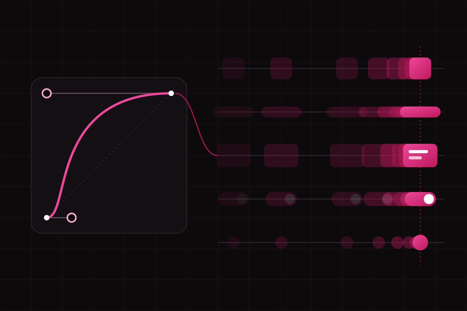
An easing curve is the rule that sets how fast an animated value moves at each moment of its duration, and in a product it works as art direction: one curve, applied to every drawer, menu and toast, gives the interface a temperament people recognise before they can name it. Two products can share a palette, a typeface and a grid and still feel different, because one settles every movement in a long, soft tail and the other snaps into place.
This matters to whoever owns how a product feels: a head of design setting up a design system, a founder whose app looks right in screenshots and wrong in the hand, a frontend lead facing forty different transition values. On paper the outcome is small. One signature curve, two or three variants of it, three durations, all written as tokens. In use, the product moves like one thing.
What is an easing curve, in practical terms?
Every animation maps time to progress. At 0 percent of the duration the element is where it started. At 100 percent it is where it ends. The easing curve decides everything in between. A linear curve covers the same distance every frame, which reads as mechanical. Every other curve speeds up, slows down, or both.
On the web the curve is written in one of two ways:
cubic-bezier(x1, y1, x2, y2): four numbers that place two control points. The first pair shapes the departure, the second shapes the arrival. The keywordsease,ease-inandease-outare preset values of this function.linear(): a list of points the browser joins with straight segments. With enough points it draws springs and bounces that a single cubic Bézier cannot, because values can go past 1 and come back. It has worked in every major engine since Safari 17.2 shipped it in December 2023, after Chrome 113 and Firefox 112 (MDN).
Native platforms use the same two ideas. Apple's SwiftUI made a spring its default animation in 2023, as the WWDC23 session Animate with springs explains. A spring is described by response and damping instead of control points, but on screen it is still a curve with a shape.
How does a curve carry tone?
A curve's shape reads like a typeface. Four shapes cover most products:
- Fast start, long settle. The element leaves at once and arrives slowly. It feels responsive and calm at the same time. Most product interfaces live here.
- Slow start, fast end. The element hesitates, then accelerates away. On an entrance it feels sluggish. On an exit it reads as decisive, which is why design systems keep it for things leaving the screen.
- Symmetric ease-in-out. Even acceleration and deceleration. Neutral and a little mechanical, the motion equivalent of a default sans serif.
- Overshoot. The element passes its target and comes back. Playful, physical, sometimes childish. Used once, it marks a moment. Used everywhere, it tires.
The public design systems show how deliberate these choices are. Google's Material 3 sets its standard easing to cubic-bezier(0.2, 0, 0, 1): a very fast departure and a long, quiet landing. For hero transitions it adds an emphasized decelerate curve, cubic-bezier(0.05, 0.7, 0.1, 1), that covers most of the distance almost at once (Material 3 easing and duration tokens). IBM's Carbon goes further and names the tone: a productive standard curve, cubic-bezier(0.2, 0, 0.38, 0.9), and an expressive one, cubic-bezier(0.4, 0.14, 0.3, 1), with the guidance to keep expressive motion for occasional, important moments (Carbon motion guidelines).
Put those numbers side by side and the personalities show. Material's curve says "already done". Carbon's productive curve says "efficient, no fuss". Its expressive curve takes a breath before it moves.
Duration is the other half of the tone
The same curve at 120 ms and at 600 ms gives two different products. Nielsen Norman Group puts most interface animations between 100 and 500 ms: around 100 ms for simple feedback such as a checkbox or a toggle, 200 to 300 ms for larger changes such as a modal entering (NN/g on animation duration). Apple's guidelines ask for motion that is brief and precise (Human Interface Guidelines, Motion).
A working rule: the curve sets the character, the duration sets the energy. A calm brand keeps the curve and lengthens the durations a little. A sharp, tool-like brand keeps the same curve and shortens them. Change both at once and the comparison stops meaning anything.
Why one curve and not one per component?
Consistency is what turns motion into identity. If the menu uses one curve, the drawer another and the toast a third, nobody perceives a brand. They perceive a product assembled by different hands, which is often exactly what happened. One signature curve works like one type family: variations exist, and they visibly belong together.
In practice "one curve" means a small family:
- Standard, for anything moving between two resting positions on screen.
- Enter, a decelerating version of the same shape, for things arriving.
- Exit, an accelerating version, for things leaving, usually faster.
- Optionally one expressive variant, kept for a short list of moments: a first result, a finished onboarding, a launch screen.
Carbon's model is exactly this structure, three curves in two modes. Material's is close to it. Neither ships a curve per component.
How to pick the signature curve
Choosing a curve is a design decision, so it follows the same steps as choosing a typeface.
- Write the tone in two words. "Calm and exact", "quick and warm", "steady and serious". Two words are enough to reject most candidates.
- Draw three or four candidates in a Bézier editor (browser devtools include one) and keep them as plain numbers.
- Test each one on three moments: a button press at about 100 ms, a drawer or modal at about 250 ms, a page or view transition at about 400 ms. A curve that works on all three is a candidate. One that only flatters the long transition is decoration.
- Compare on the real product, never on a test square. A curve that feels elegant on a grey box can feel slow on a dense table.
- Derive the enter and exit variants from the winner and write all of it as tokens.
The tokens sit next to colour and type in the same system, named for their role and not their shape, as we describe in our article on token naming:
--motion-ease-standard: cubic-bezier(0.2, 0, 0, 1);
--motion-ease-enter: cubic-bezier(0.05, 0.7, 0.1, 1);
--motion-ease-exit: cubic-bezier(0.3, 0, 0.8, 0.15);
--motion-duration-quick: 120ms;
--motion-duration-base: 240ms;
--motion-duration-slow: 400ms;
The values above are Material's, used only as a readable example. The point of the exercise is three curves that belong to the product.
When should a product not use expressive easing?
When people use it for hours. In a dashboard, an admin panel or a data tool the same panel opens dozens of times a day. An overshoot that charms on the first open costs attention on the fortieth. Those products want the productive end: fast start, short duration, no bounce. We wrote about this shift in our piece on calm UI.
Expressive motion fits where time is not the cost: marketing pages, onboarding, empty states that turn into a first result, consumer apps used for minutes rather than hours. Even there it stays the exception, and the standard curve is what makes it visible.
Reduced motion: keep the timing, drop the travel
Some people get dizzy or nauseous from movement on screen. WCAG 2.3.3, Animation from Interactions (level AAA), asks that motion triggered by an interaction can be turned off unless it is essential (W3C, Understanding 2.3.3). The common way to meet it is the prefers-reduced-motion media query, which the W3C documents as technique C39.
Reduced motion does not have to erase the brand. The criterion covers movement, and a fade is not movement. A drawer that slides 320 px can, under reduced motion, fade in place with the same duration and the same curve. The rhythm survives. The travel goes. Our functional animation checklist covers the rest of what to verify before motion ships.
@media (prefers-reduced-motion: reduce) {
  .drawer { transform: none; transition-property: opacity; }
}
What this looks like on a real product
Take a B2B SaaS whose screens are clean and whose movement is noise: a CSS framework default here, a library's spring there, a 600 ms hover someone added in a hurry. The fix takes three passes. First, an inventory: search the codebase for every transition, animation and easing value, and count the distinct ones. Second, a choice: the two-word tone, three candidate curves, the three-moment test. Third, a migration: every value replaced by a token, every component checked under reduced motion.
The screens stay the same. The product starts to feel like one piece, and its motion joins the same art direction as its colour and type.
Sources
- Material Design 3: Easing and duration tokens
- IBM Carbon Design System: Motion
- Nielsen Norman Group: Executing UX Animations, Duration and Motion Characteristics
- Apple Human Interface Guidelines: Motion
- Apple WWDC23: Animate with springs
- MDN: linear() easing function
- WebKit: Features in Safari 17.2
- W3C: Understanding SC 2.3.3 Animation from Interactions
- W3C Technique C39: Using the CSS prefers-reduced-motion query
Frequently asked questions
There is no single best curve, because the curve is a choice of tone. For most product interfaces a fast-start, slow-settle curve is the safest default, and Material 3's standard cubic-bezier(0.2, 0, 0, 1) is a well-documented example. Avoid linear timing for movement, since constant speed reads as mechanical, and keep overshoot for rare moments. Test any candidate at about 100, 250 and 400 ms on real screens before adopting it.
They solve a different problem. A spring keeps its velocity when an animation is interrupted or driven by a gesture, a point Apple's WWDC23 session on springs makes directly. A cubic-bezier curve has a fixed duration and is simpler to write as a token and to keep consistent across a web codebase. CSS linear() can draw a spring's shape, but it does not carry velocity across an interruption the way a physics-based spring does. Many products use Bézier curves for CSS transitions and springs for gesture-driven movement on native platforms.
Technically yes: both systems publish their values openly, and they are well-tested starting points. The trade-off is identity. A product that moves on Material's curves at Material's durations will feel related to Google's apps, the same way a product set in a platform's system font feels related to that platform. A reasonable path is to start from one of these curves, move the control points toward the tone written down for the brand, and keep the family structure (standard, enter, exit) that both systems model.
Related services
Related articles
Design Design
Long form UX best practices: 12 rules for forms people finish
The average checkout asks for 11.3 fields when 8 would do. Twelve rules for long forms: what to cut, how to split pages, when to validate, what to save. Design