 Design
Functional UI animation in 2026: the checklist before it ships
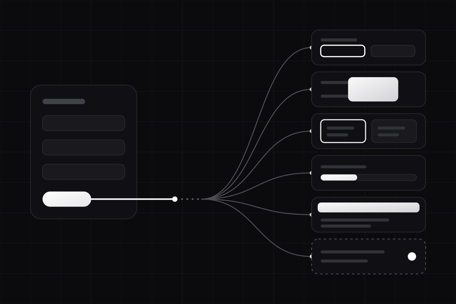
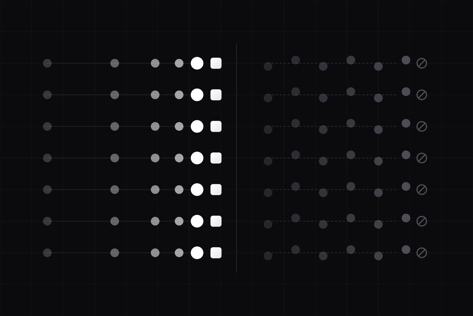
The 7 do, 7 don't checklist we apply on every product we ship: durations from 100 to 500ms, opacity and transform only, prefers-reduced-motion honored at the root.
Functional UI animation is motion that does a job: confirming an action, showing a state change, guiding attention from one part of the interface to the next. It is not decoration, and it is not a personality piece. When motion has a job, users barely notice it. When it does not, they feel the friction even if they cannot name it.
This article is the checklist we apply on every product we ship in 2026. It is opinionated. It assumes you already know how to write a CSS transition and that you have a design system to put motion into.
Why this matters more in 2026 than it did in 2022
Three things have changed.
First, the EU Accessibility Act came into force on 28 June 2025, and motion is one of the most common audit findings. Vestibular disorders affect a meaningful slice of the adult population: roughly 35% of adults aged 40 and over have experienced some form of vestibular dysfunction. Animations that scale, pan, or parallax can trigger nausea, dizziness, and headaches for these users.
Second, calm UI is no longer a niche stance. Apple, Atlassian, and IBM all shipped motion guidelines in the last 18 months that reduce default durations and push expressive motion to specific moments. The phrase "less but better" applies.
Third, frame budgets have not gotten more generous. 60fps still means 16.66ms per frame. The properties browsers can animate cheaply (opacity, transform) are the same ones that were cheap five years ago. The properties that cost a layout or a paint (width, height, top, left, margin, padding) are still expensive. None of this is new. It is still ignored.
Do this
1. Keep durations short and contextual
Material Design 3 fixes 200ms as the standard reference for component-level transitions and 300ms for inter-screen transitions. Apple's Human Interface Guidelines land in the same range. The rule we follow:
- Micro-interaction (hover, focus, toggle): 100 to 200ms.
- Component state change (modal open, drawer slide, dropdown reveal): 200 to 300ms.
- Full-page transition: 300 to 500ms, only when it carries meaning.
- Anything above 500ms must justify itself.
A motion the user triggers thirty times a session should sit under 150ms. A motion they see once needs more room to read.
2. Use easing as a verb, not a vibe
Each easing curve has a job:
- ease-out for elements entering the screen. Starts fast, settles. Feels responsive.
- ease-in for elements leaving the screen. Starts slow, accelerates off. The user has already decided.
- ease-in-out for movement between two states of the same element.
- linear only for indeterminate progress and continuous motion (spinners, loaders).
These should live as tokens in the design system (--ds-easing-enter, --ds-easing-exit, --ds-easing-standard), never inline in a component.
3. Animate only opacity and transform
GPU-composited properties stay locked at 60fps because they skip layout and paint. The list is short: opacity, transform (translate, scale, rotate), and filter with care. Use transform: translateY() instead of animating top or margin-top. Use transform: scale() instead of animating width and height. The difference shows up on mid-range Android, not on the M-series Mac you used to build the page.
4. Honor prefers-reduced-motion at the root
WCAG 2.1 Success Criterion 2.3.3 requires that motion triggered by interaction can be disabled, except where the motion is essential. The mechanical answer is one rule in your global stylesheet:
@media (prefers-reduced-motion: reduce) { *, *::before, *::after { animation-duration: 0.01ms !important; animation-iteration-count: 1 !important; transition-duration: 0.01ms !important; scroll-behavior: auto !important; } }That covers most damage. For non-essential parallax, autoplay video backgrounds, and large scaling reveals, also guard with a JavaScript-level matchMedia('(prefers-reduced-motion: reduce)') check before mounting the animation at all. Setting the duration to 0 still runs the listener; it does not undo the JS work.
5. Make every animation interruptible
If a user can click a button, the animation that runs after the click must not block the next click. Locked transitions, modals that ignore the escape key during their entry, and dropdowns that refuse to close until the open animation finishes are the most common offenders. The fix is structural: state changes drive the animation, not the other way around. If state flips back to closed mid-open, the animation should reverse from its current frame, not wait.
6. Move motion into the design system as tokens
Duration tokens (--ds-motion-duration-fast, --ds-motion-duration-base, --ds-motion-duration-slow) and easing tokens (--ds-motion-ease-out, --ds-motion-ease-in, --ds-motion-ease-standard) belong in the same layer as color and spacing. Atlassian, IBM Carbon, and Material 3 all publish their token layer. Copy the structure if your design system does not have one.
7. Animate to communicate state, not to entertain
The three jobs motion legitimately does in a product UI:
- Feedback: confirming a button press, a toggle flip, a successful save.
- Continuity: showing where a new element came from, so the user does not have to re-parse the screen.
- Hierarchy: drawing attention to the one element that just changed, then settling.
If a proposed animation does not do one of these three, cut it.
Don't do this
1. Parallax that runs on every scroll
Foreground and background moving at different speeds during scroll is the most-cited vestibular trigger in accessibility audits. It rarely adds meaning. If the marketing site insists, gate it behind prefers-reduced-motion: no-preference.
2. Animating width, height, top, left, or margin
These trigger layout. Layout costs roughly 6 to 14ms on mid-range devices and cascades to every descendant. You will drop frames. Use transform instead.
3. Six things animating at the same time
When more than two or three elements animate together, the user cannot tell what is responding to their action and what is moving for atmosphere. Pick the one element that matters. Move it. Let the rest stay still.
4. Decorative loading spinners on actions under 300ms
If the action finishes in 150ms, the spinner adds latency, not reassurance. Render the success state directly. Reserve spinners for operations that genuinely take time, and prefer a skeleton or an inline progress bar for anything above one second.
5. Autoplaying scroll-triggered scale or pan on hero sections
Cinematic page reveals on first visit feel like a portfolio piece, not a product. They also fail WCAG 2.3.3 unless you guard them. The cost-benefit is bad: 100ms of perceived wow for the small share of users not affected, and physical discomfort for those who are.
6. Custom easing curves that do not match the system
A bespoke cubic-bezier(0.4, 0.0, 0.2, 1) on one component and a different one on the next is how a product starts to feel off without anyone being able to point at the cause. Use the same three or four curves everywhere.
7. Motion you cannot turn off in development
If your team cannot disable animation while debugging a component, that animation is in the way of every keyboard test, every screenshot diff, and every accessibility audit. Add a top-level flag (env var, query param, or DevTools toggle) that kills animation site-wide. You will use it weekly.
The recap
- Micro-interaction duration: 100 to 200ms.
- Component state change: 200 to 300ms (Material 3 and HIG range).
- Page transition: 300 to 500ms, only when it carries meaning.
- Easing for enter: ease-out. Feels responsive.
- Easing for exit: ease-in. The user has decided.
- Properties to animate:
opacityandtransformonly. - prefers-reduced-motion: honored at the root, plus a JS guard for heavy motion.
- Interruptibility: always. State drives the animation, not the reverse.
Read this list with a senior engineer before the first sprint of any product. The motion bugs that come up later are almost always the items skipped here.
Related on this blog: Calm UI in 2026: the shift away from animation theatrics and Accessibility-first design after the EU Accessibility Act.
Sources
Frequently asked questions
Under 150ms. Hover is the highest-frequency motion in a typical interface: the user triggers it dozens of times per minute while scanning a page. Anything longer feels laggy and breaks the sense that the page is responding to them. We default to 120ms for hover, focus, and toggle states across the design system, and we keep that value in a single token so a future tweak applies everywhere.
It does not remove anything by itself. It is a signal from the operating system that the user wants less motion, and the implementation is up to you. The common practice is to shorten transition and animation durations to near zero with the global CSS rule, and to skip non-essential motion entirely (parallax, autoplay video, scale-in hero reveals). Essential motion that conveys information (a progress bar moving, a sortable list reordering) should remain, because removing it would break the experience.
For most product UI in 2026, yes. Native CSS transitions, the Web Animations API, and CSS @starting-style cover modal entries, dropdowns, hover states, page transitions, and reorderable lists. Framer Motion earns its place when you need shared-element transitions across routes, gesture-driven physics (drag-to-dismiss with momentum), or coordinated sequences across many elements. If you reach for it for a fade-in, you are paying ~30 KB gzipped for a one-line CSS transition.
Related services
Related articles
Design Design
Figma MCP design-to-code handoff: 6 steps and its limits
The Figma MCP server gives coding agents design context and a code starting point. Six steps to a clean handoff, and the four gaps it still leaves. Design