

 Design
SaaS dashboard design: show data without drowning users
Most SaaS dashboards fail by showing everything at once. Here is the summary-first layout, the widget limit, and progressive disclosure that keeps users oriented.
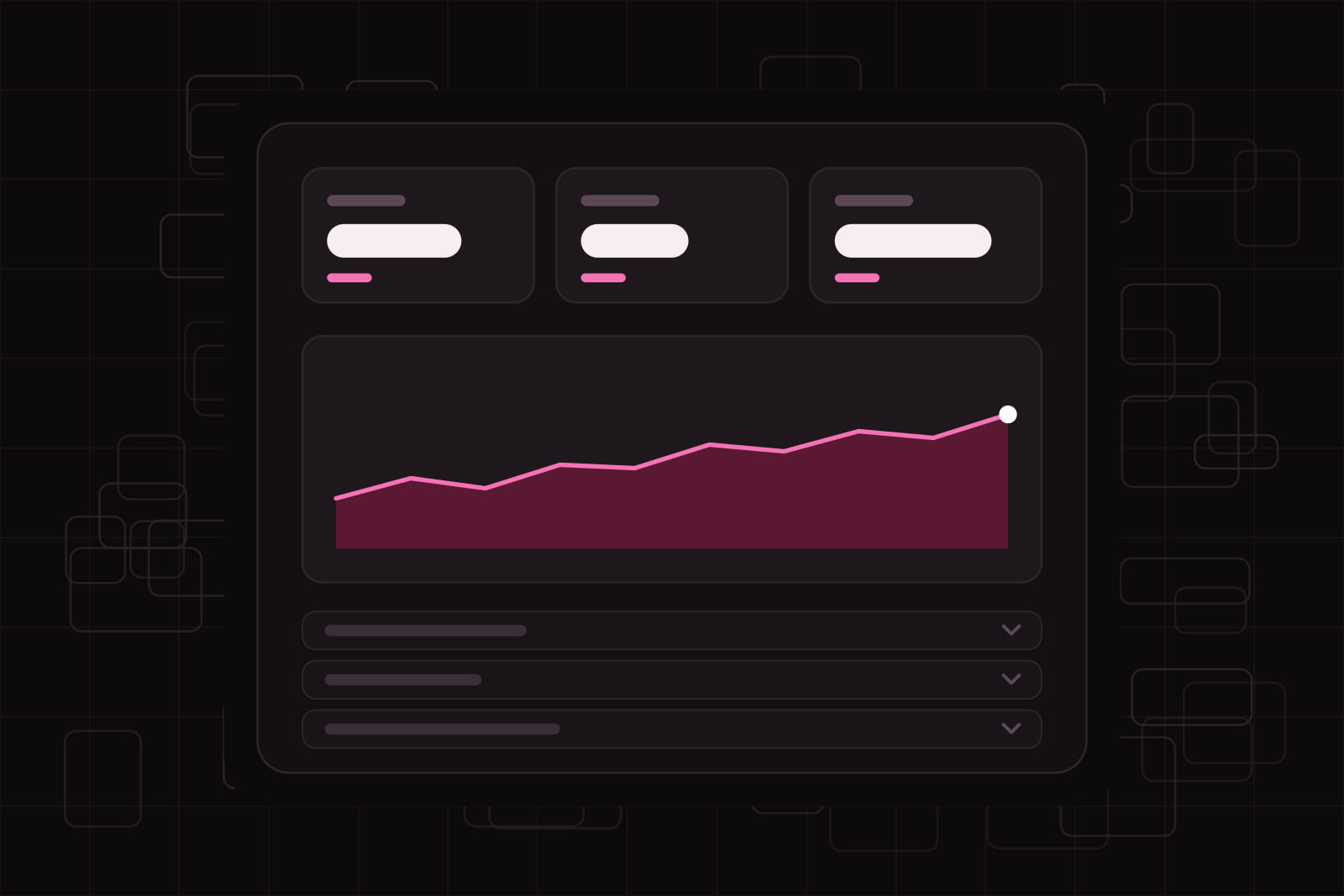
A SaaS dashboard is the home screen of a product: one view that tells a user what is happening and what needs a decision right now. Stephen Few, who wrote the reference book on the format, defined a dashboard as the most important information needed to reach a goal, arranged on a single screen so it can be read at a glance. The good ones do that in about five seconds. The bad ones show everything the database can produce and leave the user to sort it out.
That second version is common. A team ships a product, the data grows, and every stakeholder asks for one more chart. Six months later the dashboard has thirty widgets, four filters, and a scroll bar that never ends. Users stop reading it. They open the one report they trust and ignore the rest. This article is about the design decisions that keep a dashboard readable as the data behind it grows.
Why a crowded dashboard costs you users
Information overload is the most reported dashboard problem, and it has a mechanical cause. Human working memory holds a handful of items at once. George Miller put the number at seven, plus or minus two, in 1956, and while that figure is a memory observation rather than a hard interface rule, the direction is right: past a certain count, people stop comparing items and start scanning past them.
A dashboard that shows forty numbers does not inform forty times better than one that shows six. It informs worse. The eye has no anchor, the important metric sits at the same weight as the vanity metric, and the user spends attention deciding where to look instead of deciding what to do. The cost is not aesthetic. It is a slower time to first action, more support tickets asking where do I see X, and a feature nobody opens.
Why adding a filter does not fix it
When a dashboard feels crowded, the reflex is to add controls: a date picker, a segment dropdown, a toggle for each team. Filters help a power user who already knows what they want. They do nothing for the person who opens the screen cold and needs to know, in one glance, whether today is fine or on fire. You have moved the work onto the user instead of doing it in the design. More controls also mean more state to hold in memory, which is the opposite of what an overloaded screen needs.
The same trap applies to adding a second dashboard, then a third. Now the user has to remember which screen answers which question. The problem was never storage. It was hierarchy.
What actually works
Lead with a summary, reveal detail on demand
Progressive disclosure is the strongest pattern here. Show the few numbers that matter first, and let the user click, expand, or drill down for the rest. Jakob Nielsen, who named the pattern, describes it as deferring advanced or rarely used options to a second screen so the primary ones get full attention. On a dashboard this looks like a top row of three to five headline metrics, each of which opens a detailed view when clicked. The founder gets a status read in seconds. The analyst still gets every layer, one tap away.
One dashboard, one job
Decide who the screen is for before you design it. A dashboard built for a founder tracking growth and one built for a support lead clearing a queue should not be the same screen with different widgets bolted on. Role-based views cut the widget count because most metrics are irrelevant to most roles. If you cannot name the single question a dashboard answers, that is the bug, and no layout will fix it.
Respect the count, but chunk instead of capping
Aim for roughly five to nine elements in a single view. Treat that as a smell test, not a law: on-screen options do not need to be memorized because they stay visible, so the real goal is grouping. Chunk related metrics into labeled sections, so the eye reads three groups of four rather than twelve loose tiles. A well-labeled group of related numbers reads as one unit, which is how you fit more data on a screen without adding load.
Build a real visual hierarchy
Put the most important metric where the eye lands first, the top-left in left-to-right layouts, and give it the most size and contrast. Everything secondary steps down in weight. Use color with restraint: a palette where every tile is a different bright color has no hierarchy, because nothing stands out when everything shouts. Reserve saturated color for the one state that needs action, a breach or an alert, and keep the rest calm. This is the same discipline we describe in calm UI: quiet by default, loud only where it earns it.
Make each number mean something
A number alone is not information. 1,240 signups tells a user nothing until they know whether that is up or down, and against what. Pair every headline metric with context: a comparison to the previous period, a target line, or a trend arrow. A metric with a threshold, such as 83% of quota with green above 80%, lets a user judge it without doing math. That single habit removes more confusion than any chart type choice.
Design the empty and loading states
Dashboards are shown before they have data: a new account, a slow query, a filter that returns nothing. If those states are an afterthought, the first impression of the product is a broken-looking screen. A skeleton on load, a clear no data yet with a line on how to get some, and a fast fallback when a query lags all keep the user oriented while the numbers arrive.
Cut the metrics nobody acts on
For every metric on a dashboard, ask one question: if this number moved, would anyone do anything differently. If the answer is no, it is a vanity metric, and it belongs in a report someone can pull on request, not on the screen people check daily. Total lifetime signups feels good and changes no decision. Signups this week against last week changes whether you worry. Cutting the first kind is the fastest way to free space and sharpen the screen, and it is usually the hardest, because someone asked for each one.
What this looks like in practice
Take a support tool whose old dashboard had eighteen widgets on one scroll. We rebuilt it around one question the support lead actually asks each morning: is the queue under control. The new top row shows four numbers: open tickets, tickets breaching SLA, median first response time, and today's resolved count. SLA breaches are the only red element on the screen. Below the fold, three labeled sections hold the detail: per-agent load, tag breakdown, and the trend over fourteen days. Everything that used to be a top-level widget is now one click inside a section. The screen reads in a glance, and the detail is still there for the analyst who wants it. The data did not shrink. The hierarchy did the work.
None of this is a visual-design problem first. It is an editing problem. A good dashboard is mostly a set of decisions about what not to show on the first screen. Motion, color, and layout reinforce those decisions, the same way animation earns its place only when it points the eye at something that changed.
Sources
Frequently asked questions
A dashboard monitors the current state at a glance and is meant to be checked often. A report answers a specific question in depth and is pulled when someone needs it. The mistake is turning a dashboard into a report by piling every possible breakdown onto the daily screen. Keep the dashboard to the few numbers that drive a decision, and move the deep breakdowns into reports a user can generate on demand.
As few as the number of distinct roles that check the product regularly. One per role usually beats one giant shared screen, because each role asks a different question. Adding a second dashboard is worth it only when it answers a question the first cannot, not when it holds spillover widgets. If you cannot state the question a new dashboard answers in one sentence, it should be a section inside an existing one.
Watch behavior, not opinions. Track time to first action after the screen loads, how often users backtrack or re-filter, and whether support tickets ask where to find a number that is already on the screen. A dashboard that people check and then act on quickly is working. One that people open, scan, and leave to pull a spreadsheet instead is not, no matter how complete it looks.
Customization is useful once the default is already good, and a poor substitute for a good default when it is not. Most users never change settings, so the out-of-the-box view has to work for them on its own. Offer customization for power users who have earned an opinion, but design the default as if it is the only screen anyone will ever see. If you are relying on users to fix the layout themselves, the layout is the problem.
Related services
Related articles
Design Design
Why your UI looks unprofessional: 9 details to fix before launch
Off-scale spacing, radii that don't nest, wobbling numbers, missing focus states: nine details that make a UI look unfinished, each with its fix. Design