
 Design
Multi-brand design tokens: 6 steps from one primitive layer
One primitive layer, one alias-only file per brand, components that read only semantic names: six steps built on the DTCG 2025.10 spec and Figma variables.
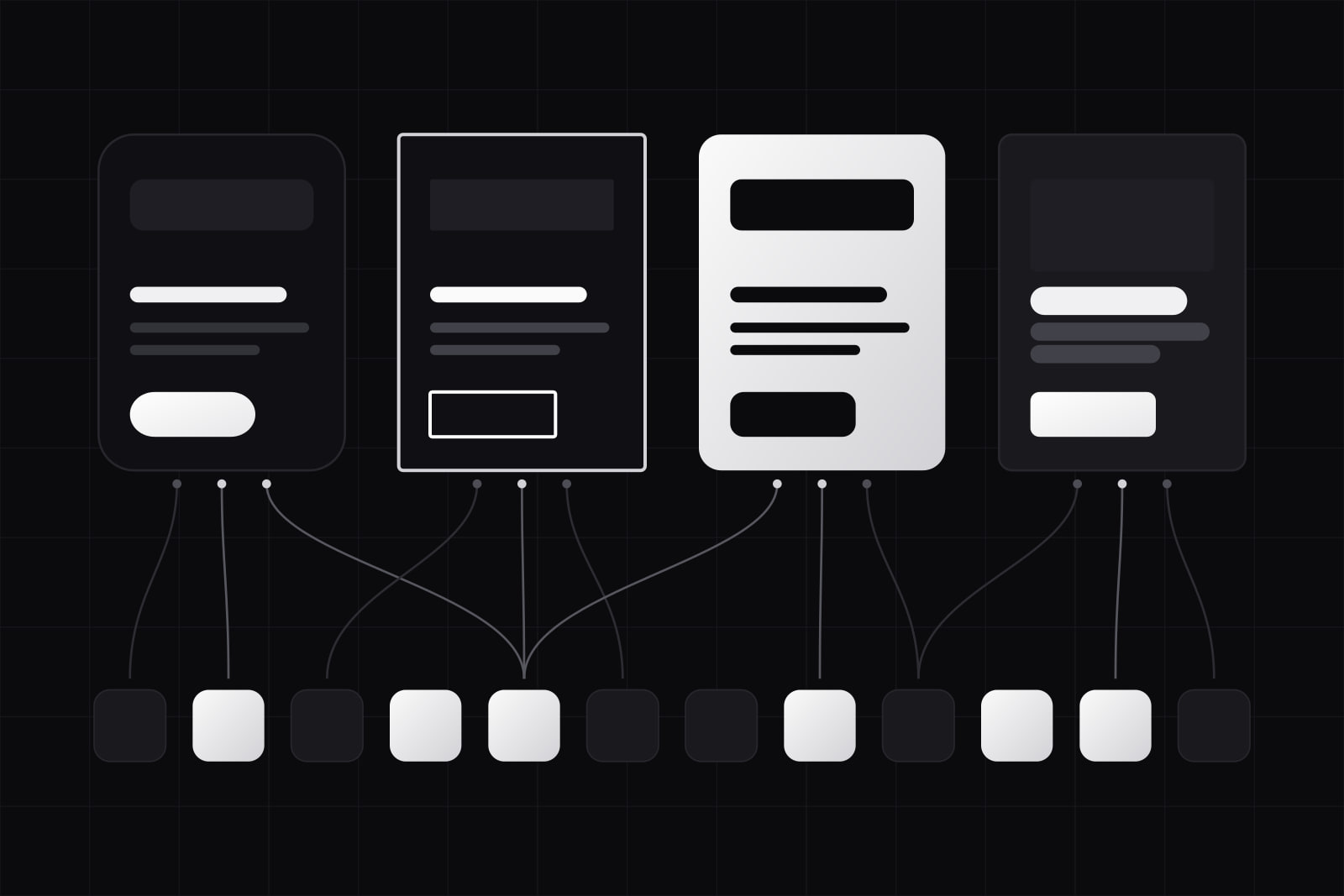
At the end of this guide you will have one token source that serves several brands. It has four parts: a primitive layer every brand draws from, a semantic contract every brand fulfils, one small file of decisions per brand, and components that read only semantic names. Adding a brand becomes a new brand file and a new build target. The component library stays as it is.
Multi-brand token architecture is a way of organising design tokens so that several products share one component library while each keeps its own colour, type and shape. It is for teams running sister products, white-label platforms, or a parent company with more than one consumer brand. The cost of skipping it shows up as forks. Infinum described a telecom group with four brands where every brand had its own assets file, mobile components file and web components file: twelve files, and every shared change made four times.
The format is settled now. The Design Tokens Community Group published its first stable specification, 2025.10, on 28 October 2025, with theming and multi-brand support as one of its headline features. The steps below use its JSON format, so any tool that reads it (Style Dictionary, Terrazzo, Tokens Studio) can build the result.
What you need before starting
- A component library that already reads tokens or CSS custom properties, not hard-coded hex values. If it does not, fix that first: component drift is where multi-brand projects stall.
- The list of brands, and for each one a person who can say yes or no to a colour.
- A build tool that reads DTCG JSON and can run once per brand and platform.
- A design tool with variables. In Figma, the number of modes per collection depends on the plan: up to 10 on Professional, up to 20 on Organization, unlimited on Enterprise through extended collections.
Step 1. List what actually differs between the brands
Put every brand side by side in a spreadsheet, one row per decision: primary colour, neutral tint, heading font, body font, corner radius, button shape, density, motion. Mark each row as shared or brand-specific.
The brand-specific rows are usually fewer than the brand teams expect. Spacing scales, breakpoints, z-index steps and durations tend to be the same everywhere, and they belong to the core. Colour, type families and radius tend to differ. Write the list down before naming a single token, because it decides how large each brand file will be. A brand file that ends up with 300 entries means the audit was skipped.
Also note what differs in structure, not in skin. A brand that needs a different navigation pattern or an extra checkout step has a component problem. Tokens cannot solve it.
Step 2. Build one primitive layer for every brand
Primitives are raw values with no meaning attached: colour ramps, font families, a radius scale, a spacing scale. Put all of them in one layer, the ramps of every brand included, and name each one for what it is (color.teal.600), never for who owns it (color.acme.primary).
Two brands that both use a near-identical blue then share one ramp, and a rebrand that moves a brand from teal to violet changes one alias instead of renaming a ramp. Components never read this layer. If they do, you lose the ability to swap brands without editing component code.
Step 3. Define the semantic contract every brand must fulfil
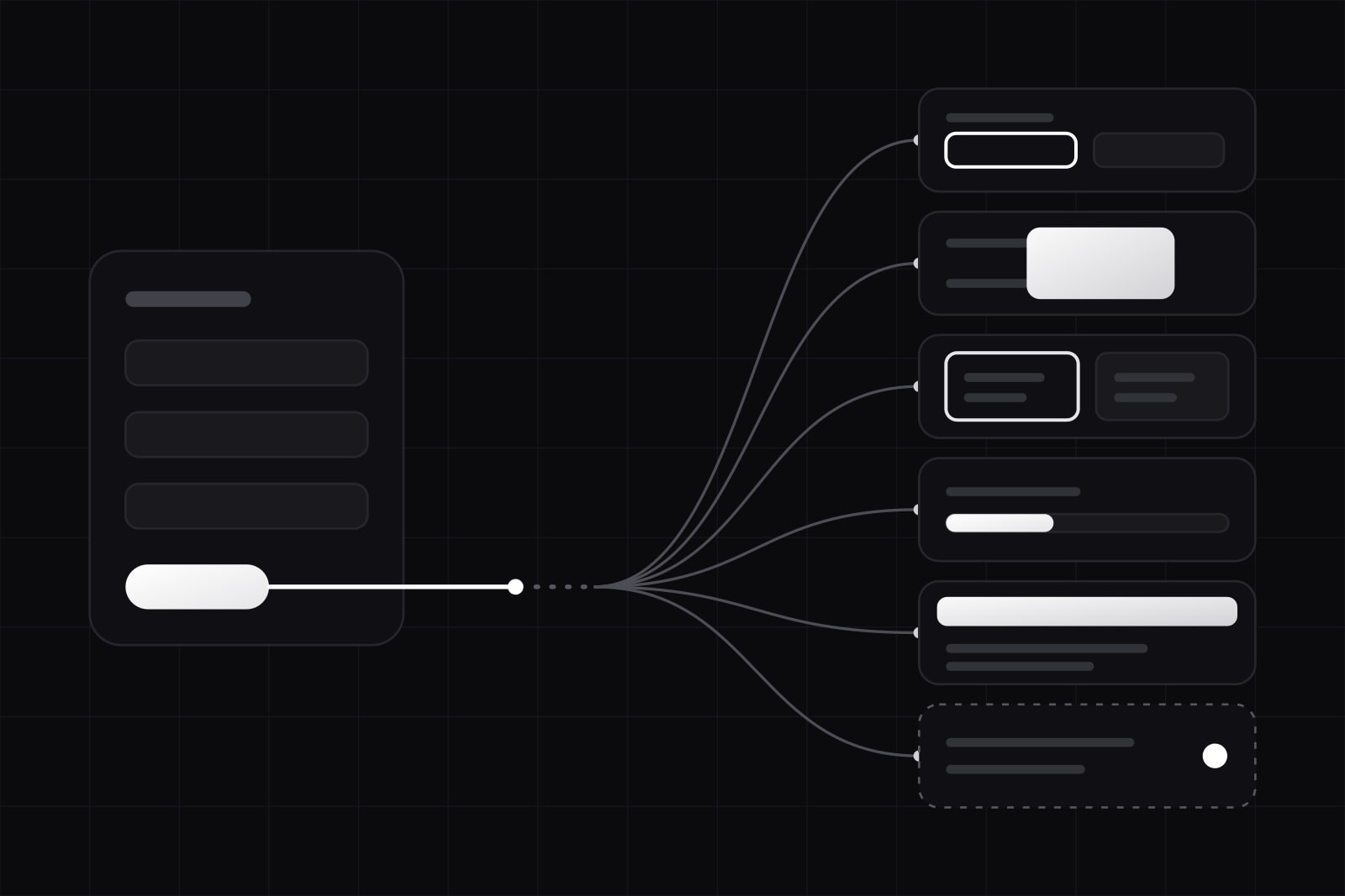
Semantic tokens name a role: color.action.background, color.text.default, radius.control, font.family.heading. This list is the API between the system and the brands. Components read it and nothing else, and every brand has to provide a value for every entry.
Keep the contract small and stable. Each new semantic token is a new obligation for every brand, so add one only when a role exists in at least two brands. We cover the naming itself in a 3-tier naming system that scales.
Step 4. Write one brand file per brand, with aliases only
A brand file maps semantic tokens to primitives and holds no raw values. In DTCG JSON a single entry looks like this:
{
  "color": {
    "action": {
      "background": { "$type": "color", "$value": "{color.teal.600}" }
    }
  }
}
Aliases keep every brand inside the primitive layer, which is the only place where contrast is checked. A designer who wants a new shade adds it to a ramp, where every brand can see it.
The spec's Resolver module describes how to combine these files. You declare sets (the core files) and modifiers (brand, theme), each with its contexts, and a resolution order. The module warns about the trap every multi-brand system meets: when a brand modifier and a theme modifier both set the same token, the order of the array decides the value. Pick the order on purpose. Resolving theme before brand lets a brand file correct a dark-mode value it disagrees with. Whichever order you choose, write it in the readme.
Step 5. Build once per brand and per platform
Style Dictionary's own multi-brand, multi-platform example shows the shape: tokens split into brand, platform and global folders, and a build script that loops over every brand and platform pair, writing to build/web/brand-1/ and so on.
On the web there are two ways to ship the output:
- One file per brand. Each product loads only its own CSS. Use this when the brands are separate apps.
- One file, scoped by attribute. Every brand's custom properties sit under a selector such as
[data-brand="b"], and the app switches by changing one attribute. Use this for white-label products where one deployment serves many customers.
Count the outputs before you add a modifier. Four brands, two themes and three platforms already make 24 builds. The Resolver module calls this combinatorial explosion, and every new axis (density, high contrast, reduced motion) multiplies it again.
Step 6. Mirror it in Figma and guard it in CI
In Figma, put primitives in one collection and semantic tokens in another, with one mode per brand. On Enterprise, extended collections do this more cleanly: each brand extends a parent collection, overrides only what differs, and inherits every later change to the variables it left alone. An extended collection cannot add variables or modes of its own, which is the same contract as Step 3, enforced by the tool.
In CI, three checks catch most regressions:
- Every semantic token resolves for every brand. A missing value fails the build.
- No component file references a primitive or a brand-named token.
- Every text and background pair passes the 4.5:1 contrast minimum for body text, per brand and per theme.
Verifying it works
Add a fake brand with deliberately loud values: a saturated green, square corners, a serif heading font. Render the full component gallery under it. Every component should change. Any component that keeps the old look is reading a primitive or a hard-coded value, and you have found it before a real brand did.
Common failures and fixes
- Brand names inside components. A button that reads
color.acme.primaryworks for one brand only. Replace it with the semantic token and move the brand value into the brand file. - Component tokens copied per brand. Writing
button.backgroundseparately for each brand multiplies the files without adding control. Alias component tokens to semantic ones, and let a brand override a component token only when it really differs. - Raw hex values in a brand file. They skip the contrast checks on the primitive layer. Add the shade to a ramp, then alias it.
- Structure disguised as skin. When a brand needs another layout or another flow, no token will deliver it. Make it a component variant and keep it out of the token files.
Going further
Brands rarely differ only in colour. Type, motion and density carry identity too, and tokens beyond color covers how to model them. Once several products consume the same core, the release process matters as much as the architecture: governing a design system across 10 consumer projects describes the versioning and the review rules we use.
Sources
- Design Tokens specification reaches first stable version (W3C Design Tokens Community Group)
- Design Tokens Resolver Module 2025.10
- Style Dictionary: Multi Brand and Multi Platform example
- Figma plans and features
- Figma: extended collections for multi-brand design systems
- Infinum: how design tokens helped us build four brand experiences from one design system
- W3C: Understanding Success Criterion 1.4.3, Contrast (Minimum)
Frequently asked questions
The token format sets no ceiling. The limits show up elsewhere: in the build count, which multiplies with every modifier, in Figma's modes per collection (10 on Professional, 20 on Organization), and in the brand files themselves. When a brand needs many component-level overrides, or a different structure, it is turning into a separate product, and a shared library starts costing more than it saves. Watch the size of the brand files: if they grow release after release, the semantic contract is missing roles.
Only for the values that really differ. Shared scales (spacing, sizes, radius steps, the neutral greys if the brands agree on them) stay in one place, and brand hues sit beside them as named ramps. Splitting the whole primitive layer per brand looks tidy, but it duplicates every scale, and the copies drift apart within a few releases. A quick test: if two brands would change a value together, it is one primitive.
The structure is the same. Delivery changes: a white-label product loads every brand's values under a data-brand attribute and switches at runtime, often from a setting stored with the customer's account, so the CSS for all brands ships to everyone. Separate brands load only their own file. White-label platforms also tend to let customers pick their own colours, which means checking contrast at the moment a customer saves, on top of the checks in CI.
The design system team owns the primitive layer and the semantic contract. Each brand team owns its brand file and can change any alias in it without asking, because the CI checks catch contrast failures and missing values. Adding a semantic token or a new primitive goes through the system team, since it creates work for every brand. Writing this split down early settles the most common argument in multi-brand systems: whose change is it.
Related services
Related articles
Design Design
Figma MCP design-to-code handoff: 6 steps and its limits
The Figma MCP server gives coding agents design context and a code starting point. Six steps to a clean handoff, and the four gaps it still leaves. Design