
 Design
Error state UX design: what to show when a request fails
A request can fail six ways, from a rejected field to a dropped connection. What each needs on screen, how to make retry safe, and the copy to write.
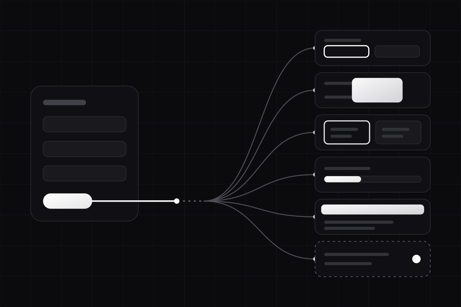
The error path is everything a product shows when a request does not succeed: the message, where it appears, what happens to the work the user just did, and the one action that gets them moving again. It covers six different failures, from a field the server rejects to a connection that drops halfway through a save. Each one needs its own screen. Design it before launch, because in production the first person to meet it is someone in the middle of a task, not a tester.
Why does the error path decide whether users trust a product?
A failure costs twice: once for the request, again for the time the user spends working out what happened. Baymard Institute's checkout testing found that unexpected error messages contributed to form abandonment, and that 31% of the sites it benchmarked had no inline validation at all. Those are e-commerce checkouts. A SaaS form that saves an invoice or invites a teammate has the same mechanics, and the same exit.
The harder cost is trust. Someone who has lost ten minutes of typing to a timeout has a good reason to copy their text somewhere safe before pressing Save next time. That habit outlives the bug.
Why is "Something went wrong" not enough?
The quickest fix is a toast: Something went wrong. Please try again. It fails on four counts. It names no cause, so the user can't tell a typo from an outage. It offers an action that may be the wrong one: retrying a declined card three times gets the same answer three times. It disappears after a few seconds, often before anyone has read it. And unless it sits in a live region, a screen reader user never hears it.
The fix starts before the copy. Each failure has a different cause, a different thing the user can do about it, and so a different place on screen.
What are the six ways a request fails?
Group failures by what the user can do next. The status code is only the input. Six groups cover almost every request a SaaS product makes.
- Input rejected (400, 422). The server refused a value, and the user can fix it. Show the message at the field, keep every other value, and move focus to the first field in error.
- Session or permission (401, 403). The user signed out in another tab, or lost access. They can sign in again or ask for access. Re-authenticate in place, in a dialog, then resend the request so the work survives.
- Conflict or gone (404, 409, 412). Someone else changed or deleted the record. The user needs to see what changed before deciding. Show both versions, or say plainly that the item no longer exists and where to go instead.
- Too many requests or overloaded (429, 503). The server asks the client to slow down, often with a
Retry-Afterheader. The user can only wait. Show how long, count it down, and retry without asking. - Server error (500, 502). Something failed on the other side. Retry once automatically. If it fails again, show a reference ID the user can send to support.
- Offline or timed out. The request never got an answer, and the user doesn't know whether it went through. Keep the action queued, say it will be sent when the connection returns, and never show it as saved until the server confirms.
One question separates the groups and drives the whole design: did the request change anything on the server? For rejected input, permissions and conflicts, the answer is no. For a timeout, the honest answer is that the client doesn't know. That's the case that needs the most care.
How do you keep the user's work when a request fails?
Nielsen Norman Group's error-message guidelines put it in four words: preserve the user's input. On the error path that turns into four rules.
- Never clear a form on failure. Re-render it with the values the user typed, including the ones the server accepted.
- Store drafts of long inputs (a description, a message, a multi-step form) in the browser as the user types, so a reload or a crash brings them back. Our rules for long forms cover autosave in more detail.
- When a session expires, re-authenticate in a dialog over the page. A redirect to the sign-in page throws the form away.
- If the interface updated optimistically (the row appeared before the server answered), roll it back visibly and say why. A row that silently vanishes reads as lost data.
When is it safe to show a retry button?
A retry button promises that pressing it twice won't do the thing twice. For reads, that holds by default. For writes, it holds only if the server can recognise a repeat. Stripe's API does it with an idempotency key: the client sends a unique key with each create or update, Stripe saves the first response for that key, and a retry with the same key gets the saved response instead of a second charge. Stripe keeps keys for at least 24 hours. Your own endpoints need the same pattern before the interface offers to retry a payment, an invite or anything that sends an email.
Automatic retries need limits too. Amazon's Builders' Library calls retries selfish: when a service fails because it's overloaded, retries add load and can make the outage worse. The pattern it recommends is capped exponential backoff with jitter. Wait longer after each attempt, stop at a ceiling, and add randomness so a thousand clients don't retry in the same second. When the server sends Retry-After with a 429 or a 503, use its number instead (RFC 9110 defines the header, RFC 6585 the 429 status).
In the interface we work to three rules: one silent retry on a read, no silent retry on a write without an idempotency key, and a visible state for anything that takes longer than a couple of seconds.
How should an error message be written?
NN/g's scoring rubric splits a good message into visibility, communication and efficiency. On screen that comes down to two sentences: what happened, and what to do now.
- Name the cause in the user's terms. Your bank declined the card tells them who to call. Payment error 402 doesn't.
- Give the next action as a button. Use another card, Sign in again, Load the latest version. A message with no action leaves the user to guess.
- Don't blame. NN/g advises against words such as invalid, illegal and incorrect. That date is before the start date explains. Invalid date scolds.
- Match the weight to the damage. A field error sits under the field. A failed save of the whole page gets a banner that stays until the user acts. A full-page error is for when nothing on the page works, and it still keeps the navigation so the user can leave.
- Add a reference ID to server errors. A short code the user can paste into a support ticket turns it broke into a log line someone can find.
How do you make the error path accessible?
An error shown only in red fails users who can't tell the color apart and users who can't see the screen. WCAG sets the floor. Success criterion 3.3.1 requires that a detected error be identified and described in text. Criterion 3.3.3 requires a suggestion for fixing it when one is known. The first is Level A and the second Level AA, so both sit inside the WCAG 2.1 AA level that EN 301 549 incorporates, as our article on the European Accessibility Act explains.
In the markup, that means:
aria-invalid="true"on the field in error, andaria-describedbypointing at the message, so a screen reader reads the message with the field.- A live region (
role="alert"for urgent failures,aria-live="polite"for the rest) for errors that appear without a page load, as MDN's alert role reference describes. - An icon or a text label next to the color, so the state reads in grayscale.
- Focus moved to the first field in error, or to the banner, after a failed submit.
What does the error path look like on one screen?
Take an illustrative case: someone edits an invoice in a B2B billing tool and presses Save. Here is the same screen across the six failures.
- The VAT number is malformed (422). The field switches to its error state with This VAT number needs a country prefix first, such as IT or ES, focus jumps to it, and every other field keeps its value.
- The session expired an hour ago (401). A sign-in dialog opens over the invoice. After sign-in, the save goes through with the same idempotency key.
- A colleague changed the due date in the meantime (409). A banner says Anna moved the due date to 30 November while you were editing and offers Keep mine or Use theirs.
- The API is rate limited (429, Retry-After: 20). The Save button reads Saving in 20 s and counts down. No click needed.
- The server returns a 500. One automatic retry with the same key. If that fails too, a banner says We couldn't save the invoice. Your changes are still here. with Try again and a reference ID.
- The laptop drops off the Wi-Fi. The invoice shows Not saved yet. We'll save it when you're back online. and the tab title carries a marker until the save lands.
Six states, one component. In a design system they live as variants of the same form and banner components, which is why we draw them in the same file as the happy path instead of leaving them to a ticket after launch. The same thinking applies to the screen before any data exists, covered in empty state design.
Sources
- Nielsen Norman Group: Error-Message Guidelines
- Nielsen Norman Group: Error-Messages Scoring Rubric
- Baymard Institute: Usability Testing of Inline Form Validation
- W3C: Understanding SC 3.3.1 Error Identification
- W3C: Understanding SC 3.3.3 Error Suggestion
- MDN: ARIA alert role
- Stripe API reference: Idempotent requests
- Amazon Builders' Library: Timeouts, retries, and backoff with jitter
- RFC 9110: HTTP Semantics, Retry-After
- RFC 6585: 429 Too Many Requests
Frequently asked questions
Not as the headline. A 409 or a 503 means nothing to most users, and leading with it buries the sentence they need. Put the cause and the next action first, then the status and a reference ID in a smaller line or a Details disclosure, where support staff and technical users can find them. Developer tools and API consoles are the exception: there the status code is the most useful fact on screen, so show it up front.
Yes, for a background action that blocks nothing and can be retried from the toast itself, such as a failed sync of a list the user isn't editing. Keep it on screen until the user dismisses it: a message that fades after four seconds can be gone before someone who reads slowly, or uses a screen magnifier, gets to it. Put it in a live region so screen readers announce it. For a failed save of something the user is looking at, use an inline message or a banner next to the content.
For reads, one or two attempts with backoff inside about two seconds, then a visible state. For writes, none without an idempotency key, since a retry could create a duplicate. With a key, one automatic retry is a sensible default before asking the user. When the server sends Retry-After, wait that long and show the countdown: retrying sooner adds load to a service that has already said it is overloaded.
Force each failure on purpose. Chrome DevTools can set the Network panel to Offline, throttle the connection and block a single request URL. A mock layer such as Mock Service Worker, or a test-only flag on your API, can return a 401, 409, 429 or 500 on demand. Then walk every form and save action through the six failures and check three things each time: the input is still there, the message names a next step, and a screen reader announces it.
Related services
Related articles
Design Design
Figma MCP design-to-code handoff: 6 steps and its limits
The Figma MCP server gives coding agents design context and a code starting point. Six steps to a clean handoff, and the four gaps it still leaves. Design