

 Design
Border vs shadow in UI: when each wins, and when a fill does
Shadows vanish in forced colors mode and fade in dark themes, input borders need 3:1 under WCAG 1.4.11. When to separate UI regions with border, shadow or fill.
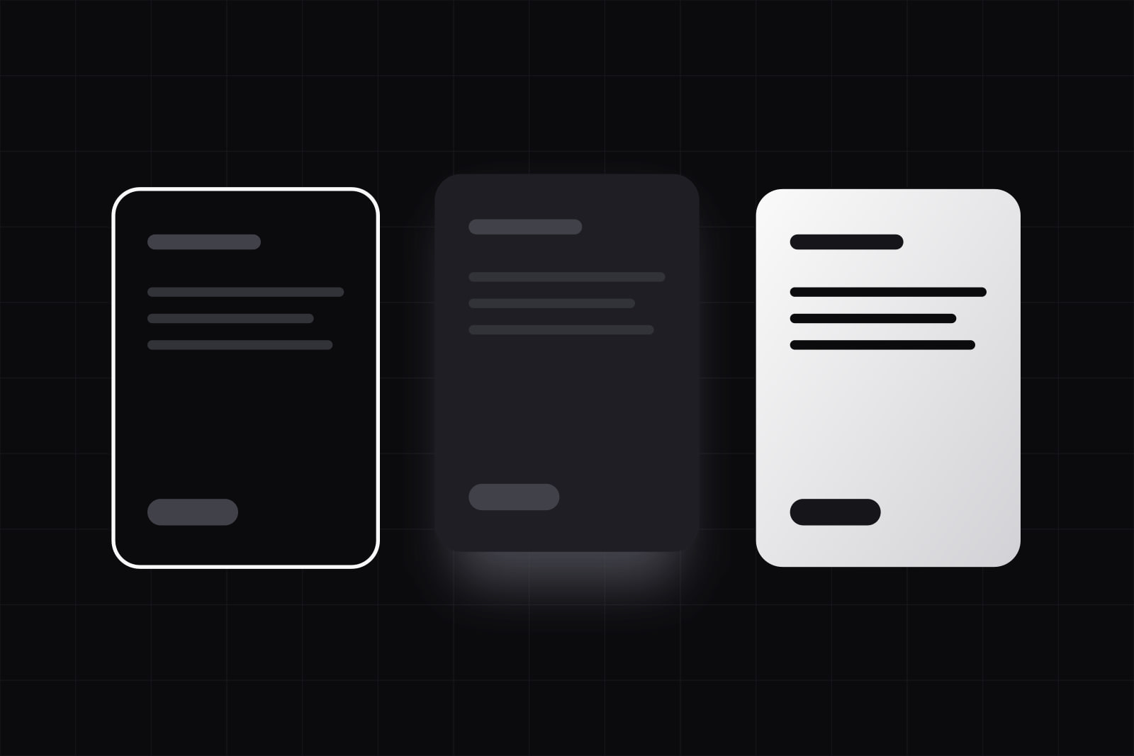
Surface separation is the visual cue that tells a user where one region of an interface ends and the next begins. Product UI has four tools for it: space, a fill (a change of background tone), a border and a shadow. Each one says something different. A border marks an edge. A fill marks a different place. A shadow marks a layer that sits above the rest. Pick the wrong one, or stack all three on the same card, and a clean layout turns busy.
This article compares border, shadow and fill on the points that decide real screens: what each one tells the user, how it behaves in dark mode and in Windows forced colors mode, and which accessibility rule applies to it. It ends with the order we try them in and the small token set we keep for them.
Why does surface separation get noisy so fast?
Boundaries are strong signals. Nielsen Norman Group's article on the common region principle notes that a clear boundary "can overpower other grouping principles such as proximity or similarity". The same article warns that borders are often added out of caution, when spacing alone would have grouped the content, and that the result is a cluttered screen.
The noise compounds. A card with a border, a shadow and a tinted fill uses three cues to say one thing. Put twelve of those cards on a grey page inside a bordered panel and the screen shows dozens of edges before the user reads a word of content. The fix is rarely a new style. It is fewer cues, each with one job.
Border vs shadow vs fill: the short answer
Use space first. Use a fill to tell large regions apart. Use a border where an edge has to be precise or has to survive accessibility settings: inputs, tables, dividers. Use a shadow only for things that sit on top of other content: menus, popovers, dialogs, toasts. An element that needs two cues almost never needs a third.
Material Design 3 makes the same split visible in one component. Its card guidelines define three card types, elevated, filled and outlined: a shadow, a fill and a border, offered as alternatives. None of the three combines all of them.
How do border, shadow and fill compare?
- What it tells the user. Border: here is an edge. Fill: this is a different region. Shadow: this layer is above the page, and the page continues underneath.
- Where it fits. Border: inputs, tables, list dividers, focus rings. Fill: sidebars, page sections, cards on a tinted page. Shadow: menus, popovers, dialogs, toasts, a header once the page scrolls under it.
- Dark mode. Border: works with a lighter tone. Fill: works, and lighter means higher. Shadow: weak, because a dark shadow on a dark ground has almost nothing to darken.
- Forced colors mode. Border: kept, recoloured to a system colour. Fill: replaced by the system background. Shadow: removed.
- Density. Border: one line per element, heavy in long lists. Fill: no lines at all, as long as the tone difference is visible. Shadow: blurs into its neighbours when items sit close together.
Where does a border win?
Form inputs
WCAG 2.2 success criterion 1.4.11, Non-text Contrast, asks for a 3:1 contrast ratio on the visual information needed to identify a user interface component. The W3C explanation of 1.4.11 is precise about when a boundary counts: a button with readable text needs no visible edge, because the text already identifies it. A text field is the opposite case. An empty input has no text and often no icon, so its edge is the only thing that says it exists. The W3C example that passes is a grey border, #767676, on a white page. A pale border at 1.5:1 that looks refined in a mockup fails.
Tables and dense lists
A 1 px divider separates rows in less height than any gap that would do the same job. In a data table with forty rows, that difference decides how much fits above the fold. We covered the density trade-off in data table vs card layout: when the user compares values across rows, thin rules and a zebra fill beat a grid of floating cards.
Anything that must survive forced colors mode
Windows contrast themes switch the browser into forced colors mode. The CSS Color Adjustment specification lists what happens: box-shadow computes to none, background colours are replaced by the system background, and every other colour, border colours included, is forced to a system colour. A dropdown drawn with a shadow alone, or a card drawn with a fill alone, loses its edge entirely. A border stays.
The usual fix costs one line. Give shadow-only and fill-only containers border: 1px solid transparent. In normal rendering the border is invisible. In forced colors mode a transparent border is not a system colour, so the browser repaints it in one, and the edge comes back. MDN documents the forced-colors media query for the cases that need more than that.
Where does a shadow win?
Overlap. Of the three cues, a shadow is the only one that says an element sits above the page and the page goes on underneath. That is the exact message of a menu, a popover, a dialog, a toast, or a header with content scrolling under it. A border on a popover says "edge" and nothing about depth, so the user can read it as part of the layout.
Material 3 describes elevation as a mix of shadows, tonal colour and scrims, and that mix is the right model for a product. Shadows carry the floating layers. Resting content gets its depth from tone. When cards, panels and buttons all cast shadows at rest, everything floats, and a real overlay has nothing left to stand out with.
Two cautions. In dark mode a shadow is close to invisible, so pair the overlay with a lighter fill than the page; our piece on context-aware dark mode goes into the tone side of that. And keep the count low: two shadow tokens (one for menus and popovers, one for dialogs) cover most SaaS interfaces.
Where does a fill win?
Large regions. A sidebar against the main canvas, a settings section against the page, a footer band: a change of tone separates them without drawing a single line, which is why fills keep dense screens calm. The eye reads a different tone as a different place.
Material's own history shows how a fill scale should work. In March 2023 Material 3 moved to tone-based surface colours: five surface container roles, from Surface Container Lowest to Surface Container Highest, chosen for their containment job and no longer tied to elevation. The Flutter migration note maps the old tinted elevation levels onto them one by one. The lesson for any design system is the ladder: a fixed set of tones, each with a role, picked by meaning rather than mixed by hand on each screen. Five steps suit a platform as broad as Android. Three usually cover a web product: page, region, inset.
Fills need discipline on contrast. Two tones that differ by a hair disappear on a dim laptop screen, and two that differ too much read as two separate apps. WCAG does not ask for 3:1 between a sidebar and a canvas, since neither is a control. It does when the fill is the only thing that identifies a control: a filled input with no border needs its fill to reach 3:1 against what surrounds it, the same rule the W3C example applies to a white field on a dark blue panel.
What goes wrong when the cues stack up?
- Three cues on one card. Border, shadow and tint together say "separate" three times. Keep one. Add a second only when the card sits on a busy background.
- Shadows on everything at rest. If every element floats, menus and dialogs lose the one signal that marks them as overlays.
- Boxes inside boxes. A bordered card inside a bordered panel draws a double line along every shared edge. Remove the inner border and let space do the grouping.
- Pale input borders. A field edge below 3:1 fails 1.4.11 and leaves people with low vision looking for the field.
- Shadow-only and fill-only controls. They vanish in forced colors mode. The transparent border above brings them back.
- Light-mode shadows copied into dark mode. They render as nothing. Dark themes need tone for depth.
Most of these show up together in a product that has grown without a rule, and they are part of why an interface looks unfinished even when every component is neat on its own.
The order we try them in, and the tokens we keep
- Space. If a bigger gap and a heading group the content, stop there. Our guide to visual hierarchy without colour covers the spacing and type moves that do most of this work.
- Fill. For regions that space alone cannot separate: app shell, sections, insets.
- Border. For edges that must be exact or must survive accessibility settings: inputs, tables, dividers, focus.
- Shadow. For layers that overlap the page, and nothing else.
In the design systems we build, that order turns into a short token list: three surface fills (page, region, inset), two border colours (a quiet one for structure and one at 3:1 or above for inputs), two shadows (popover and dialog) and a base rule that gives every overlay a transparent border for forced colors mode. Seven values and one rule. Tokens like these carry the decision, so a screen built next year follows it without a meeting; we wrote about tokens that encode behaviour and context beyond colour.
A settings page shows the whole set at work. The sidebar sits on the region fill. Each group of settings is separated by space and a heading, with no box. Inputs carry the 3:1 border. The confirmation toast after saving is the only element with a shadow. Four cues on the screen, each with one job, and the user can tell from the edges alone which parts are places, which are controls and which are messages passing over the page.
Sources
- Nielsen Norman Group: The Principle of Common Region
- W3C: Understanding Success Criterion 1.4.11, Non-text Contrast (WCAG 2.2)
- W3C: CSS Color Adjustment Module Level 1, Forced Colors Mode
- MDN: forced-colors media feature
- Material Design 3: Cards overview
- Material Design 3: Elevation overview
- Material Design blog: Tone-based surface color in Material 3 (March 2023)
- Flutter docs: New ColorScheme roles for Material 3
Frequently asked questions
Fewer than most design kits ship. Material 3 defines six elevation levels and five surface container roles because it serves every kind of Android app. A typical SaaS interface works with three surface fills (page, region, inset) and two shadows (one for menus and popovers, one for dialogs). Add a level only when a real screen needs a layer the existing ones cannot express; a level nobody can name a use for becomes the source of drift.
Keep them for overlays, but do not rely on them. A dark shadow on a near-black page has almost no contrast to work with, so depth in a dark theme comes from tone: the higher a layer, the lighter its fill. Material 3 follows the same logic with its surface container roles. A menu in dark mode should sit on a lighter fill than the page and can keep a soft shadow as a secondary cue.
No. WCAG 2.2 criterion 1.4.11 applies to user interface components and to graphics needed to understand content, and a static card that only groups text is neither. The W3C guidance also says a control with visible text or a clear icon needs no boundary at all. The exception is a card whose edge is the only sign that it can be clicked or selected: that edge, border or fill, needs 3:1 against its surroundings. The W3C still recommends visible boundaries on controls as a best practice for people with cognitive disabilities.
Related services
Related articles
Design Design
Error state UX design: what to show when a request fails
A request can fail six ways, from a rejected field to a dropped connection. What each needs on screen, how to make retry safe, and the copy to write. Design