

 Design
SaaS pricing page design: 6 fixes that stop losing deals
Gartner puts 67% of B2B buyers on a rep-free path, and rep-free buyers report 23% more purchase regret. Six fixes that make a pricing page decide.
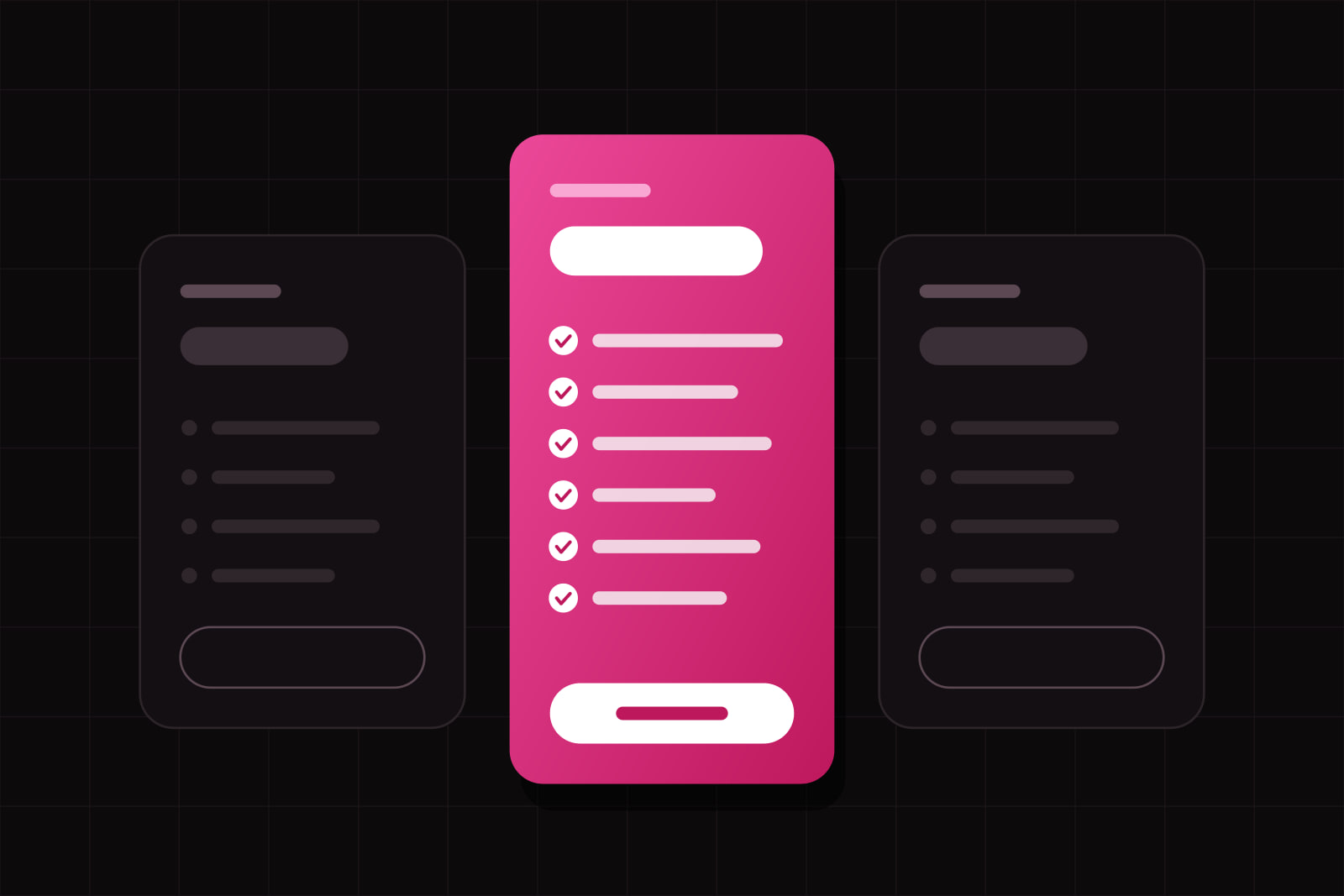
A SaaS pricing page is the comparison screen where a buyer decides, without talking to anyone, whether the product fits their budget, their team size, and the next twelve months. It is the page where interest turns into a number, and it is usually the last one a visitor reads before signing up or closing the tab.
Gartner's 2026 sales survey found that 67% of B2B buyers prefer a rep-free experience (Gartner, March 2026). That preference carries a cost. Earlier Gartner research on digital buying measured purchase regret running 23% higher among buyers who prefer to buy without a rep (Gartner, 2021). Those two numbers are the brief for the page: let people decide alone, and protect them from deciding badly.
What a pricing page is actually being asked to do
Three jobs, in this order. Qualify: tell a visitor within seconds whether they are the customer. Disambiguate: make the difference between plans legible without a spreadsheet. De-risk: answer the questions that would otherwise go to a salesperson, from what happens at the usage limit to who owns the data after cancellation.
A page that only shows numbers does the first job and skips the other two. That is where deals leak. Traffic arrives with the highest intent it will ever have, reads three columns of checkmarks, cannot work out which column applies, and leaves to compare with a competitor whose page is easier to read.
Why cutting to three plans rarely fixes it
The standard advice is to reduce the tier count and highlight the middle one. It traces back to Iyengar and Lepper's 2000 supermarket study, where a tasting table of 24 jams drew more visitors than a table of 6 and produced roughly a tenth of the purchases. The finding is real. It does not generalise the way pricing advice implies. Scheibehenne, Greifeneder and Todd meta-analysed 63 conditions from 50 experiments covering 5,036 participants and found a mean effect of assortment size close to zero, with wide variance between studies (Journal of Consumer Research, 2010). Choice overload appears when options are hard to tell apart and the chooser lacks domain knowledge. It disappears when options are easy to compare.
So the lever is comparison cost, not column count. A four-plan page a buyer can read in twenty seconds beats a three-plan page where every row says Advanced reporting.
Fix 1: name the buyer, not the feature count
Plan names like Basic, Pro and Business describe the tiers. They do not tell a five-person agency which column is theirs. Put one line under each plan name that names the customer and the trigger to move up: for solo consultants billing under 20 clients, for teams of 5 to 25 that need shared workspaces and SSO. The buyer self-selects on the first read, and the table below turns into confirmation instead of analysis.
That line does double duty in AI search. An assistant summarising your pricing quotes the sentence that says who a plan is for, because it is the only sentence that answers the user's question.
Fix 2: state every difference, including what is missing
Nielsen Norman Group's guidance on presenting options is blunt: when choices differ, spell the differences out, because users left without explicit differences either assume the options are equivalent or fixate on trivia (NN/g). On a pricing table that means three things. Name the axis that changes across plans and put it in the first rows. Quantify every limit instead of writing generous. Show exclusions as an explicit not included rather than an absent row.
A checkmark grid with no crosses reads as marketing. A grid that says what a plan does not do reads as honest, and honesty is what buys down regret at renewal.
Fix 3: show the total, not the unit
Seat pricing with a usage component is now normal. Metronome's January 2025 survey of 100 SaaS companies found consumption-based pricing at 77% of the largest software companies (State of Usage-Based Pricing 2025). The design problem it creates is arithmetic. A line reading 12 dollars per user per month plus 0.002 per API call pushes the calculation onto the buyer, who does it badly and either over-estimates and leaves or under-estimates and churns at the first invoice.
Ship the arithmetic instead. Two input fields with a live total, three worked examples tied to named profiles, and a plain statement of what happens at the limit: hard stop, throttle, or overage at a stated rate. When the product bills AI usage, that line is where the margin is decided, which is the same maths we walked through in budgeting AI token cost.
Fix 4: answer the questions a rep would have answered
Every objection a salesperson used to handle in a call still exists. On a rep-free path it either gets answered on the page or it gets answered by a competitor. The seven that come up in almost every self-serve evaluation:
- What happens when we hit the limit, and what does the overage cost.
- Can we move between plans mid-cycle, and how is the difference prorated.
- Is there a contract, a minimum term, or a notice period.
- Who owns the data after cancellation, and in what format is the export.
- Which plan includes SSO, audit logs, and a signed DPA.
- Can we pay by invoice and bank transfer instead of card, and are prices excluding VAT.
- What support response time comes with each plan.
Put them near the decision, in plain sentences, not in a support article three clicks away. The plumbing behind them (self-serve upgrades, proration, invoices) is mostly a billing configuration question, and we compared the two surfaces that handle it in Stripe Checkout vs Customer Portal.
Fix 5: keep the sales route where it is true
Custom scope, procurement, a security review, negotiated terms: those deals need a person, and a contact route is the correct design. Hiding every price behind that route is a different decision, and it charges every self-serve buyer for the convenience of handling the few deals that genuinely need a negotiation. The middle position holds up well. Publish the self-serve tiers in full, then give the enterprise column a starting price, a minimum commitment, or at minimum the shape of the deal and the length of the process.
Fix 6: make it readable on a phone and to a screen reader
Comparison tables break on small screens before anything else does. The pattern that survives: one plan per card on mobile with the differentiating rows repeated inside each card, a sticky plan header on desktop so column identity survives the scroll, and real table semantics instead of a grid of divs. Screen reader users navigate a pricing table by row and column headers, and a div grid gives them nothing to navigate with. For products sold to consumers or public bodies in the EU, that is a compliance surface as well as a usability one since the European Accessibility Act came into application, which we covered in accessibility-first design.
What the pass looks like in practice
Half a day, in this order. Read the page cold and write down which plan you would pick and why; if you cannot, neither can a buyer. Delete every row that is identical across all plans, because it is product marketing rather than comparison. Rewrite the top three rows so they carry the axis that actually separates the plans. Add the who-it-is-for line under each plan name. Add one total-cost example per plan. Add the seven answers from fix 4 as a section under the table. Then open the page at 375 pixels wide and walk it with the keyboard alone.
Measure the result on two numbers rather than one. Pricing page to signup is the obvious one and it moves fast. Signup to activation is the one that tells you whether the page sold the right plan to the right person, and it only moves when the page stops overselling. That second number is the honest scoreboard, and it is the same one we use for the rest of the funnel in the SaaS activation metric.
Sources
- Gartner Sales Survey Finds 67% of B2B Buyers Prefer a Rep-Free Experience (2026)
- Gartner Says B2B Sales Organizations Need to Give Customers a Seller-Assisted Digital Buying Experience
- Scheibehenne, Greifeneder and Todd, Can There Ever Be Too Many Options? A Meta-Analytic Review of Choice Overload (JCR, 2010)
- Nielsen Norman Group, Explicitly State the Difference Between Options
- Metronome, State of Usage-Based Pricing 2025
Frequently asked questions
There is no universal number. Three to five is common because most products serve that many distinct buyer types, and the tier count matters far less than how cheaply the plans can be compared. Add a tier only when it maps to a buyer with a different trigger for buying, and merge two tiers when they serve the same buyer with different volumes. If two plans need a paragraph to tell apart, the problem is the rows, not the count.
Publish what is fixed and give the negotiated part a shape. A starting price, a minimum commitment, or a stated range for the enterprise column lets a buyer decide whether to start the conversation at all. Full price opacity does move more people into a contact form, and it also moves in people who leave once they hear the number. Fewer, better-qualified conversations are usually the better trade for a small team with limited sales capacity.
Only when the bill depends on something the buyer has to estimate: seats plus usage, API calls, storage, AI tokens. With flat per-seat pricing a calculator adds a step and answers a question nobody asked. With a usage component, three worked examples tied to named customer profiles cover most visitors, and a two-field calculator with a live total covers the rest. Whichever you ship, state the overage rule next to it in one sentence.
Separate the three decisions: who the new price applies to, when it applies, and how it is communicated. Grandfathering current customers on their existing plan buys goodwill and costs revenue, so most teams grandfather for a fixed window instead of forever. Give notice before the renewal date, show the old and new amounts side by side in the message, and keep a page that explains the change rather than a single email. Contract terms and consumer notice periods vary by country, so have the wording checked by a lawyer before it goes out.
Related services
Related articles
Design Design
Why your UI looks unprofessional: 9 details to fix before launch
Off-scale spacing, radii that don't nest, wobbling numbers, missing focus states: nine details that make a UI look unfinished, each with its fix. Design