

 Design
Website photography for software: the 7-step shot list
Software has no object to photograph, so most product sites default to stock. The 7 steps we use to pick, grade and ship a set of 8 to 12 images.
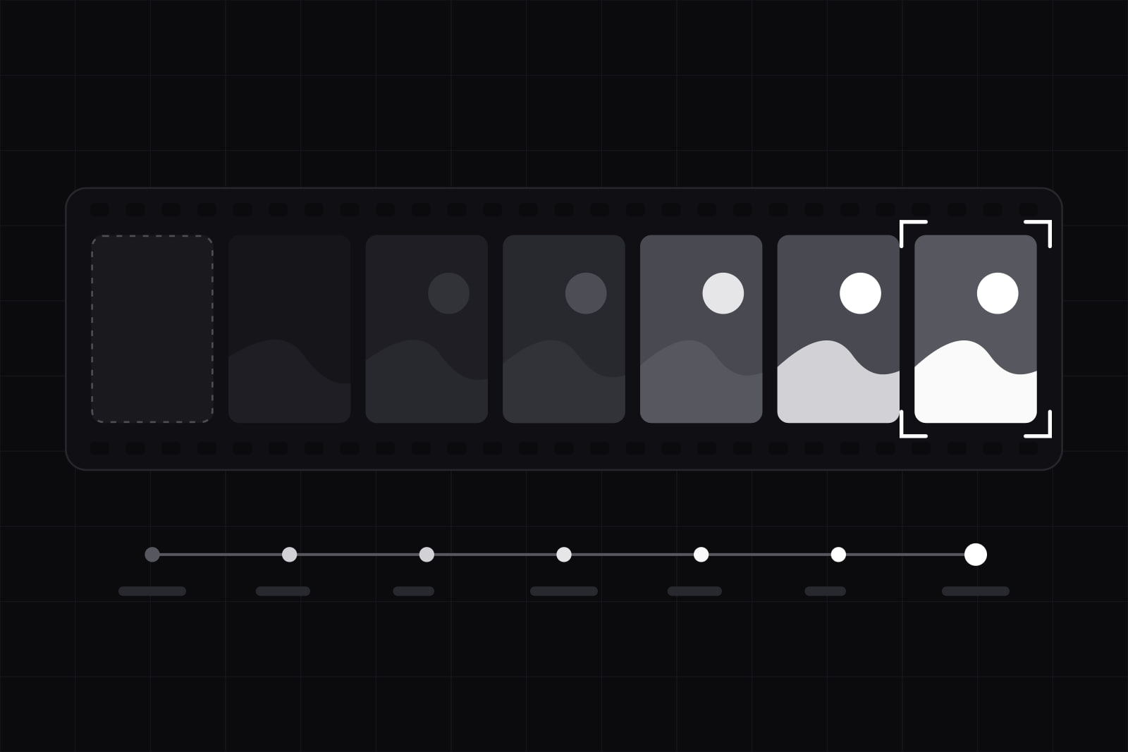
At the end of this process you have a shot list of eight to twelve images, a source decision for each one, and a treatment that makes them read as a single set. The constraint is specific: the product is software, so there is nothing to put on a table and light.
That constraint is why so many product sites land on the same four pictures. A person smiling at a laptop. A meeting around a whiteboard. Two hands on a keyboard, shot from above. A gradient blur standing in for the idea of technology. Getty Images' VisualGPS survey found that 98% of consumers say authentic images and video matter for earning trust, and close to 90% want to be told when an image was generated by AI. A photograph the visitor has already seen on three competitor sites fails that test before anyone reads the headline.
What you need before you start
- The positioning in one sentence. Who the product is for and what changes for them. Without it the shot list drifts toward whatever looks nice in the folder.
- A page inventory. Every slot that renders an image, with its aspect ratio and its rendered width. A 1600px hero and a 320px card need different subjects, not one subject cropped twice.
- The interface in a state worth showing. Real labels, plausible data, no lorem ipsum, no placeholder avatars.
- A budget line and a date. A commissioned half-day, a licensed set, and a generated set sit at different prices and different lead times.
Step 1: Give every image one job
Three jobs exist on a software product site, and each image does one of them.
- Show the product. The interface, cropped to the part that carries the argument of the section it sits beside.
- Show the work around the product. The warehouse aisle, the clinic reception, the desk at 7am. Software lives inside somebody's day, and the day photographs even when the software does not.
- Carry the tone. Material, texture, light. No people, no screens, no story. This is the image that makes eight pages feel like one brand.
Write the job next to each slot in the inventory before you look at a single photograph. Most weak image choices come from picking the image first and inventing its purpose afterwards.
Step 2: Cut the four shots that say nothing
These four run on software sites in every market, and each one can be swapped for a competitor's version without changing the meaning of the page.
- The laptop-and-coffee desk. Describes an office, not a product.
- The meeting with sticky notes. Describes a workshop, usually one nobody in the frame is running.
- The handshake. Describes a transaction that already closed.
- The abstract data visual. Blue nodes on a dark field, standing in for whatever the software does.
The test takes ten seconds. Cover the logo and the headline. If the image would sit unchanged on a competitor's page, it is decoration bought at photography prices.
Step 3: Build the shot list from the product's own vocabulary
Take the nouns customers use in support tickets and sales calls, and photograph those. A scheduling tool for dental clinics has a vocabulary: the reception desk at opening, the paper day-sheet the software replaces, the phone that rings mid-procedure, the door at 8am. Four shots, none of them available as stock, all of them legible to the people who run a clinic and to nobody else.
Eight to twelve images covers a marketing site of five to eight pages. Below eight the site repeats itself. Above twelve the set loses coherence, and somebody starts filling the gaps with whatever is in the shared drive.
Step 4: Pick the source for each shot
Three sources, chosen per image rather than per site.
Commission the shots that carry the vocabulary from step 3. No library holds pictures of your customer's workplace. A half day with a photographer produces the three or four frames that make the site impossible to copy.
License the tone shots, where a specific place and a specific person are not the point. Read the alt text before the thumbnail, and check the photographer's other work: a set from one photographer grades together far more easily than five images from five.
Generate with a disclosure plan attached. Nielsen Norman Group tested the question in 2026 with 77 US adults, who rated six versions of a fictional consulting firm's homepage: three with AI-generated hero images, three with licensed stock. Participants who did not know the source rated the AI images as trustworthy and professional as the stock ones, marginally higher on all three measures, though the differences were small enough that NN/g declined to call AI images better. The finding that holds is narrower than the headline: AI images were not penalised when the viewer had no idea.
The viewer increasingly has an idea. Since 2 August 2026, Article 50 of the EU AI Act has required providers of generative systems to mark synthetic image output in a machine-readable format so it can be detected as AI-generated, and requires deployers to disclose artificially generated or manipulated image content that constitutes a deep fake. Penalties for breaching the transparency obligations reach 15 million euros or 3% of worldwide annual turnover, and the technical marking standards are still being settled through the Code of Practice. If generated images ship on a site serving EU users, treat marking and disclosure as part of the production step, and have a lawyer read your specific case.
Step 5: Grade the set so it reads as one set
Five variables decide whether eight images look chosen or collected: colour temperature, contrast, subject distance, depth of field, and crop ratio. Fix each one across the whole set and hold it. One warm frame among seven cool ones reads as an error to a visitor who could not name what is wrong. Subject distance is the variable teams forget: a wide environmental shot next to a tight macro breaks the set even when the colour matches. This is the same discipline that stops a product looking like a template.
Step 6: Ship them without wrecking LCP
The hero image is usually the Largest Contentful Paint element. The HTTP Archive Web Almanac 2025 found an image is the LCP element on 76% of mobile pages and 85.3% of desktop pages, and the formats in production are old: JPG accounts for 57% of LCP images, PNG 26%, WebP 11%, AVIF 0.7%. The attribute that fixes the load order, fetchpriority="high", appears on 17% of mobile pages with an LCP image.
- Serve AVIF with a WebP fallback. Browser support sits above 94% for both.
- Set
fetchpriority="high"on exactly one image per page, the hero, and never lazy-load that one. - Give every image an explicit width and height, or an aspect ratio, so the layout holds while it loads.
- Export at twice the rendered width, not at whatever came out of the camera. A 3.2MB hero is a photography problem that becomes an engineering problem.
The measurement side sits in Core Web Vitals on Next.js.
Step 7: Write alt text for the subject, not for the keyword
Alt text describes what is in the frame for someone who cannot see it. "Dental receptionist checking the day's appointments on a wall screen" is alt text. "Best scheduling software for clinics" is a keyword pushed into an accessibility attribute, and it degrades the experience for the people the attribute exists to serve. Tone images that carry no information take an empty alt attribute, so screen readers skip them instead of announcing a texture.
How to check the set works
- Cover every logo and headline on the site. Can you still tell which industry it serves?
- Put the images in a grid at thumbnail size. Does one of them look like it came from a different site?
- Reverse image search the licensed frames. Who else in your market is running them?
- Load the homepage on a throttled 4G profile. Count the seconds until the hero appears.
- Turn images off entirely. Does the page still make its argument? If yes, the images are working as support rather than as substitutes for copy.
Common failures and how to fix them
The set was picked in a folder instead of on the page. Thumbnails flatter images that fall apart at 1600px wide with text over them. Drop every candidate into the live layout at the real crop before deciding.
The hero is the whole interface at 30% scale. A full screenshot shrunk to hero size shows a grey rectangle. Crop to one component, one chart, one row of the table, at a size where the labels are readable.
The photography is strong and the interface beside it is not. Typography carries more of a product page than photography does, and a good image next to a broken type scale makes the type scale more visible. Fix the typographic scale first.
Nobody owns the folder. Six months later the set has grown by four images nobody graded, and the site is back to looking collected. Store the images in the design system repo with the licence, the photographer, and the source recorded per file, and treat an addition as a change that needs review.
Sources
- Getty Images: Nearly 90% of Consumers Want Transparency on AI Images (VisualGPS)
- Nielsen Norman Group: AI-Generated Images Can Perform as Well as Stock Photography
- EU AI Act, Article 50: Transparency Obligations for Providers and Deployers of Certain AI Systems
- European Commission: Transparency obligations under Article 50 of the AI Act
- HTTP Archive Web Almanac 2025: Performance
- web.dev: Optimize Largest Contentful Paint
Frequently asked questions
Eight to twelve for a marketing site of five to eight pages. The number comes from the page inventory rather than from taste: count every slot that renders an image, then subtract the slots where a cropped interface detail does the job better than a photograph. Below eight images the same frames repeat across pages and the site reads thin. Above twelve the set stops looking graded, because nobody keeps twelve images consistent without a written treatment.
It is legal, and it carries obligations. Since 2 August 2026 the EU AI Act requires generative systems to mark synthetic output in a machine-readable format, and requires the party deploying a deep fake image to disclose that it is artificially generated. Fines for transparency breaches reach 15 million euros or 3% of worldwide turnover. The commercial risk is separate from the legal one: Getty Images found close to 90% of consumers want to be told when an image is AI-generated, so an undisclosed generated image is a trust liability even where no rule applies. Ask a lawyer about your specific case.
Both, in different slots. A cropped interface detail answers the question a visitor arrives with, which is what this thing looks like when it runs. A photograph answers the question that comes second, which is whether the people who made it understand the work. The failure case is a full screenshot shrunk to hero width: at that scale nothing in the interface is readable and the image reads as a grey rectangle. Crop to one component at a size where the labels can be read, and give the photograph a different slot.
For tone shots, often yes. For the images that carry the product's vocabulary, no, because the frames that would help do not exist in a free library. Two checks before shipping a free image: reverse image search it to see who else in your market is running it, and read the licence for the specific photo rather than the platform's summary page, since model and property releases are not guaranteed by the licence itself. A frame that appears on two competitor sites costs more in credibility than a commissioned shot costs in money.
Related services
Related articles
Design Design
Error state UX design: what to show when a request fails
A request can fail six ways, from a rejected field to a dropped connection. What each needs on screen, how to make retry safe, and the copy to write. Design