

 Infra
Design system documentation best practices: 6 steps that get read
Web readers take in about 20% of a page, and 47% of design system teams document in more than one place. Six steps to component docs people open and trust.
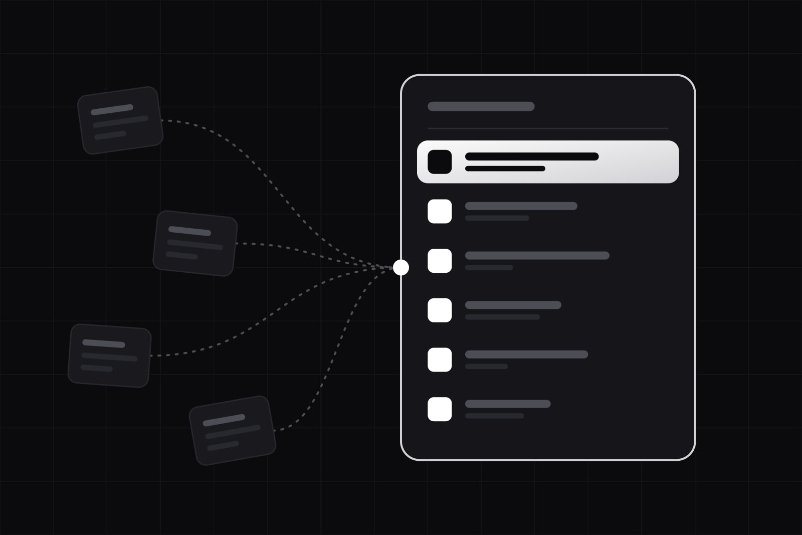
By the end of this guide you will have design system documentation set up in six steps: one home for every answer, pages split by the question the reader brings, a fixed component template that opens on the decision, a props table generated from code, an output AI agents can query, and a rule that makes docs and code change in the same pull request. Design system documentation is the set of pages that tells designers, developers and now coding agents which component to use, when, and how. It pays for itself only when people open it before they build.
Documentation is where design system teams struggle most. The zeroheight Design Systems Report 2025, built on just under 300 responses, names it the biggest pain point. The same survey found that 47% of teams document their system in more than one place, with Figma and Storybook as the most common pair, and that 60% list documentation among the education they offer, against 32% for workshops and training. Readers also skim: Nielsen Norman Group measured that web users read about 20% of the words on an average page. A docs page has to work for someone who reads one line in five.
What you need before starting
- A component library in code, with typed props (TypeScript or an equivalent).
- A design library in Figma, or whatever tool your designers use, with components that match the code by name.
- A docs host: Storybook, zeroheight, a custom site in your framework, or a mix. The steps below work on any of them.
- One person who owns the docs as part of the job, with time on the calendar for it.
- Access to the questions people ask today: the support channel, review comments, the issues on the design system repository.
Step 1: Give the docs one home and point everything else at it
Pick one place where the answer lives and make every other tool link to it. Docs spread across Figma descriptions, a wiki, a README and Storybook drift apart within a quarter, and a reader who finds two answers trusts neither.
The home does not have to hold everything. It has to be the address people reach first. A split that works: the Figma component description holds one sentence and a link; the Storybook story holds the live example; the docs page holds the guidance and pulls the other two in. When a question in Slack gets answered, the answer goes into the page, and the reply in the thread is the link.
Step 2: Split pages by the question the reader brings
A reader opens the docs with one of four needs, and each one wants a different page. The Diátaxis framework, written by Daniele Procida and adopted by Canonical for its product documentation, names them: tutorials, how-to guides, reference and explanation.
- Tutorial (learning): getting started. Install the package, render a first screen, ship it. Written for the new hire on day one.
- How-to guide (a task): recipes. Build a form with validation, add a theme, migrate from the old modal.
- Reference (looking up): props, tokens, events, keyboard behaviour. Looked up, never read top to bottom.
- Explanation (understanding): principles, why the spacing scale is what it is, why there is no third button variant.
A component page that mixes all four makes the designer looking for guidance scroll past a props table, and the developer looking for a prop scroll past three paragraphs of philosophy. Keep reference and guidance on the component page, and move principles and recipes to pages of their own that link back to it.
Step 3: Open every component page on the decision, in a fixed order
The first screen of a component page answers one question: is this the right component? Anatomy, history and variants come later. The GOV.UK Design System uses the same order on every component page: when to use this component, when not to use it, how it works, research on this component. Readers learn the order once and jump straight to their section on every other page.
The template we use on every component page:
- One sentence on what the component is for.
- A live example, rendered from the real component, never a screenshot.
- When to use it.
- When not to use it, and what to use instead, linked.
- Do and don't, in pairs, each with a picture from real product screens.
- Content guidance: label length, tone, what the text says.
- Accessibility: keyboard behaviour, what a screen reader announces, the contrast each variant passes.
- The props table, generated (Step 4).
- Status and changelog.
"When not to use" is the line with the highest return: it stops the wrong component before it reaches a release. Status belongs on the page too. GOV.UK tags new components as Trial and, as its lifecycle statuses page explains, moves them to Stable after 6 months without negative feedback. A reader who sees the tag knows how far to rely on the page.
Step 4: Generate what the code knows, write by hand only what it cannot
Every fact the code already holds should come from the code. Prop names, types, defaults and required flags change with each release, and a hand-written table is out of date after the first one. Storybook's Autodocs builds a page from each component's stories and argTypes, with the props table inferred from the TypeScript types; other hosts do the same with react-docgen or a script that reads the types at build time.
What the code cannot know is the reason. When to use a component, when not to, the content rules and the trade-off behind a variant are judgment, and judgment is what people come for. Write those parts by hand, in short paragraphs, next to the generated parts on the same page. A rule of thumb: if a sentence would still be true after a refactor, a person writes it. If it changes when the code changes, a script writes it.
Comments on the props serve both halves. A one-line comment on each prop in the component file becomes its description in the generated table, so the developer who changes the prop edits its documentation in the same file. Our article on component API design covers why a good API needs less explaining in the first place.
Step 5: Publish the docs in a form AI agents can query
Coding agents read design systems too, and an agent reads the docs every time it writes UI, not once. Storybook now ships an MCP server as @storybook/addon-mcp: it runs inside the Storybook dev server at localhost:6006/mcp, collects components, stories and docs into JSON manifests, and gives the agent a docs toolset (list-all-documentation, get-documentation, get-documentation-for-story) to look up a component and its props before it writes code.
The page from Step 3 is what makes this worth doing. An agent that reads "when not to use: for navigation, use Link" picks the link. An agent that reads a props table alone picks whatever compiles. Write the guidance in plain sentences, one rule per sentence, with the alternative named, and the same text serves the person and the model. The rules we apply when agents consume a system are in design system governance for AI agents.
Step 6: Ship the docs in the same pull request as the code
Docs go stale when they change on a different day from the component. Make documentation part of the definition of done: a pull request that changes a component's behaviour, props or visuals is not merged without its docs diff and a changelog line. The reviewer checks the page the way they check the test.
zeroheight's report ties neglected docs to low trust: in teams that trust their system least, a shortage of people and time ends with "important elements like accessibility or documentation being left to rot." A docs owner with protected hours, plus the same-pull-request rule, is the cheapest fix we know. It costs minutes per change and saves the days of a quarterly rewrite that never gets scheduled.
How to check it worked
- The new-hire test. Give someone who joined this month a task ("add a destructive confirmation to the settings page") and watch where they look. They should reach the right component page in under a minute without asking anyone.
- Repeat questions. Count the questions in the support channel that the docs already answer. The number should fall month on month; each one left is a missing sentence or a page nobody can find.
- Zero-result searches. If the docs site has search, read the queries that return nothing. They are the words your readers use and your pages do not.
- Drift. Pick five components at random and compare the docs with the code. Any difference is a release that skipped Step 6.
Common failures and fixes
- Written once at launch, never again. Fix: the same-pull-request rule from Step 6, plus a named owner.
- Screenshots instead of live examples. They go stale at the next visual change. Fix: render every example from the component itself.
- Pages that open on anatomy. The reader wanted a decision and got a labelled diagram. Fix: move anatomy below "when not to use".
- Figma and code disagree. Fix: one home (Step 1), and component names that match exactly in both tools.
- AI writes the guidance. zeroheight puts it plainly: part of the value of documentation is what you find out while writing it. Fix: let AI draft templates or tighten the language, and keep the "when to use" judgment with the person who owns the component.
Going further
Documentation is the last mile of a system that already holds together. If adoption is the real problem, start with why design system adoption stalls. If the tokens underneath are hard to name, our design token naming conventions set the vocabulary the docs then use.
Sources
Frequently asked questions
The host matters less than having one. Figma plus Storybook is the most common pair in zeroheight's 2025 survey, and 47% of teams document in more than one place, which is where docs start to disagree. Pick by who writes: if engineers maintain the docs, Storybook with MDX keeps them next to the code; if designers write most of the guidance, a docs platform that embeds Storybook stories works better. Whatever you choose, it needs live examples rendered from the real components and a props table generated from code.
For the parts the code knows, yes. Props, types, examples and the changelog stay accurate only when they change in the same pull request as the component, and that is easiest when they sit in the same repository. The guidance written by designers can live elsewhere, as long as the docs page pulls both together and a change to a component triggers a review of its guidance. A repository-only setup works when designers are comfortable editing MDX through pull requests; when they are not, give them an editor that writes back to the same source.
AI can draft and tidy it; it should not decide what it says. In zeroheight's 2025 survey, 54% of design system teams did not use AI at all and 10% used it actively, with documentation the most common use. The report warns that part of the value of documentation is what you find out while writing the guidance. Use AI for templates, consistent wording and generating the reference parts from code, and keep "when to use" and "when not to use" with the person who owns the component.
Publish it with a status, not after it settles. GOV.UK releases new components with a Trial tag, says on each trial page what feedback it needs, and moves the component to Stable after 6 months without negative feedback. The tag tells readers they may need extra work if the component changes, so they can choose with their eyes open. A component nobody can find while it is changing collects workarounds instead of feedback.
Related services
Related articles
Infra Design
Long form UX best practices: 12 rules for forms people finish
The average checkout asks for 11.3 fields when 8 would do. Twelve rules for long forms: what to cut, how to split pages, when to validate, what to save. Design