 Design
Component API design: 6 prop rules that prevent misuse
Four boolean props allow 16 versions of one button. Six rules for component APIs where the wrong use fails to compile, with the TypeScript to copy.
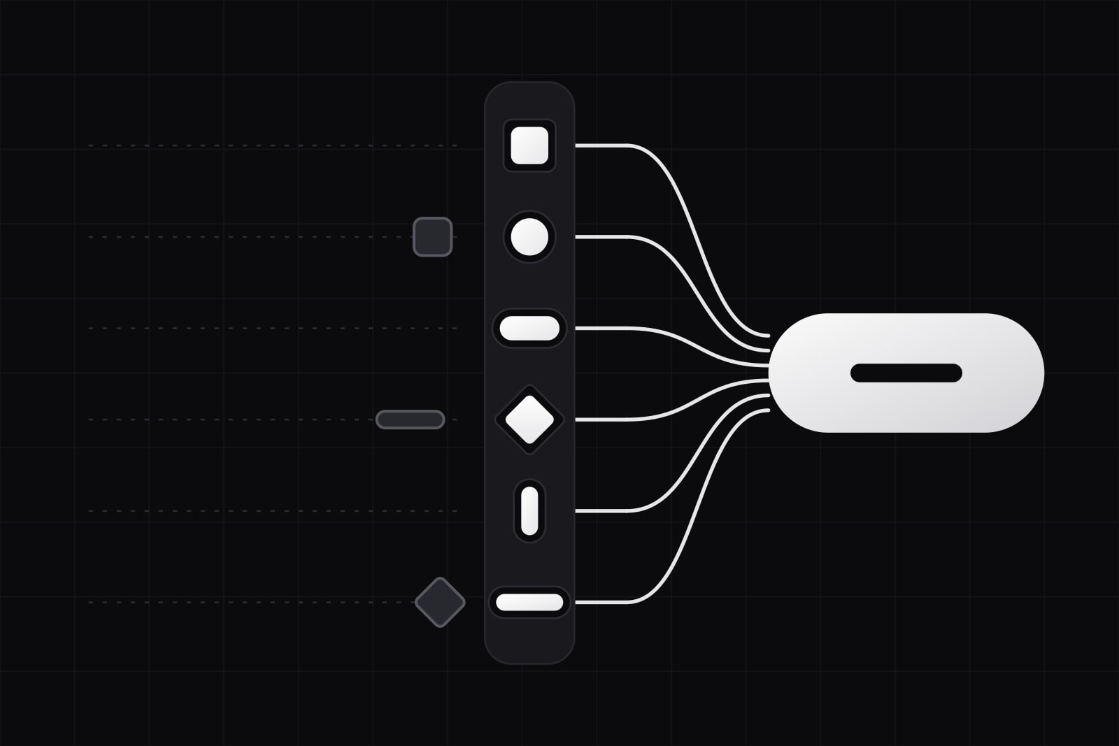
Component API design is the practice of choosing a component's props so that the intended use is the shortest one to write and the wrong use fails before it reaches a screen. The props are where a design decision stops being a picture and becomes a rule: a Figma file can show that a button comes in three variants, and only the type signature can refuse a fourth.
Teams that run one design system across several products meet this problem first. Every prop that accepts a combination the designers never drew is a combination someone will ship. Below are the six rules we apply to props, a worked example on a button, and what a strict API costs.
Why does a loose component API cost so much?
Take a button with four optional booleans: primary, secondary, danger and small. Four independent flags allow 16 combinations. The design file shows a handful of them. The rest are forbidden nowhere the compiler can see, so they reach production through ordinary pull requests: a button that is primary and secondary at once and renders whichever class won the cascade, a destructive action drawn as a quiet link.
No test catches these, because nothing throws. They surface as drift: the same action drawn three ways on three screens. We described how that drift builds up in component drift. The props are where most of it gets in.
Why doesn't documentation fix it?
The usual answer is a usage page that says "do not combine primary and secondary". The page is right and changes little, because developers read the type signature in their editor, not the docs site. When the documentation and the type disagree, the type wins every time someone presses autocomplete. So the rule has to move into the type.
Rule 1: replace competing booleans with one variant prop
When several props describe looks that exclude each other, they are one prop with several values. MUI's API design guide compares the two shapes and lists what the enum buys: it prevents an invalid combination from being used, it bounds the number of props exposed, and it takes new values without new props. The price is a few characters: variant="primary" instead of primary.
The test takes a second. If setting two of the booleans together makes no visual sense, they were never independent. Keep booleans for states that combine with everything else, such as disabled or loading.
Rule 2: make dependent props a discriminated union
Some props only make sense together. A button that navigates needs an href and no click handler. A button that acts needs an onClick and no href. Written as two optional props, "both" and "neither" are legal. Written as a TypeScript discriminated union, each branch states what it requires and what it forbids, and the compiler narrows the type inside the component.
Yaron Minsky of Jane Street put the principle in four words: "make illegal states unrepresentable". For props, the illegal states are the combinations you would otherwise warn about in a code comment.
Rule 3: require what accessibility requires
An icon-only button has no visible text, so it has no accessible name unless the caller supplies one. GitHub's Primer puts that duty on the caller: its IconButton accessibility notes say you must provide a sufficiently descriptive aria-label, which becomes the button's accessible name. Make that prop required in the type and a missing label turns into a compile error on the developer's machine, weeks before an audit would find it. The same goes for an image's alternative text, a dialog's title and a form field's label.
Rule 4: name props by role, never by appearance
color="red" describes a pixel. tone="danger" describes a decision, and it survives the rebrand that turns danger orange. It is the same split we use for design token names: the prop speaks the semantic vocabulary and the tokens behind it hold the values. Name one idea one way across the whole library as well. If one component takes disabled, none should take isEnabled.
Rule 5: close the styling escape hatch, or label it as one
An open style or className prop on every component is a second design system with no rules. Each override it allows stays invisible to the maintainers until they change something underneath it. Two large systems show the two ways out.
- Adobe's React Spectrum names it. Its escape hatches are called
UNSAFE_classNameandUNSAFE_style, and its styling guide calls overrides to Spectrum styles highly discouraged, pointing teams to build a custom component instead. Every override is one search away. - GitHub's Primer removed one. In Primer React v38, announced in October 2025, the
sxprop is no longer supported, and teams style components throughclassNameand CSS Modules. GitHub also published a temporary@primer/styled-reactpackage for the components that still hadsxusage downstream, which shows how much code one open styling prop collects over a few years.
Whichever way you choose, count the uses. A rising number of overrides per release tells you which variant the system is missing.
Rule 6: compose with children instead of adding a prop per case
Props multiply when a component tries to own every layout: iconLeft, iconRight, badge, as, linkComponent. Composition moves that variation into children. Radix's asChild tells a part not to render its default element and to pass its props and behaviour to its child instead, so a menu trigger can render as your router's link without knowing that routers exist. The component keeps its rules (focus, ARIA, keyboard) and hands over only the element.
What does this look like on a real button?
Here is a loose API of the kind that grows one request at a time:
type ButtonProps = {
  primary?: boolean
  secondary?: boolean
  danger?: boolean
  small?: boolean
  href?: string
  onClick?: () => void
  icon?: ReactNode
  style?: CSSProperties
}
Eight optional props, every one of them legal alongside every other. The same component after the six rules:
type ButtonBase = {
  variant: 'primary' | 'secondary' | 'ghost'
  tone?: 'neutral' | 'danger'
  size?: 'small' | 'medium'
  disabled?: boolean
  children: ReactNode
}

type ButtonProps = ButtonBase & (
  | { href: string; onClick?: never }
  | { onClick: () => void; href?: never }
)

type IconButtonProps = Omit<ButtonBase, 'children'> & {
  icon: IconName
  label: string // becomes aria-label, and the tooltip
  onClick: () => void
}
The visual variants are one prop. Danger is a tone, so it combines with any variant the designers approved. A link and an action are two branches, and passing both is a type error. The icon-only case is its own component with a required label. The style prop is gone: a look the system lacks becomes a request for a new variant, which is the conversation the system exists to have.
What does a strict API cost?
Three things, and they are worth stating before a team signs up.
- Edge cases slow down. A product team that needs a look the system does not offer waits for a new variant or writes its own component. That wait is the point, and it needs a short path: a contribution process that answers in days keeps teams inside the system. When the answer takes a quarter, teams leave, which is one of the causes we list in why design system adoption stalls.
- Types protect TypeScript callers only. A consumer in plain JavaScript gets none of the compile errors. Pair the types with development-only runtime warnings for the combinations that matter most.
- Removing a prop is a breaking change. Tightening an existing API means a major version and, at scale, a codemod. Primer's v38 migration is a public example of the size of that job. Strict from the first release costs far less than strict later.
On our own site a check in the build refuses inline styles, and any one-off class has to live in a single prefixed stylesheet with a note naming the task that moves it into the system. The number of one-offs is printed on every run. It is the same idea as Rule 5 applied to a whole codebase: the escape hatch exists, it has a name, and someone counts it. A smaller API is also easier to keep small, which is the argument we make in the design system diet.
Sources
Frequently asked questions
A single className on the root element is a common compromise: it lets the caller place the component in a layout (margin, grid position) without reaching into its parts. What it should not allow is restyling the internals, because those overrides break silently when the component changes. Primer kept className in v38 while removing sx, and React Spectrum keeps its overrides under an UNSAFE_ prefix. Whatever you allow, make it searchable so you can count it.
Both let a component render as a different element. An as prop swaps the tag, so the component's types have to absorb the props of every element it might become, which gets heavy in TypeScript. asChild, the pattern Radix uses, hands rendering to the child, and the child keeps its own typed props. Either works if the whole library uses the same one; mixing them is what confuses callers.
In three releases. First add the new prop next to the old ones and log a development-only warning whenever the old props are used. Then run a codemod across the consuming projects so the warnings drop to zero. Only then remove the old props, in a major version, because under semantic versioning removing a prop is a breaking change. Skipping the warning stage turns the major release into a surprise for every team that upgrades.
Related services
Related articles
Design Design
Why we kill components instead of adding them: the design system diet
Most design systems grow until they break. We treat the component count as a number to keep small. Here is the rule set we use to prune ours every quarter. Design