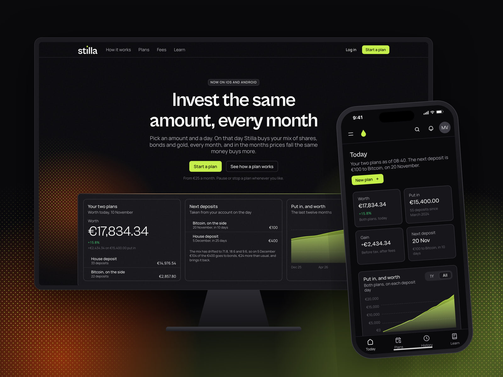
A brand, a site, an app for the web, iOS and Android, a content desk and two films for a product that invests the same amount every month. One Next.js codebase, composed from our design system, with the words in our CMS.
- Year
- 2026
- Role
- Brand, product design and engineering
The brief
Stilla sells one product: a plan that buys the same amount of a mix of shares, bonds and gold every month, on the day the customer picks. It works when its customers do nothing. Its hardest month is the one where prices fall, the plan keeps buying, and the app has to show why that is the point.
The founders came to us with the name and the maths of the plan, and nothing a customer could see. They needed a brand, a site, an app for the web, iOS and Android, a desk where their own team writes the guides and the key information documents, and the films for the launch. We built all of it on our design system and our CMS, in one Next.js codebase.
A brand made of deposits
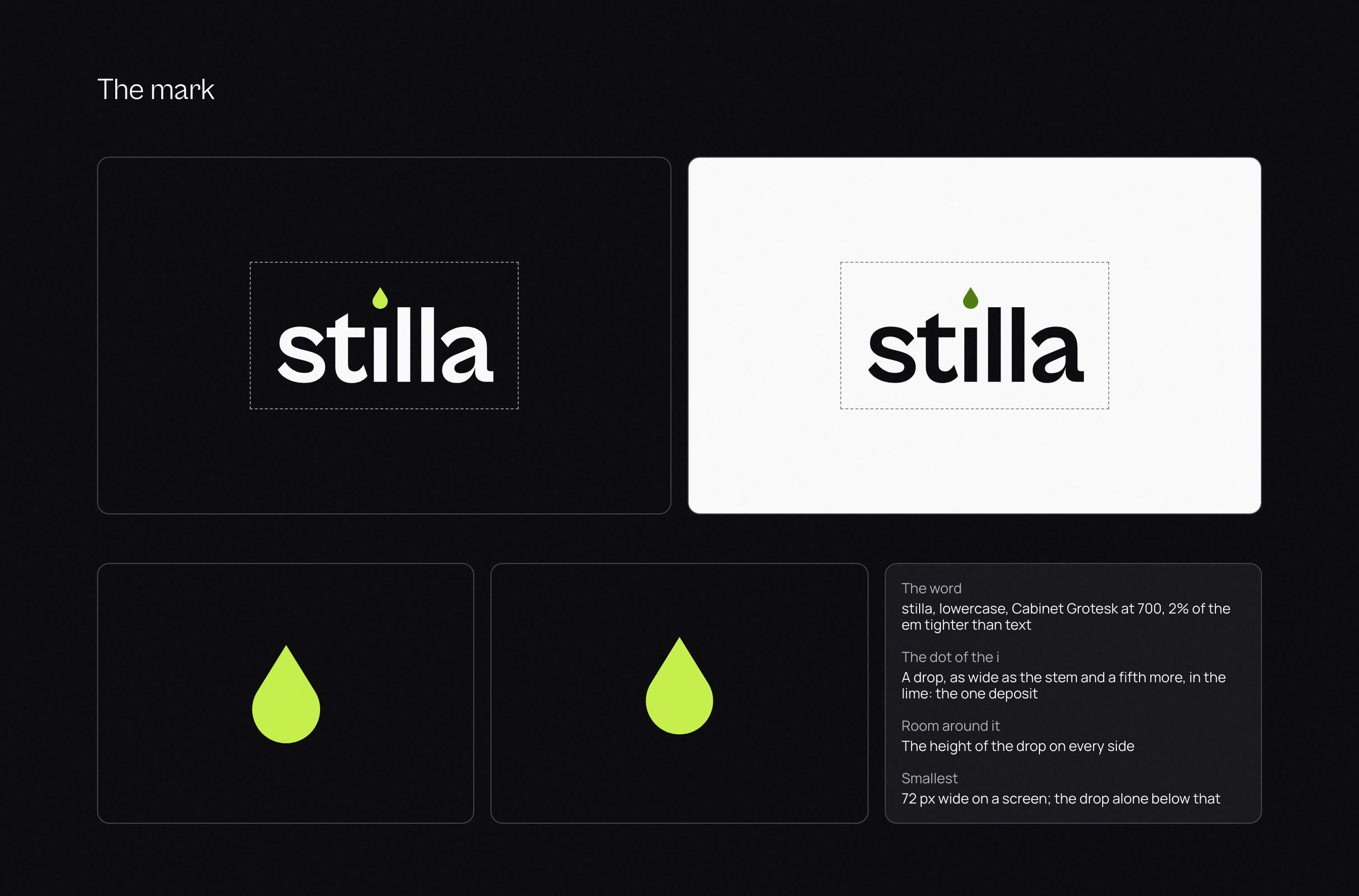
We named the product after a drop. Stilla is the word for one in literary Italian, from the Latin, and drip-feeding is what English calls buying a little every month. The mark is the dot of the i in the wordmark, drawn as a drop in lime: one deposit.
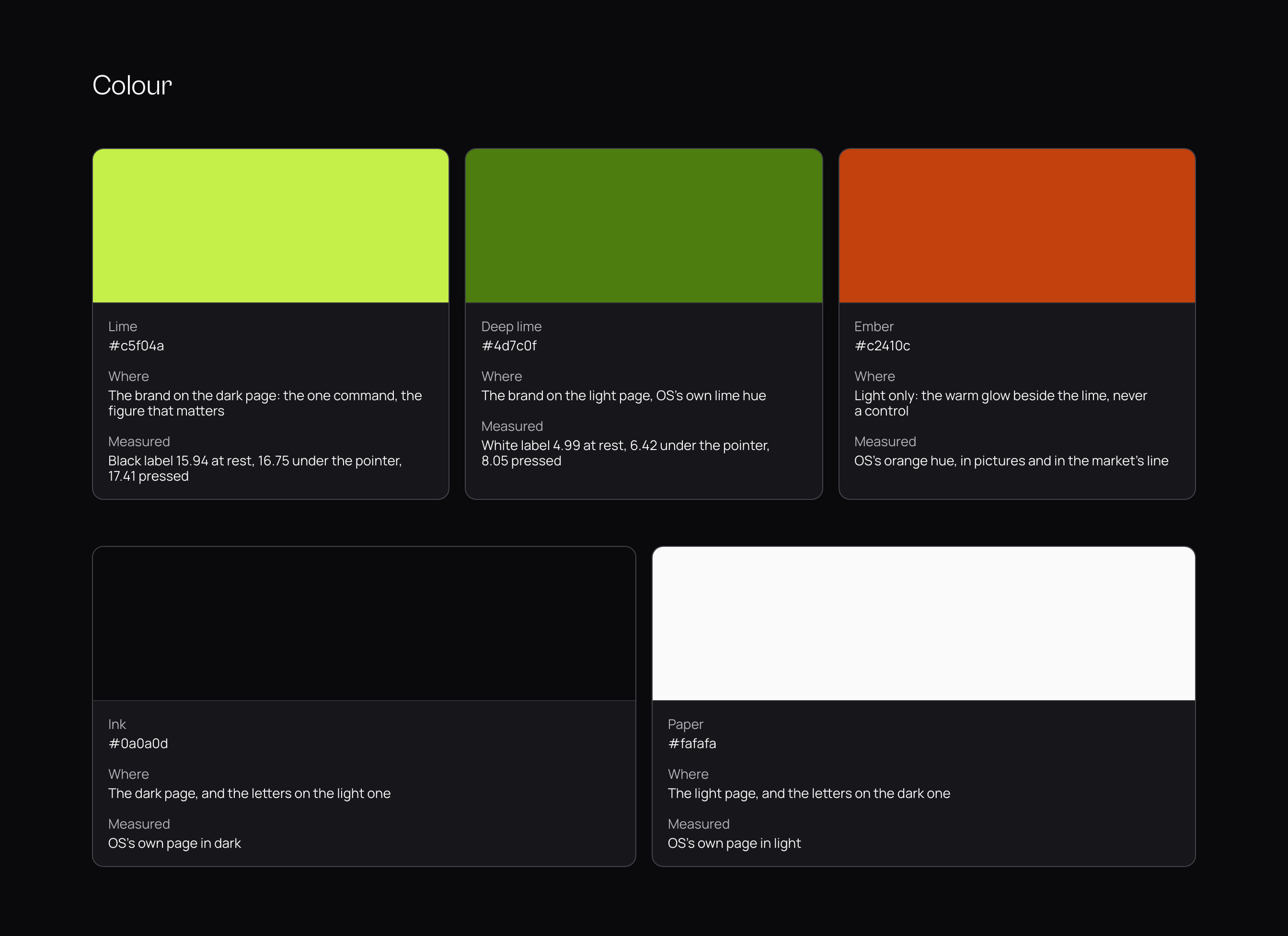
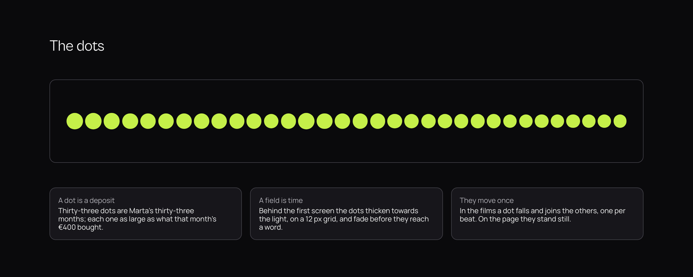
Everything else grows from that dot. On the site and in the films a field of dots stands behind the first screen, each one a month of a plan, thickening towards the light and fading before it reaches a word. The palette is one colour and the two grounds it lives on.
The lime holds 15.94:1 against the dark page with a black label, and falls to 1.2:1 on paper. Instead of lightening the brand until it worked everywhere, we gave the light page a deeper lime, with a white label at 4.99:1 at rest and 8.05 pressed. Two values for one colour, measured in every state before a screen was shown.
A site that shows the plan at work
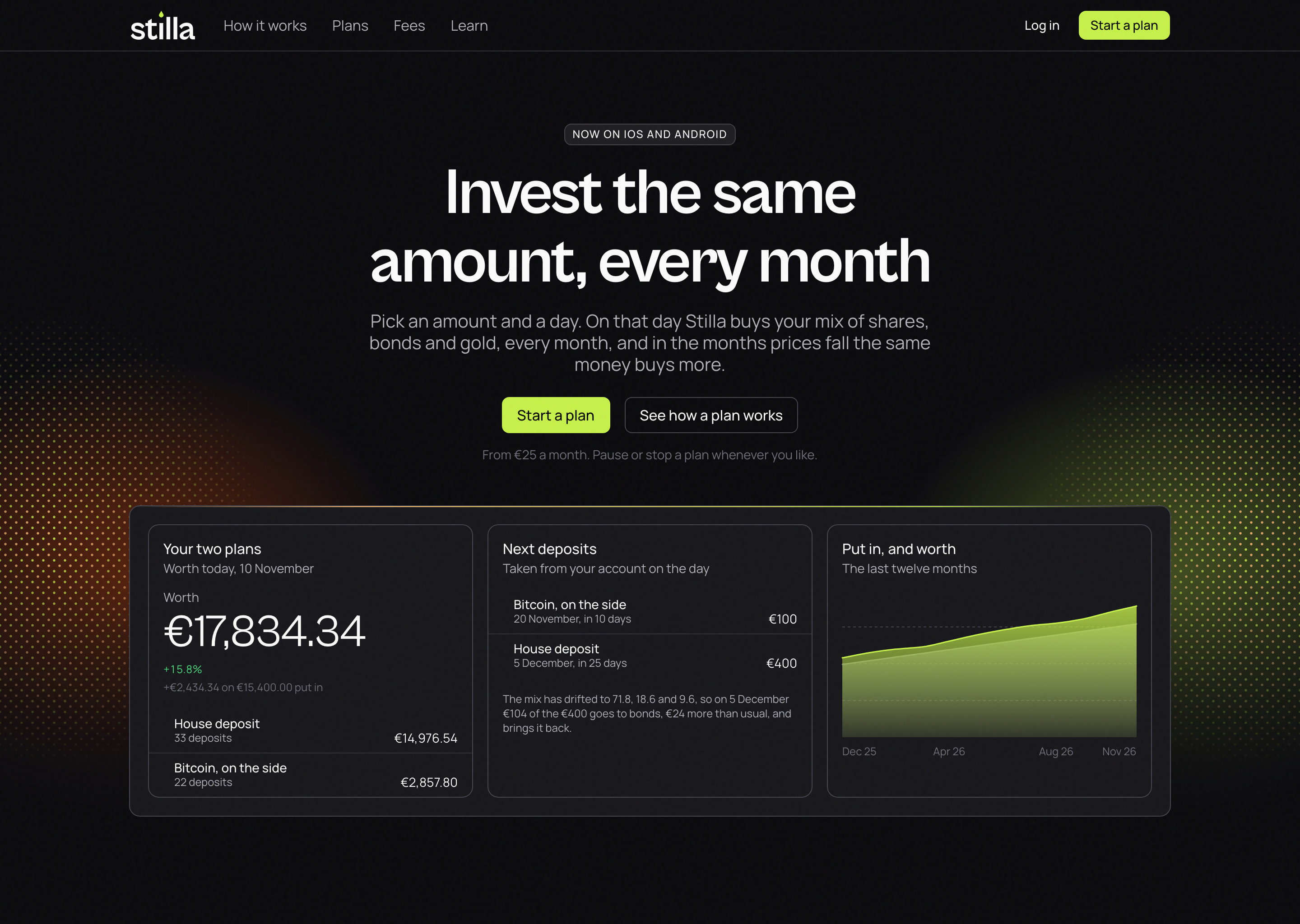
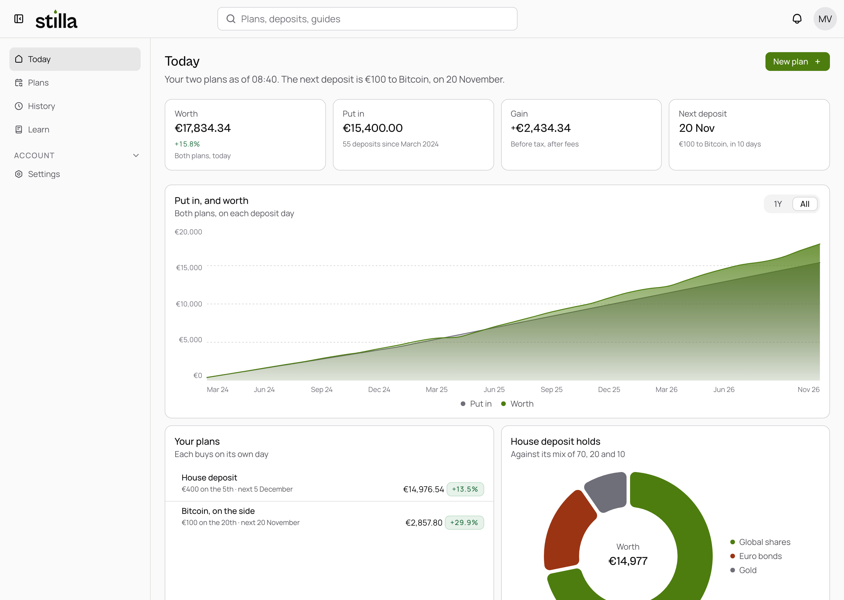
The first screen says what the product does in six words and shows it doing it: what a plan is worth, the next two deposits and the year behind them, as the app shows them that morning. We wrote one sample plan, worked out once, and used it on every screen of the site and the app, so a total on the landing page is the same total in the app.
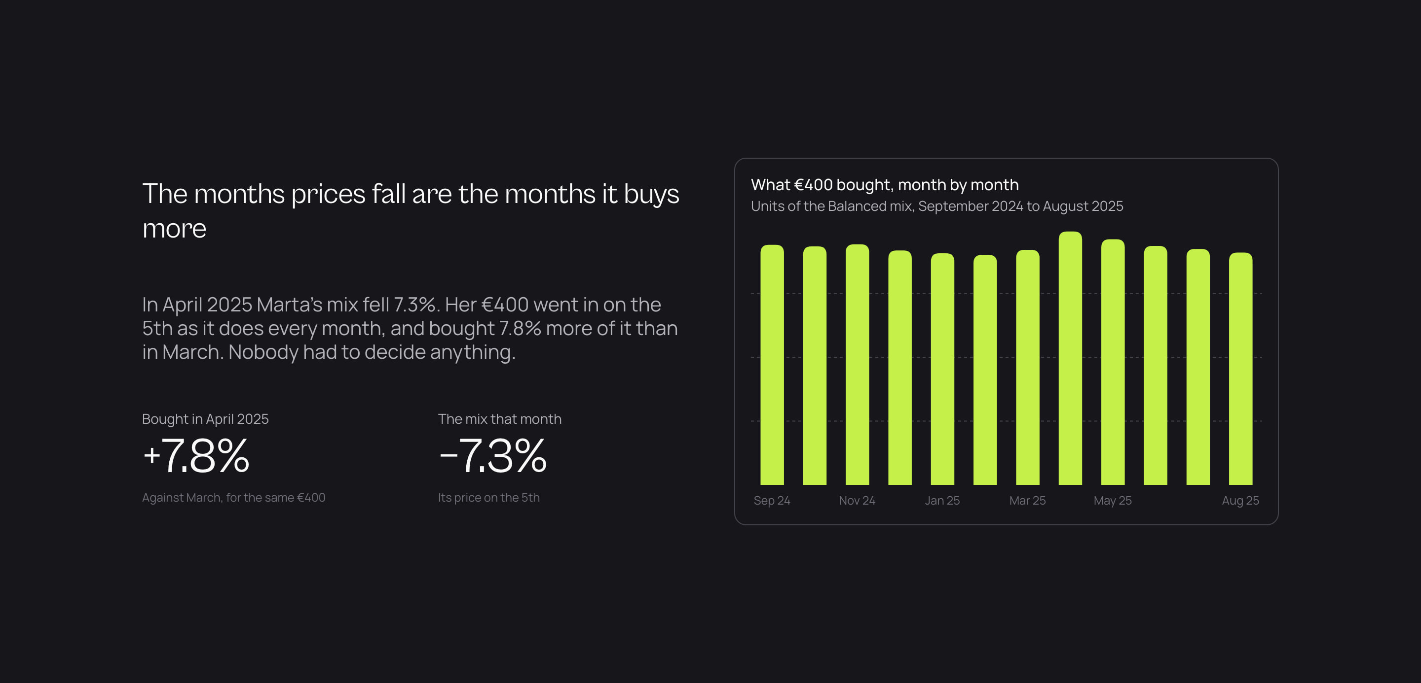
The case for a monthly plan is a falling month, so we gave it a band of its own. In April 2025 the mix fell 7.3% and the same €400 bought 7.8% more of it. The chart is the plan’s own history.
Every figure on the site is a plan’s past. We drew no projection of returns: on an investment product’s landing page it reads as a promise.
One Next.js app for the web, iOS and Android
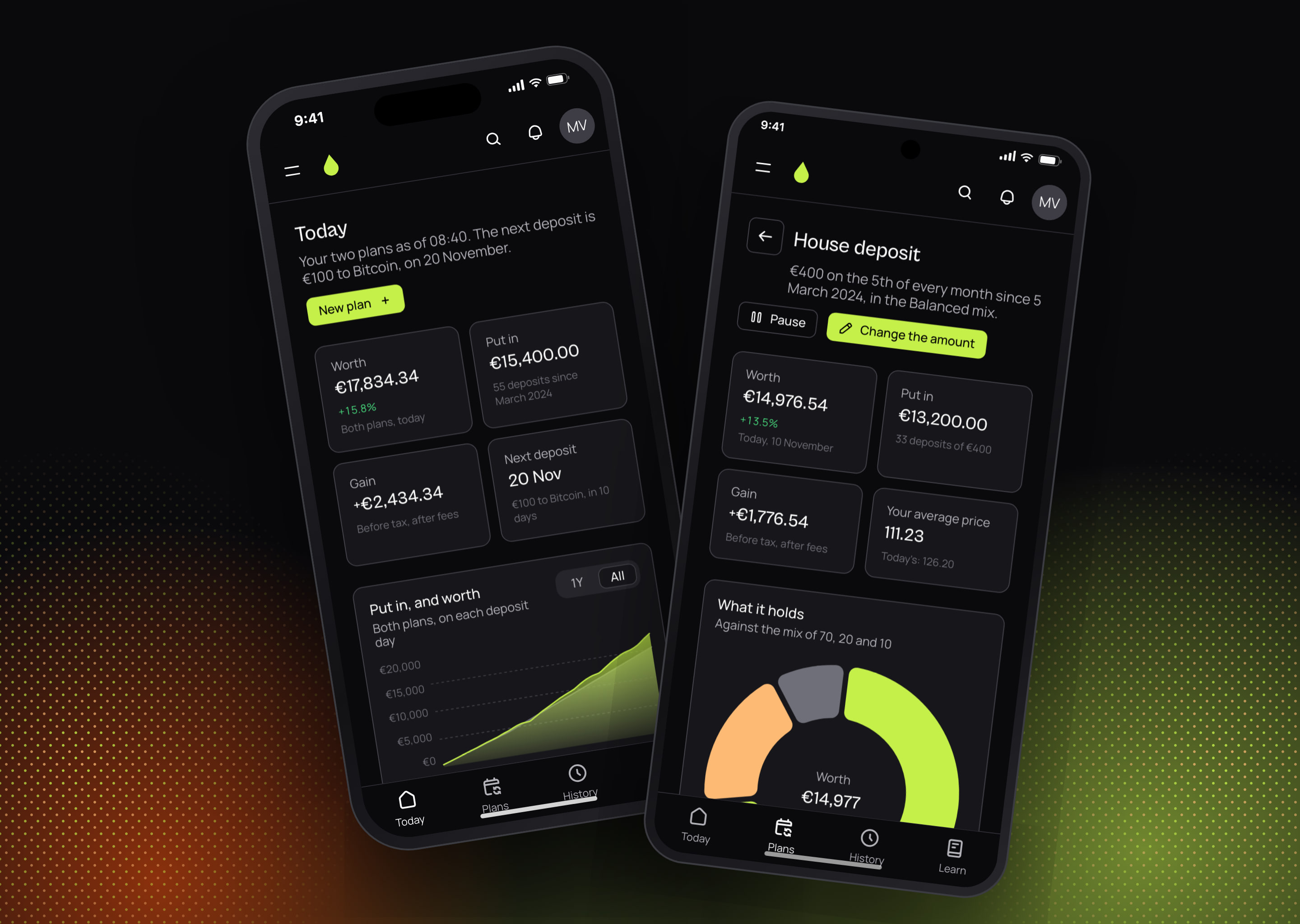
The app is the same Next.js code as the site. On a desk it opens on a column of four places; under 64rem the shell turns the column into a tab bar, and that is the phone app. We shipped it to the App Store and Google Play inside a native shell that does natively the three things a shell is there for: Face ID or a fingerprint to open it, a notification on the morning a deposit goes in, and the keys kept in the device’s keychain.
We weighed two native apps. They would have given the last word on every gesture, and they would have meant three codebases to keep in step for a product people open a few times a month to check a plan. We chose one codebase: a screen fixed once is fixed on the web, on iOS and on Android in the same release.
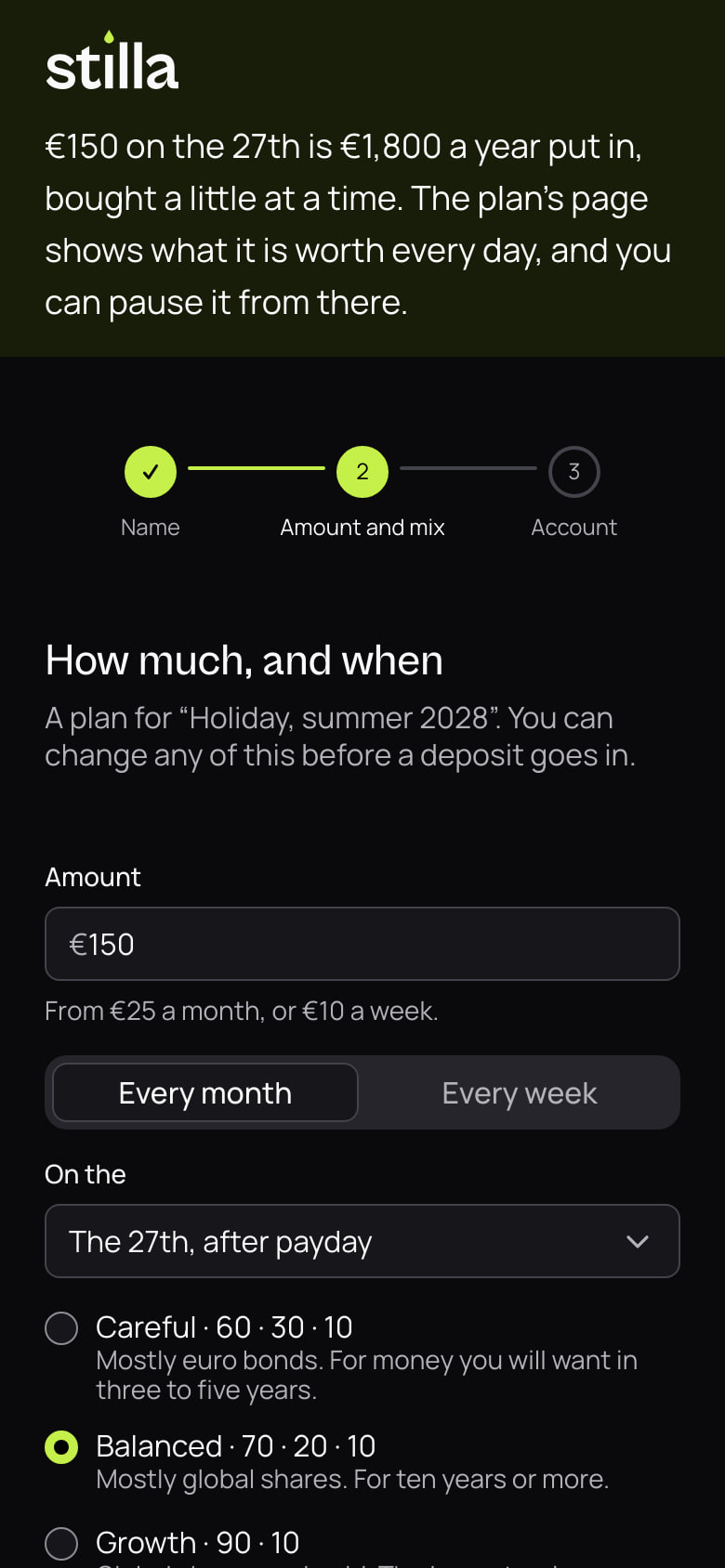
Today answers one question: how the plans are doing. A plan’s page answers the next one: what it holds against its mix, and what the next deposit will buy to bring it back. Setting up a plan is four answers in one step.
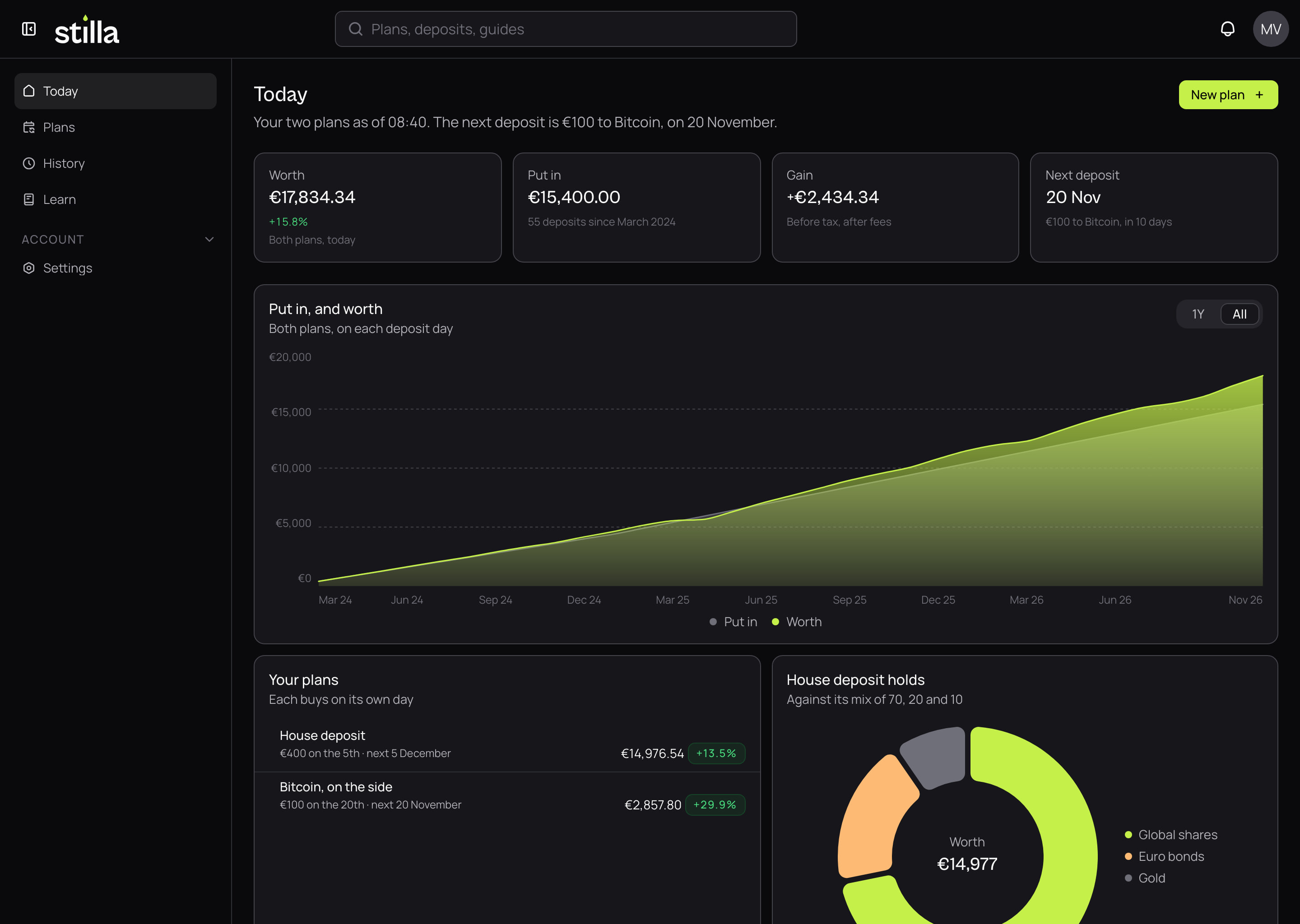
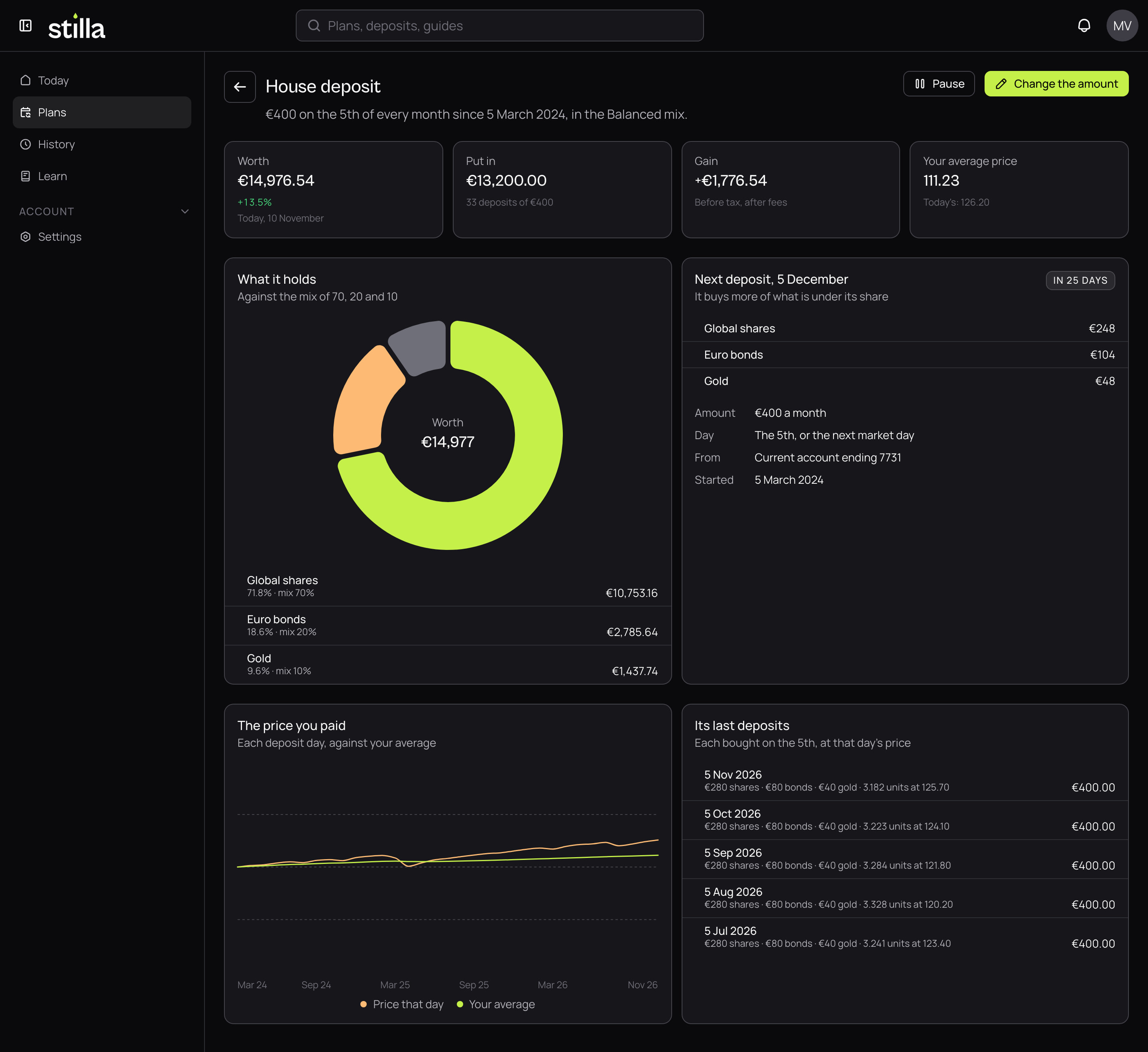
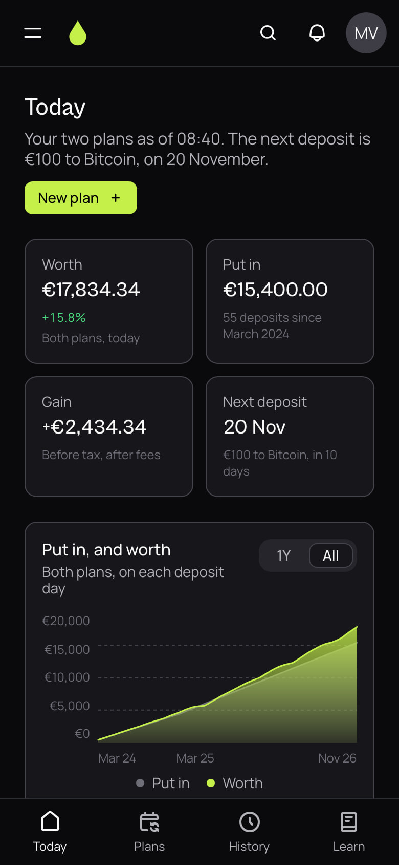
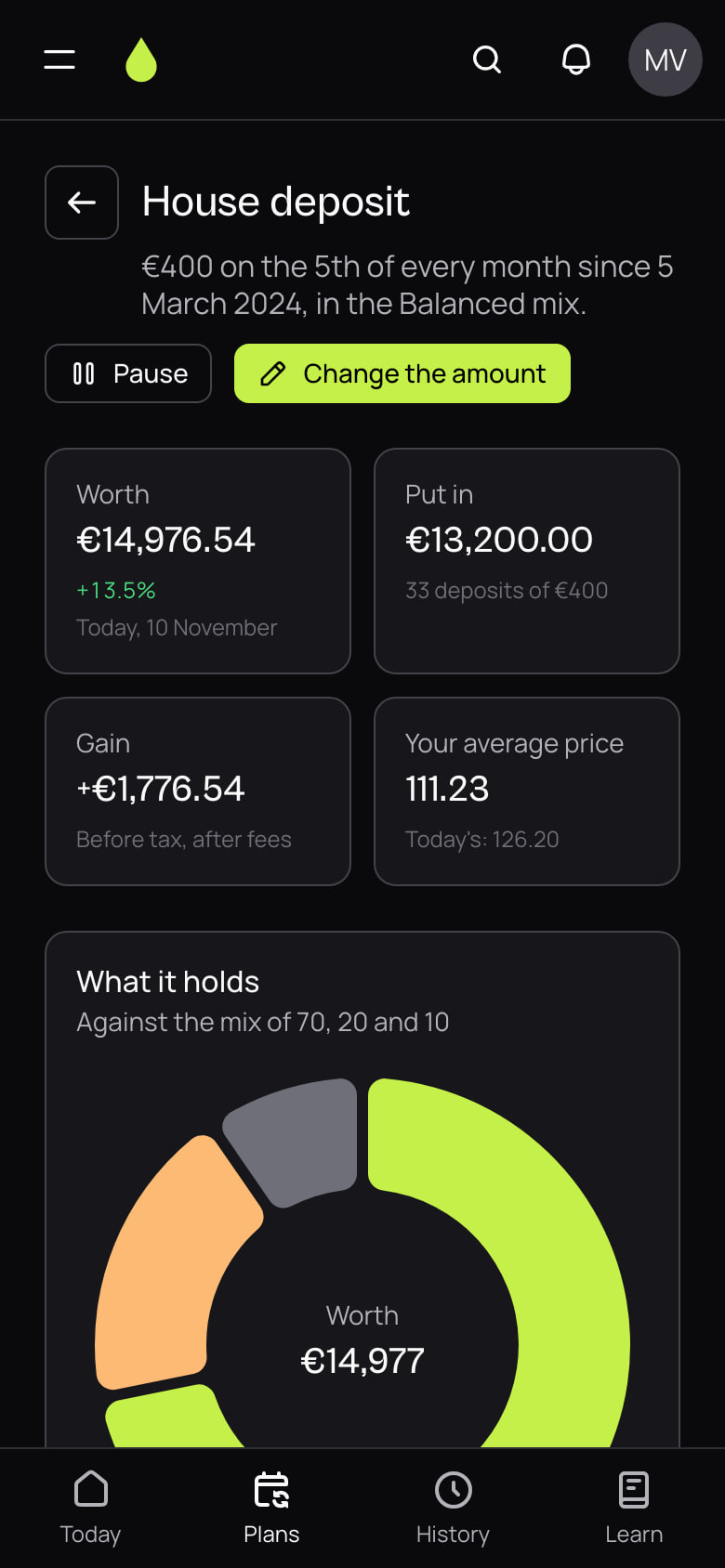
Built on our design system
Every screen in this case study is composed from our design system: 42 of its components, from the site’s first band to the desk’s editor, and none written for Stilla. What Stilla changed about the system fits in seven theme values: the lime in its two grounds, the two faces, the round shapes and the dark page it opens on. Its own look, the light and the dots, is one stylesheet laid over the system’s tokens.
That is what lets a product this size grow without a second codebase for its look. A new screen is a composition of parts that already hold both themes, every width and every state. A fix lands once, in the system, and reaches the site, the app and the desk together. The light page came that way: we switched the theme, measured the contrast, and every screen held.
The desk: the words without a release
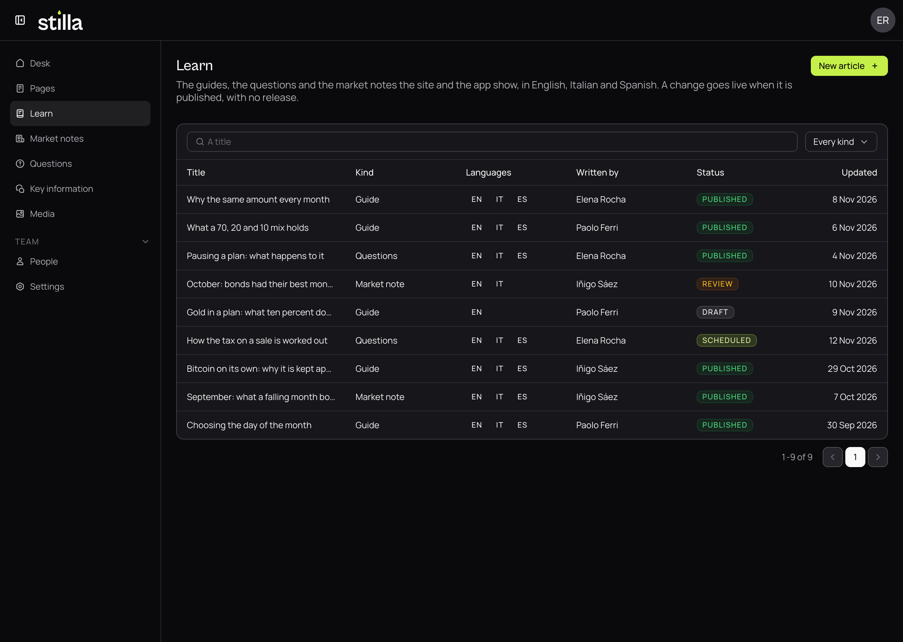
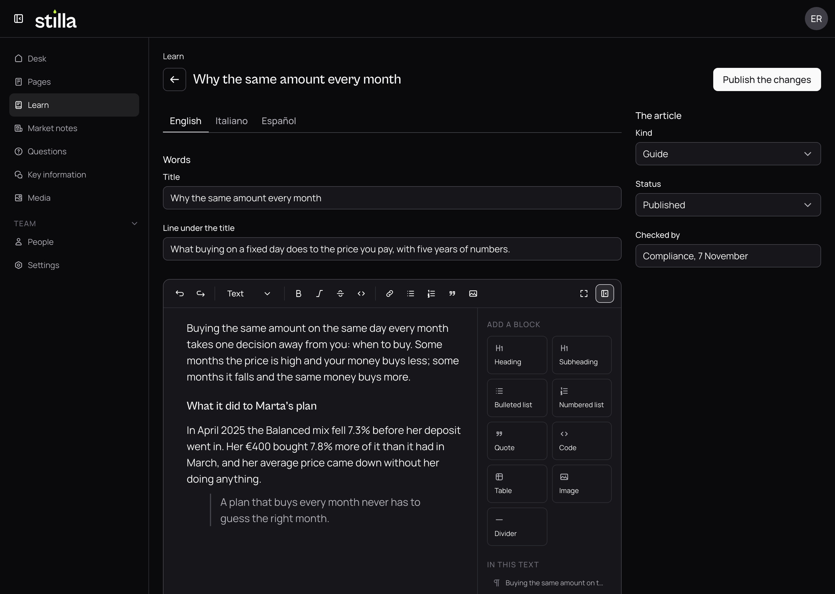
Stilla’s team writes in our CMS. The Learn guides, the questions, the market notes and the key information documents are records in its desk, in English, Italian and Spanish, each language under its own tab, and the site and the app read them as they are published. Changing a guide needs no release.
The desk is built on the same design system as the product, so the people who write the words see them in the type and the colours they will wear. Each article carries who checked it before it went out, since the words of an investment product are read by a compliance team as well as by its customers.
What it stands on
Stack
Next.js 16, React 19, TypeScript 5, Our design system, Our CMS, Capacitor, Supabase, Remotion, Vercel.