
Long form UX best practices: 12 rules for forms people finish
The average checkout asks for 11.3 fields when 8 would do. Twelve rules for long forms: what to cut, how to split pages, when to validate, what to save.
In this piece
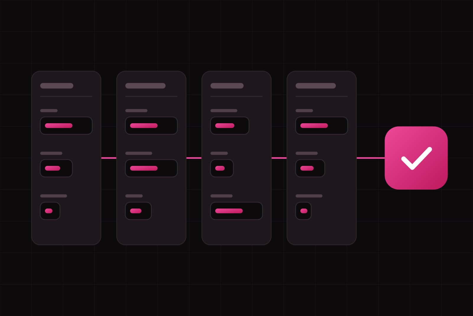
Long form UX is the practice of designing forms with dozens of fields (loan applications, onboarding questionnaires, insurance quotes, B2B signups, grant requests) so that people reach the submit button instead of the back button. A short form survives bad design because it ends before the friction adds up. A long one doesn't. Every unclear label, every retyped address, every error flagged too early gets paid for again on the next page.
The data is blunt. Baymard Institute's checkout benchmark found that the average checkout in 2024 asked for 11.3 form fields when most sites need 8, and that the number of fields hurts usability more than the number of steps. A checkout is a short form. Onboarding for a lending product or an application to a public body can run past 60 fields, and the same waste compounds on every page.
How we picked these 12 rules
Each rule below meets three conditions. It has evidence behind it: published usability research, a public design system, or an accessibility standard. It changes how many people finish. And a product team can apply it to an existing form in one sprint, without rebuilding the backend. We grouped the rules in the order a form gets built: what to ask, how to split it, how each field behaves, and what happens when something goes wrong.
What should a long form ask?
1. Cut every field nobody can name a use for
Print the form. Next to each field, write who reads the answer and what they do with it. A field with no name next to it goes. A field whose answer finance reads once a year moves to a follow-up email. This audit is dull, and it's the highest-return hour of the whole project: a deleted field needs no label, no validation, no error message and no translation.
2. Ask later what you don't need now
Plenty of long forms are long because they collect everything up front. A B2B signup asks for company size, role, industry and phone number before the person has seen the product. Sort the questions by when the answer is needed. What it takes to create the account stays. What sharpens the sales conversation moves to after the first session, when the person has a reason to answer. It's the same logic behind onboarding flows that keep users past the first week.
How should you split a long form?
3. Start with one question per page, then merge
The GOV.UK Design System tells teams to start by asking one question per page. The "one thing" is a decision, and a decision can span several inputs: a date of birth is three fields and one question. One question per page handles branching, errors and saved progress better, and it works on a phone. It's a starting point. For a form the same people fill in every week, merge related questions to cut the clicks on "Continue", then test that each merged page still reads as one decision.
4. Name each section after its content
People finish long forms across several sittings. They need to know where they are and what's left, in words they recognize: "Company details", "Directors", "Bank account", "Documents". "Step 3 of 7" doesn't say whether the passport scan is coming. GOV.UK suggests testing the form without a progress indicator first, to see whether it's simple enough to go without one. When it isn't, a list of named sections tells people more than a bar.
5. Keep it to one column
In a CXL Institute study, participants completed a single-column form 15.4 seconds faster than a multi-column version of the same form, with 356 and 346 participants in the two groups. Two columns create two reading paths, and people skip fields on the path they didn't take. Put two inputs side by side only when they're read as one answer, like the month and year of a card's expiry date.
How should each field behave?
6. Put the label above the field, never inside it
A placeholder disappears the moment someone starts typing. Nielsen Norman Group lists what that costs: people forget what the field asked for, can't check their answers before submitting, and screen readers don't always announce the text. Their advice is to avoid placeholders in place of labels. On a long form the cost multiplies, because people come back to review pages they filled in an hour earlier.
7. Mark the optional fields, and leave the required ones plain
After rule 1, most fields are required, so an asterisk on each of them adds noise to every line. GOV.UK's guidance is to add "(optional)" to the labels of optional fields and never mark mandatory fields with asterisks. The few optional ones stand out, and each is a prompt to ask whether it belongs in the form at all.
8. Size the field to the answer
A postcode field as wide as the address line makes people wonder what they got wrong. Size each input to the length of the answer it expects. Use the input type and inputmode that bring up the right keyboard on a phone. Add autocomplete values to the fields about the user, so the browser can fill in name, email, address and phone. That last one is also a requirement: WCAG success criterion 1.3.5 asks that the purpose of each input about the user can be identified in code.
9. Never ask for the same thing twice
Billing address, then shipping address. Company name in step 1, then again on the declaration page. WCAG 2.2 made this a Level A requirement: information the user already entered in the same process must be auto-populated or available for them to select. The exceptions are narrow: security, information that's no longer valid, or re-entry that's essential, such as confirming a new password. A "Same as billing address" checkbox is the classic fix. Pre-filling the declaration page is the one teams forget.
What should happen when something goes wrong?
10. Validate when the person leaves the field
Luke Wroblewski tested six versions of a registration form with the usability firm Etre. The best inline validation version produced a 22% increase in success rates and 42% faster completion times than validating on submit. The sample was 22 people and the study dates from 2009, so read the percentages as a direction. The finding that has held up is the timing: check a field after the person leaves it. An email flagged as invalid after the first character reads as an accusation. Errors only the server can catch belong in a summary at the top of the page, each one linked to its field.
11. Save progress, and warn before the session ends
A 40-minute form outlasts a lunch break, a meeting and a dropped connection. Save each page when the person moves on, and give them a way back in: an email link, or the account they already have. If the session has a time limit, WCAG 2.2.1 applies: people must be warned before it expires and given at least 20 seconds to extend it with a simple action, at least ten times. A session that expires in silence and throws away 30 answers loses the people who had already decided to finish.
12. End on a check-your-answers page
Before the submit button, show every answer on one page, grouped by section, each with a "Change" link that goes to the question and returns to the summary. GOV.UK publishes this as its check answers pattern. It catches typos while they're still cheap to fix. It also tells the person, right before they commit, that the form kept everything they said. After submission, say what happens next and when, in the words you'd use on the phone. The error and empty states around the form deserve the same care.
Where to start on a form you already have
Measure it before you change it. Field-level analytics show where the form loses people: time spent on each field, the fields people return to and correct, the last field touched before someone leaves. Then apply the rules cheapest first. Rules 1 and 7 are an afternoon of copy work. Rules 6, 8 and 9 are front-end changes. Rules 3, 11 and 12 touch the flow and the backend. Measure completion after each change, so you know which one moved the number.
Accessibility lands on the same list. EN 301 549, the European standard behind the European Accessibility Act, was republished as v4.1.1 in September 2026 and adopts WCAG 2.2, Redundant Entry included. Until the European Commission cites the new version in the Official Journal, the legal reference stays v3.2.1, which is based on WCAG 2.1 AA. Rules 8 to 11 cover criteria from both. We cover the wider picture in accessibility-first design after the EU Accessibility Act.
Sources
- Baymard Institute: Checkout optimization, minimize form fields
- GOV.UK Design System: Question pages
- GOV.UK Design System: Check answers
- CXL Institute: Form field usability, single or multi-column forms
- Nielsen Norman Group: Placeholders in form fields are harmful
- A List Apart: Inline validation in web forms, Luke Wroblewski
- W3C: Understanding SC 1.3.5 Identify Input Purpose
- W3C: Understanding SC 3.3.7 Redundant Entry
- W3C: Understanding SC 2.2.1 Timing Adjustable
- AccessibleEU: The European accessibility standard EN 301 549 has been updated
Frequently asked questions
How many fields is too many for a form?+
No single number holds, because length hurts less than questions that feel pointless. Baymard found most checkouts need 8 fields and the average asks for 11.3, so for a checkout anything past 8 needs a reason. A 50-field loan application can still complete well when every question is visibly needed to decide the loan. The practical test is ownership: every field has a named person who reads the answer. When you cannot name one, the field is too many.
Does a progress bar help people finish a long form?+
Sometimes, and it can also hurt. GOV.UK recommends testing a form without a progress indicator first, to see whether people need one. A percentage bar that shows 10% after five minutes of work tells people the form is longer than they planned for. When branching changes the number of pages, the bar has to jump or lie. For forms with distinct parts, a list of named sections with a done state on each works better than a bar.
Is WCAG Redundant Entry a legal requirement for forms in the EU?+
Not yet on its own. Redundant Entry (3.3.7) arrived with WCAG 2.2, and the standard currently cited for the European Accessibility Act, EN 301 549 v3.2.1, is based on WCAG 2.1 AA. EN 301 549 v4.1.1, published in September 2026, adopts WCAG 2.2 and becomes the reference once the European Commission cites it in the Official Journal. Teams building or rebuilding a form now are better off meeting it already. For what applies to your product and market, ask an accessibility specialist or legal counsel.
How do I find the field where people abandon a long form?+
Track the form at field level, not only at the page. Three signals matter: the last field someone interacted with before leaving, the time spent on each field, and how often people return to a field to correct it. Dedicated form analytics tools report these out of the box, and custom events in your product analytics can do the same. A field with high time and many corrections is unclear. A field that is often the last one touched is where the decision to leave happens, and the question itself usually needs rewriting or removing.
Related services
Studio
Start a project.
We write about what we build. Tell us what you want to build.