Caravan:aglobalmarketsdashboard
Five synchronised panels, one read of the day on the markets. Designed for people who follow the markets seriously but do not live in front of a terminal.
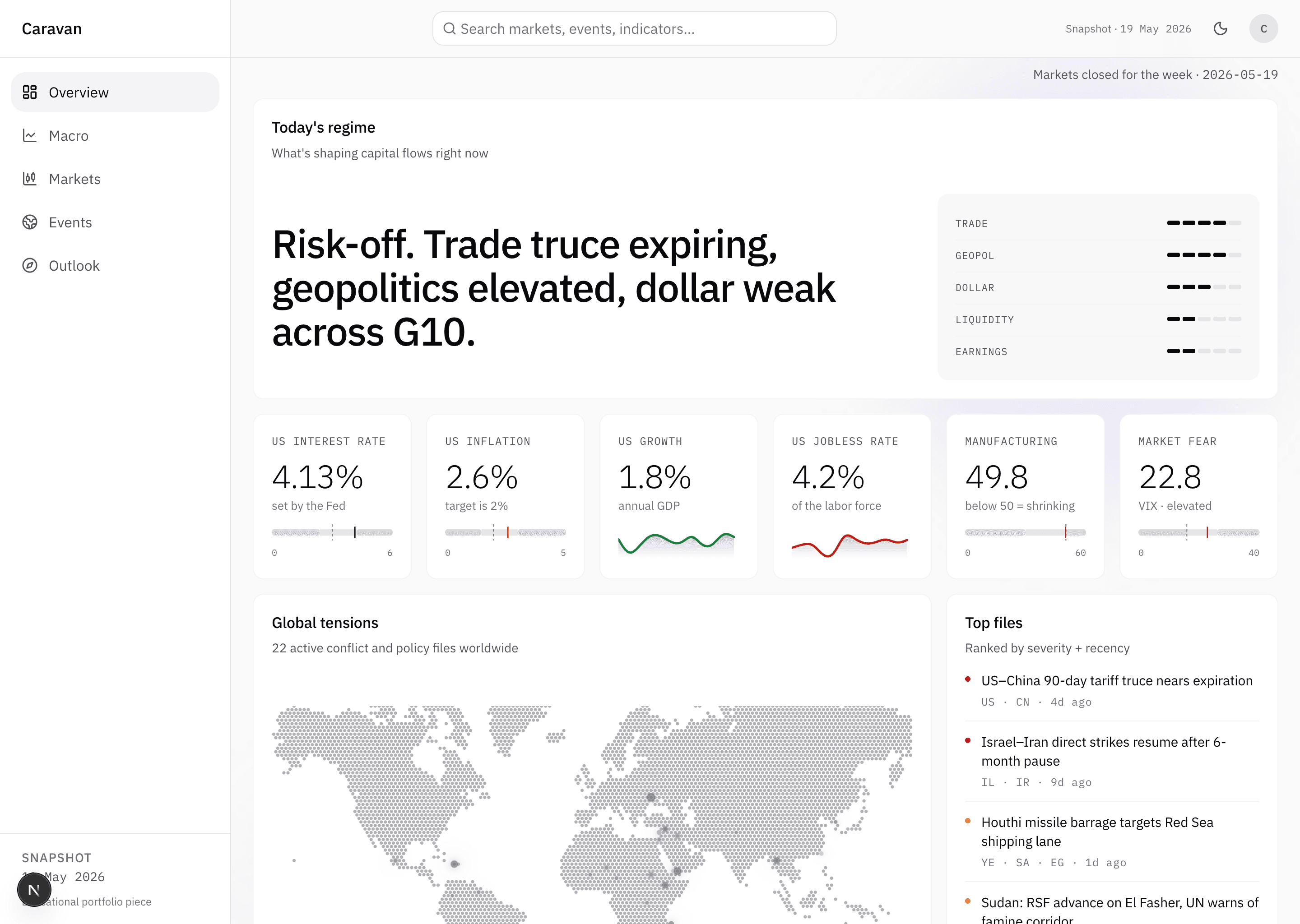
Most finance dashboards take a clear position: they are made for someone who sits in front of a terminal all day, with ten windows open, waiting on notifications. Caravan takes a different one. Five synchronised panels that give the read of the day on the markets in a few minutes, meant to be opened once or twice, not lived in.
Five panels, one read
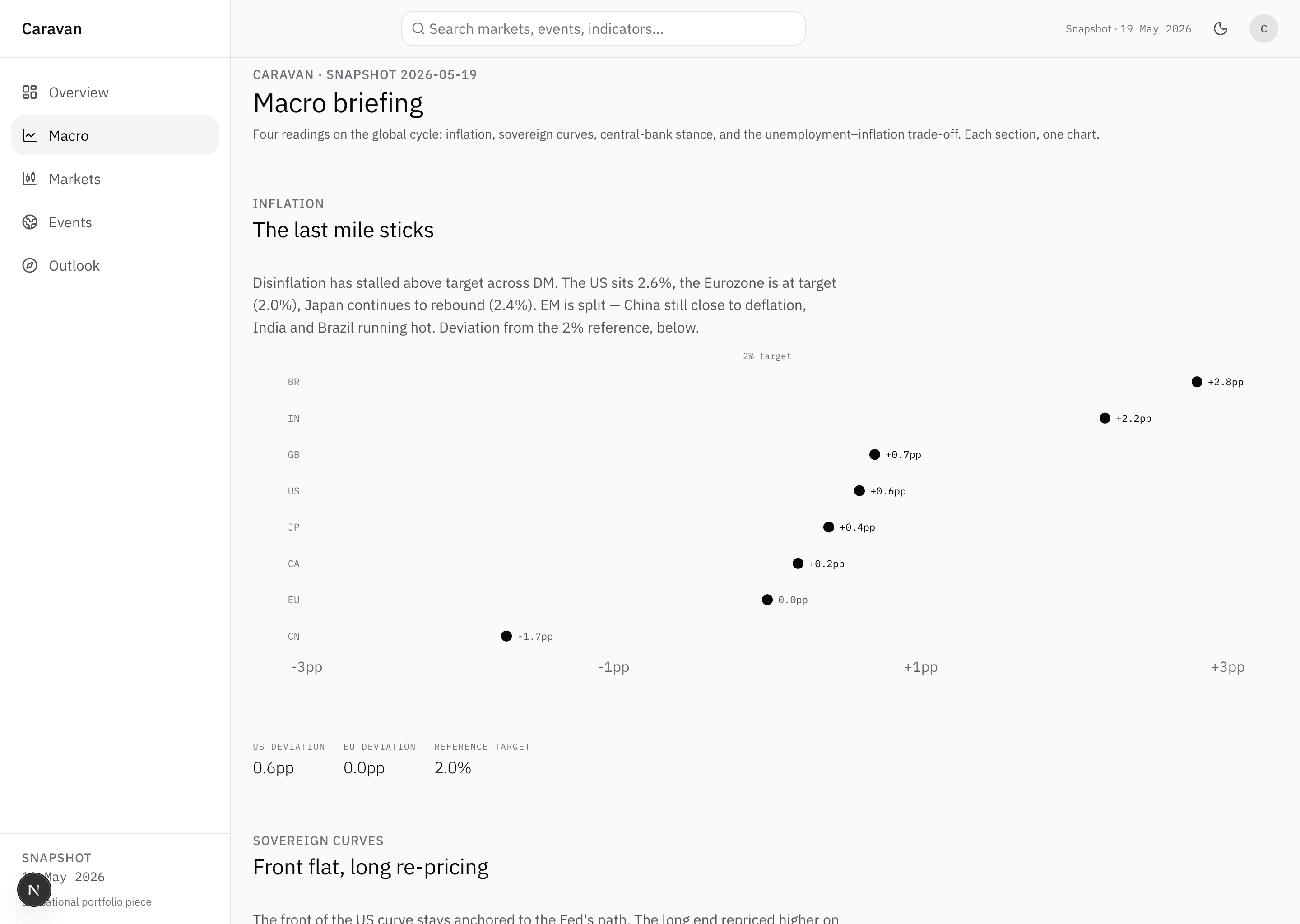
Macro. Where the global cycle is. Inflation deviation country by country, yield curves, central bank stance, employment. One page that tells you which economies are still hot, which are at target, which are slipping.
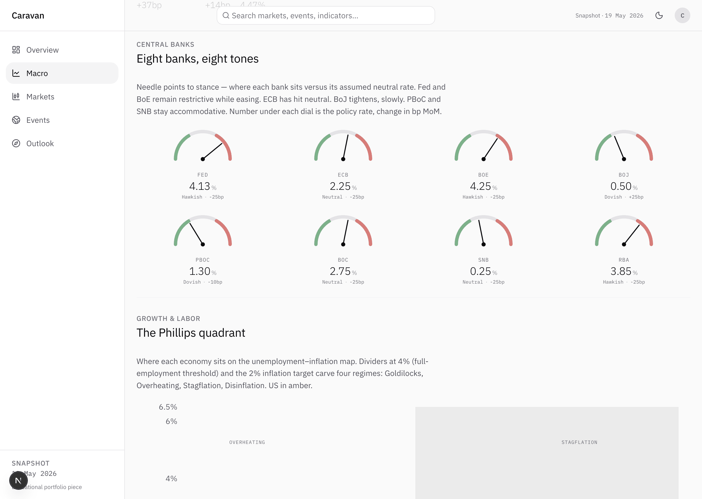
Central banks. Who is hiking, who is cutting, who is holding. Eight gauges that read the stance against each bank assumed neutral, the latest move written underneath.
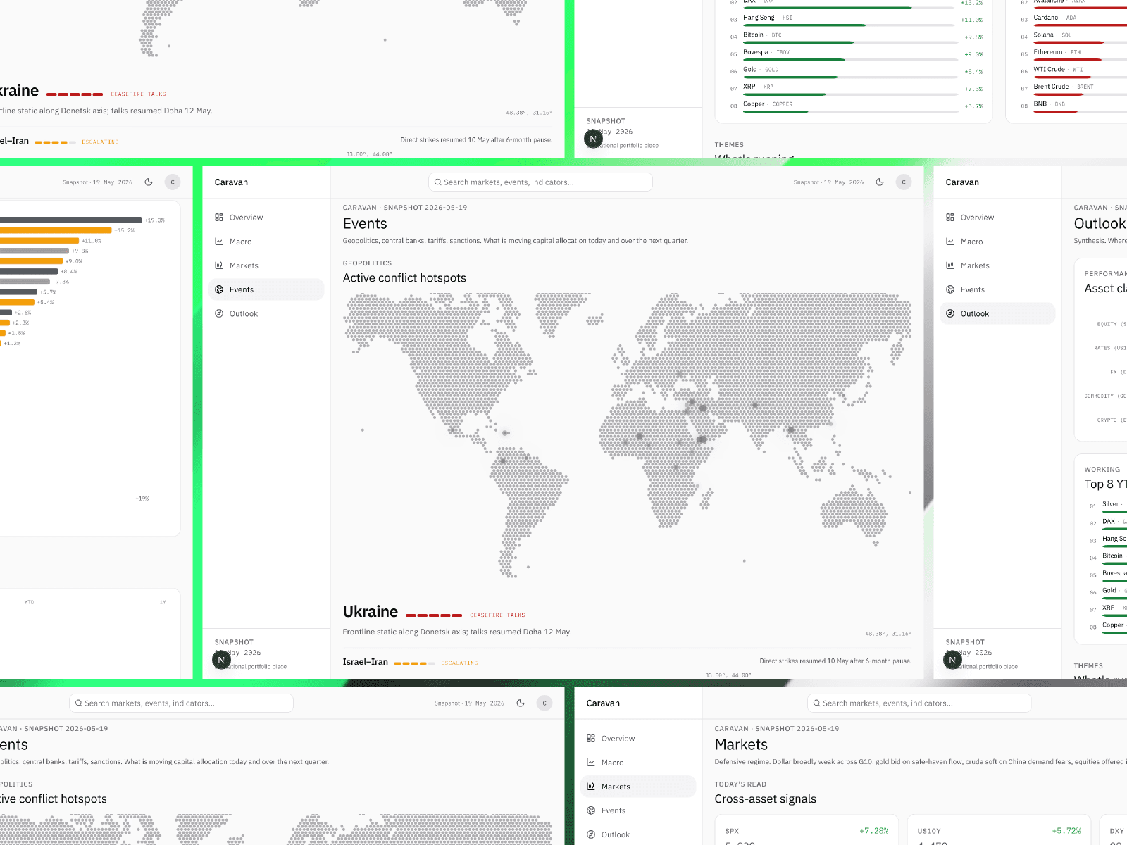
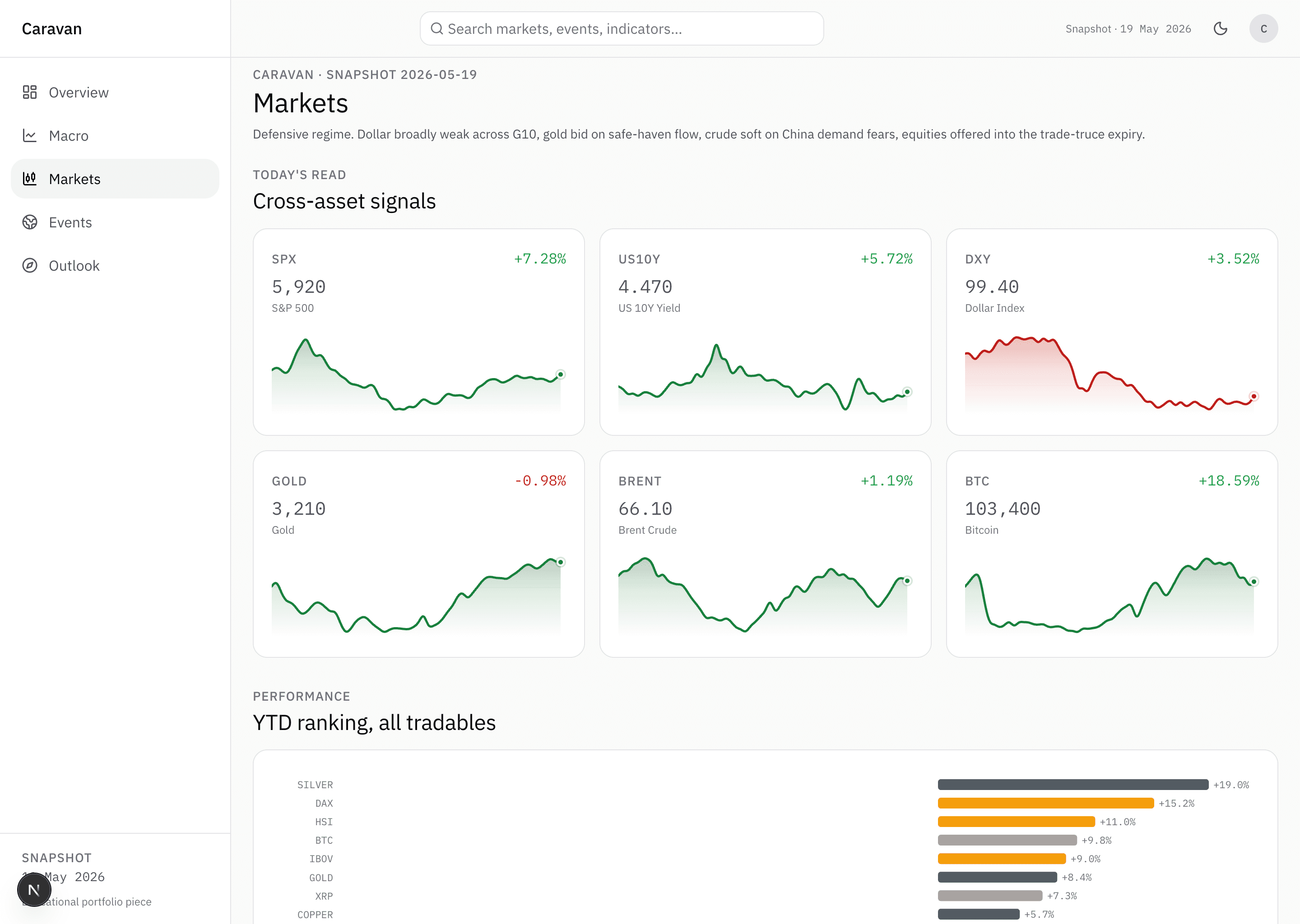
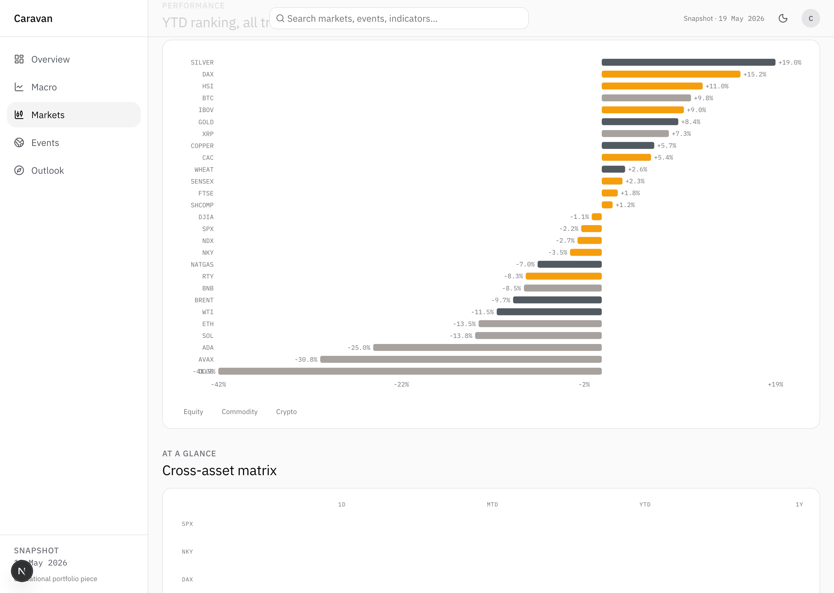
Markets. Equity, bonds, FX, commodities, crypto on one page. Six tiles up top with current value and YTD variation, a single chart ranking forty-plus tickers below.
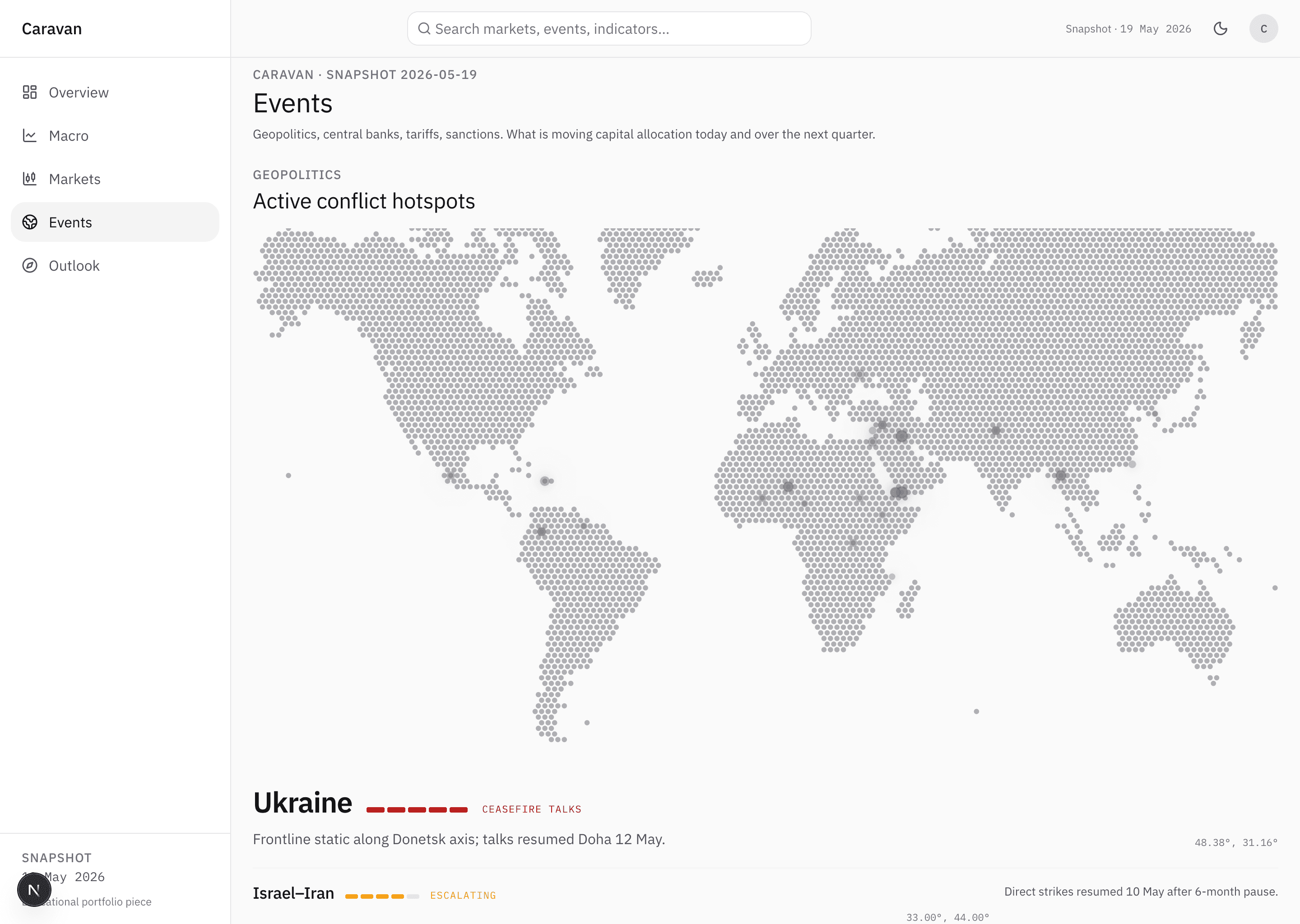
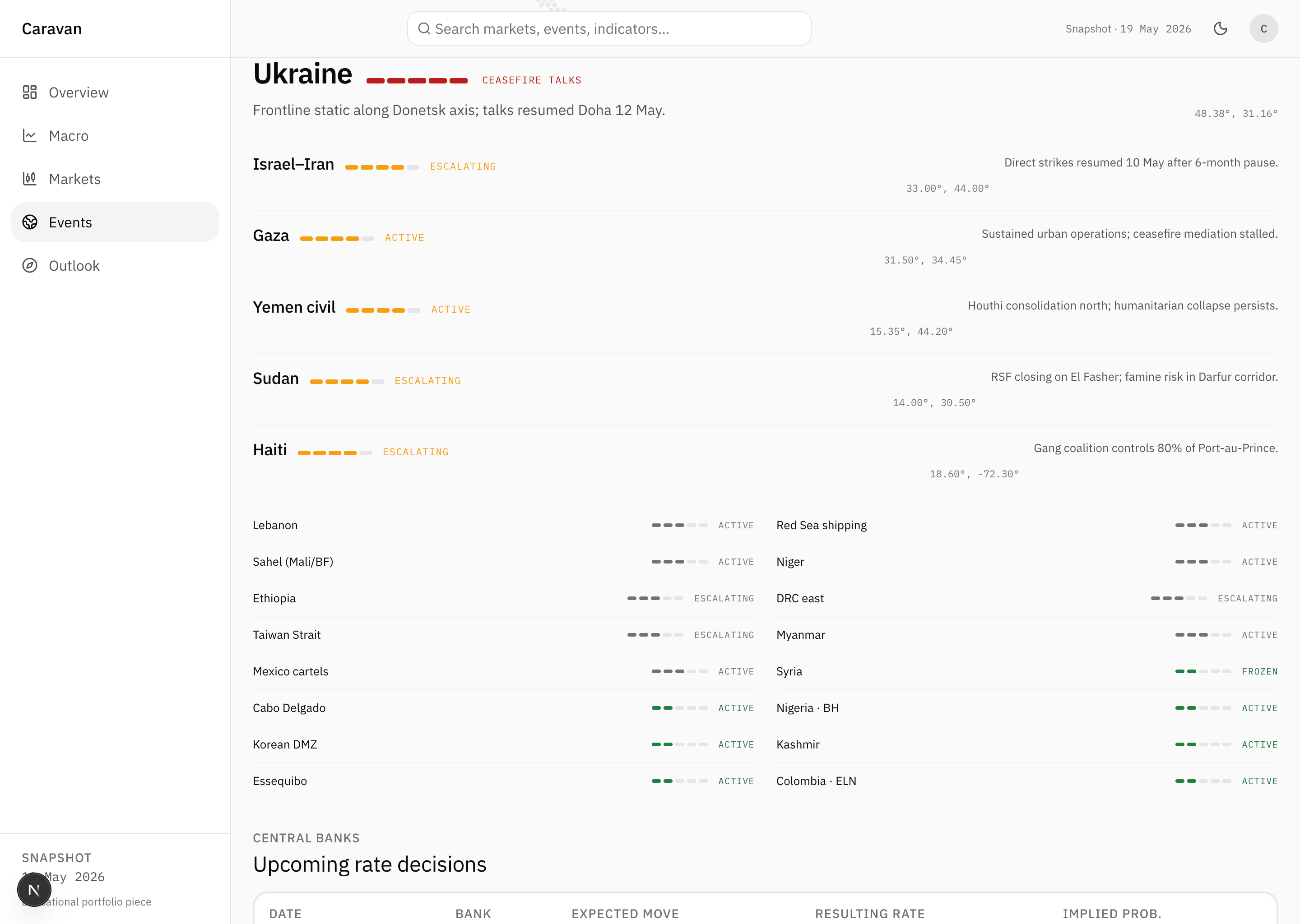
Active conflicts. The geopolitics that moves prices. A dotted world map with markers on the hotspots, the conflict list ordered by intensity.
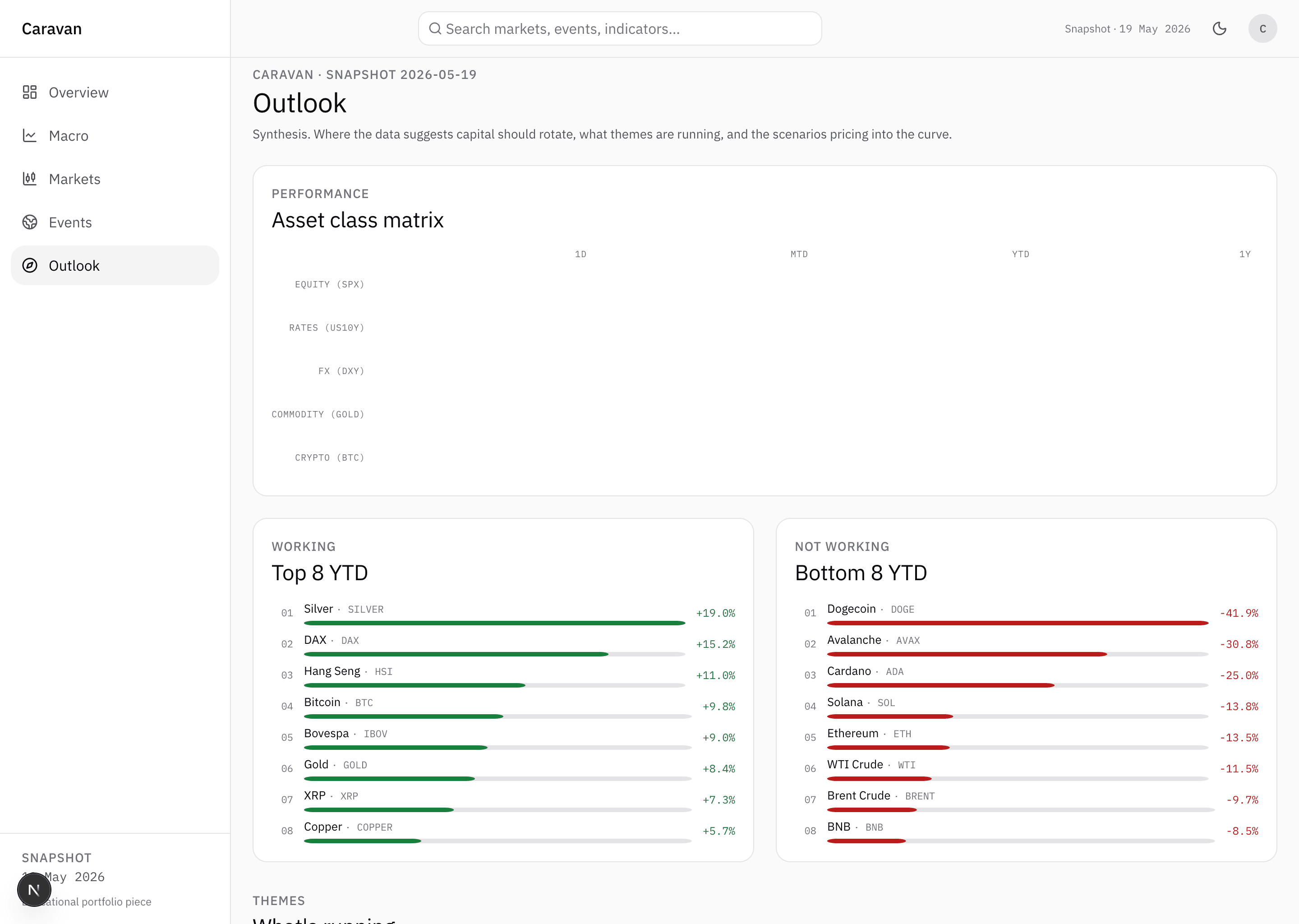
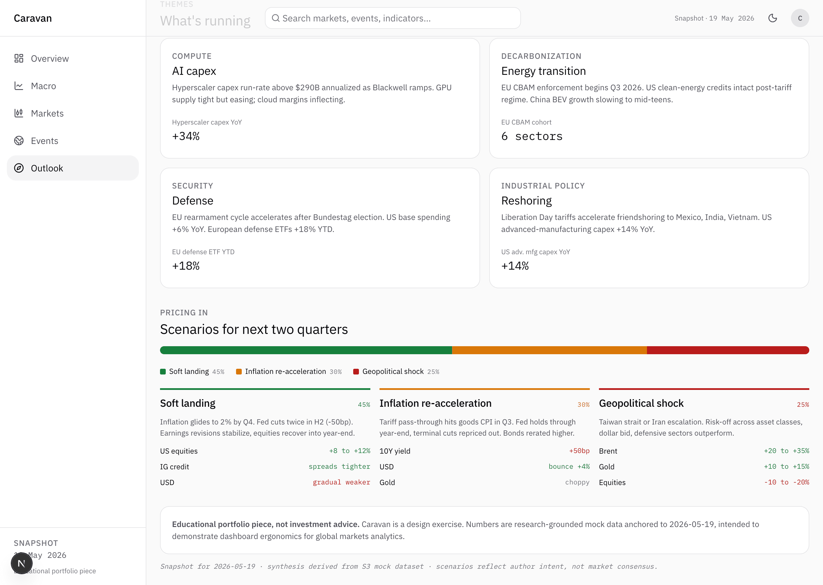
Scenarios. The synthesis. Four structural themes that matter now and three scenarios for the next two quarters with their first-order impact on assets.
The panels share one timestamp. The read has to be coherent, not an aggregate of misaligned prices.
Design choices
Editorial voice, not raw data. Each panel carries a synthetic read on top of the numbers. The macro regime panel does not just show the percentages, it spells out in two lines what they mean for the day. The product reads more like an editorial than a terminal.
No alerts, no notifications. Caravan opens when the reader chooses. Nothing flashes, nothing buzzes, nothing pings. The opposite of a Bloomberg desk, where attention is pulled constantly.
Terminal density, broadsheet typography. Full screen width, six indicators in the first view without scrolling. IBM Plex Sans on the prose, IBM Plex Mono on the numbers. Fixed-width digits make three columns of prices line up one under the other, the way they do in a financial broadsheet.
Two themes, designed together. Light and dark are not the same surface with one colour swapped for another. Both were designed at the same time: greens stay confident on black, reds stay legible on white, dividers stay quiet on either ground.
Working on something similar?
Adamarant works with founders, traders and independent studios that need digital products built to fit their actual workflow. If what you read here sounds close to your problem, get in touch.
Let's talk