kiBank: a modern, secure banking app
A banking platform we designed and built across the stack: marketing site, app, one design system, one technical infrastructure. Every product shares the same foundation, because they were thought through and shipped as a single ecosystem.
The brief
People open their banking app every day. Most apps make that moment chaotic, sterile or anxiety-inducing. kiBank set out to build a third option: a bank that disappears into the day.
The product had to feel quiet, behave fast, and prove its worth in the first ten seconds of use. Two surfaces, one promise: every screen earns its place by removing one daily friction.
Scale at a glance
- 4.8MMonthly active usersAcross iOS, Android and web
- 47Markets liveSEPA, the United Kingdom and selected LATAM corridors
- 99.99%Platform uptimeTrailing twelve months, including launch quarter
- 280msMedian time to interactiveP50 on mid-range Android, real user monitoring
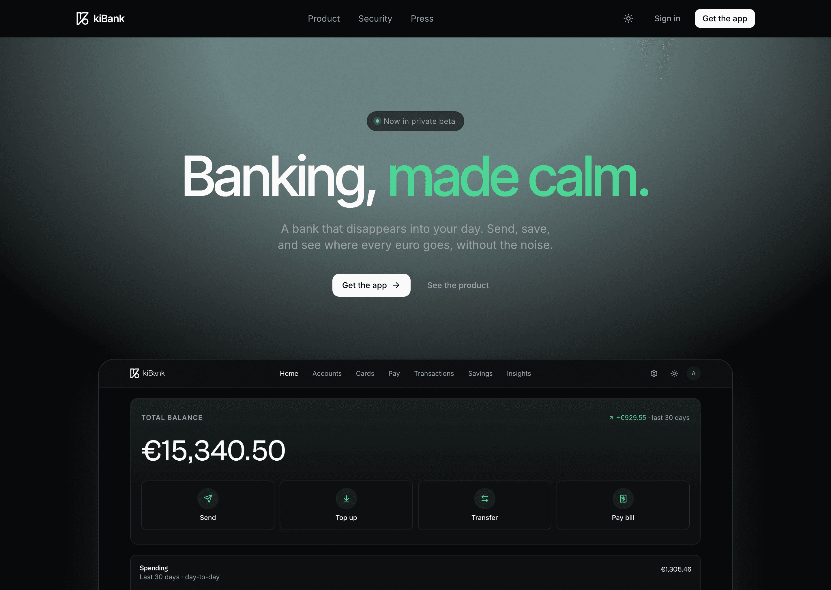
The web entry point
The site is built around a single conversion: get the app installed before the visitor changes tab. Every section answers one question that comes up in customer interviews, in the order the questions tend to arrive.
A static Next.js shell streams from Vercel Edge in under 200ms anywhere in Europe. Imagery is served from Cloudflare R2 with on-the-fly AVIF conversion. The whole landing weighs less than one product photo on a typical e-commerce site.
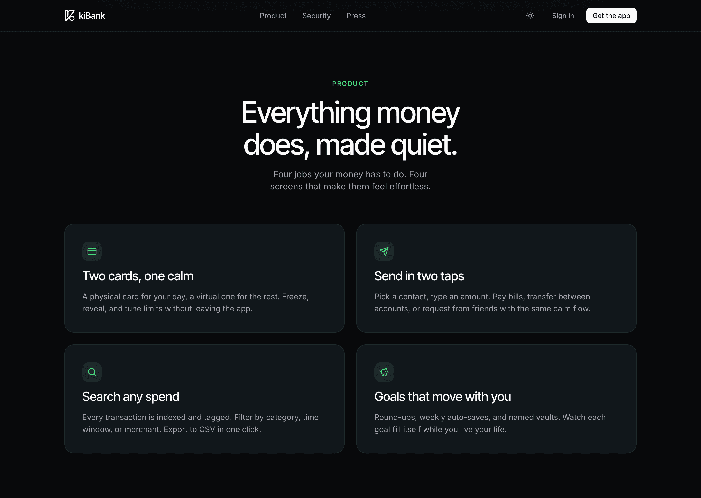
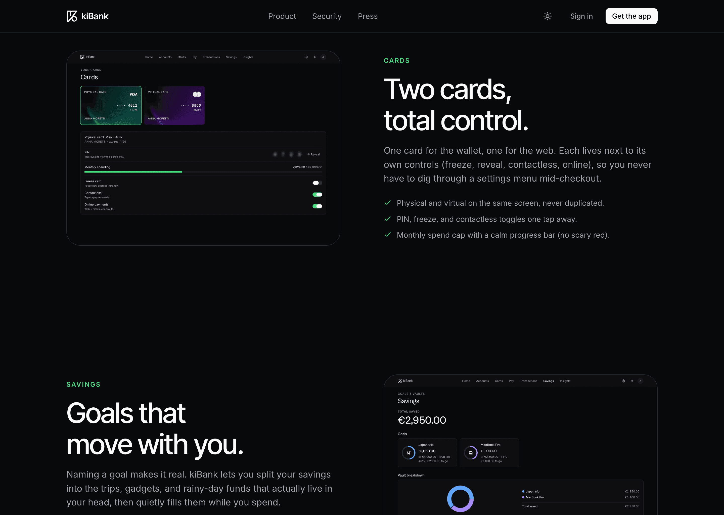
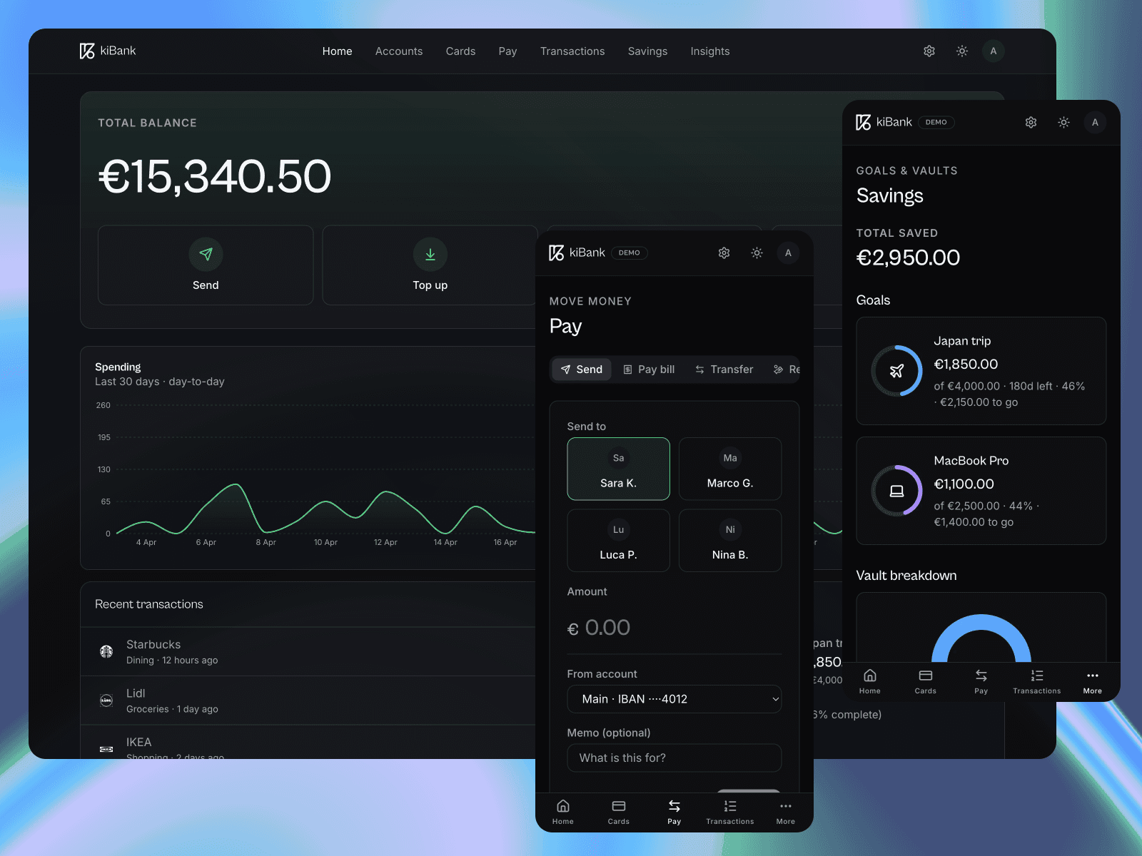
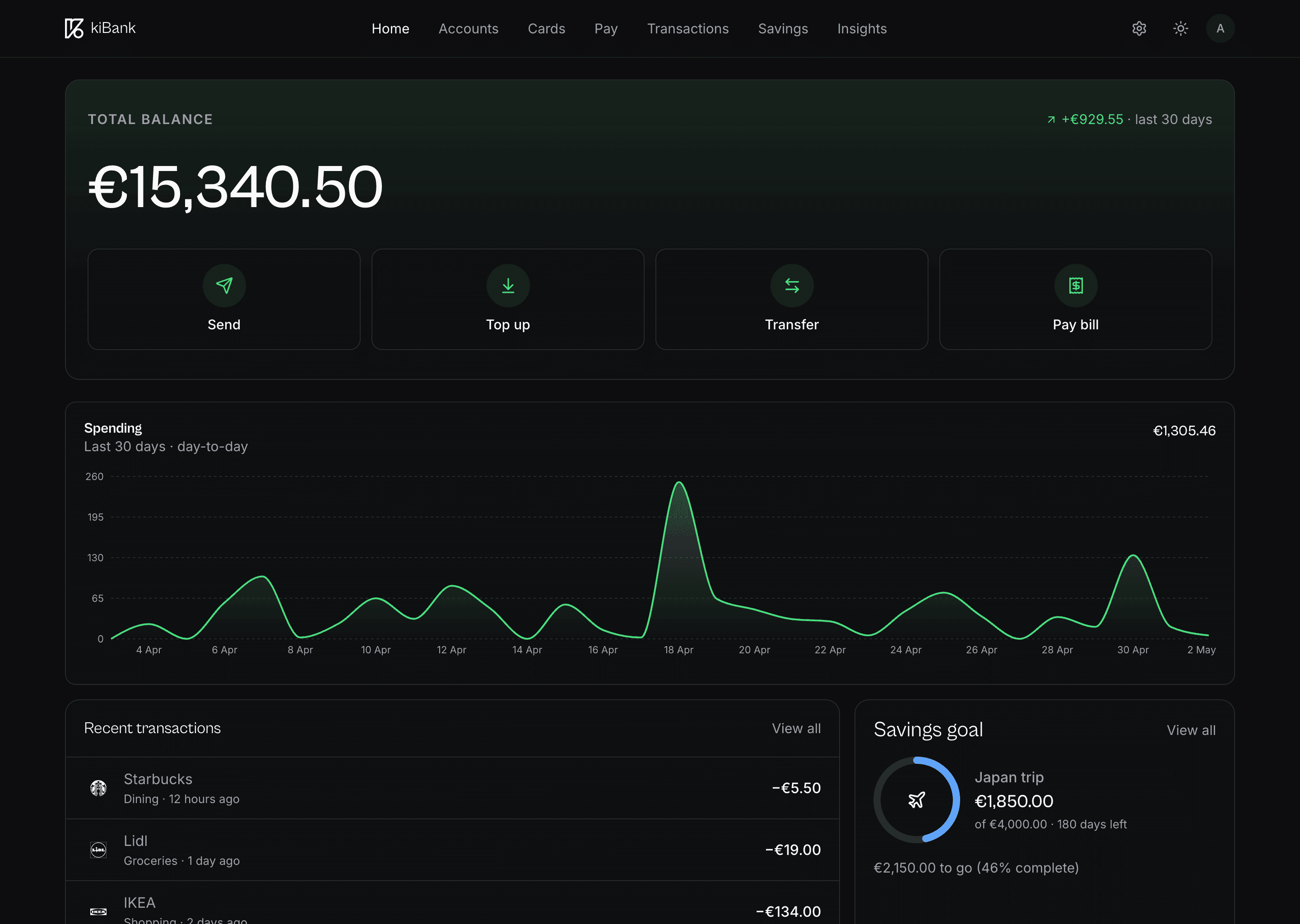
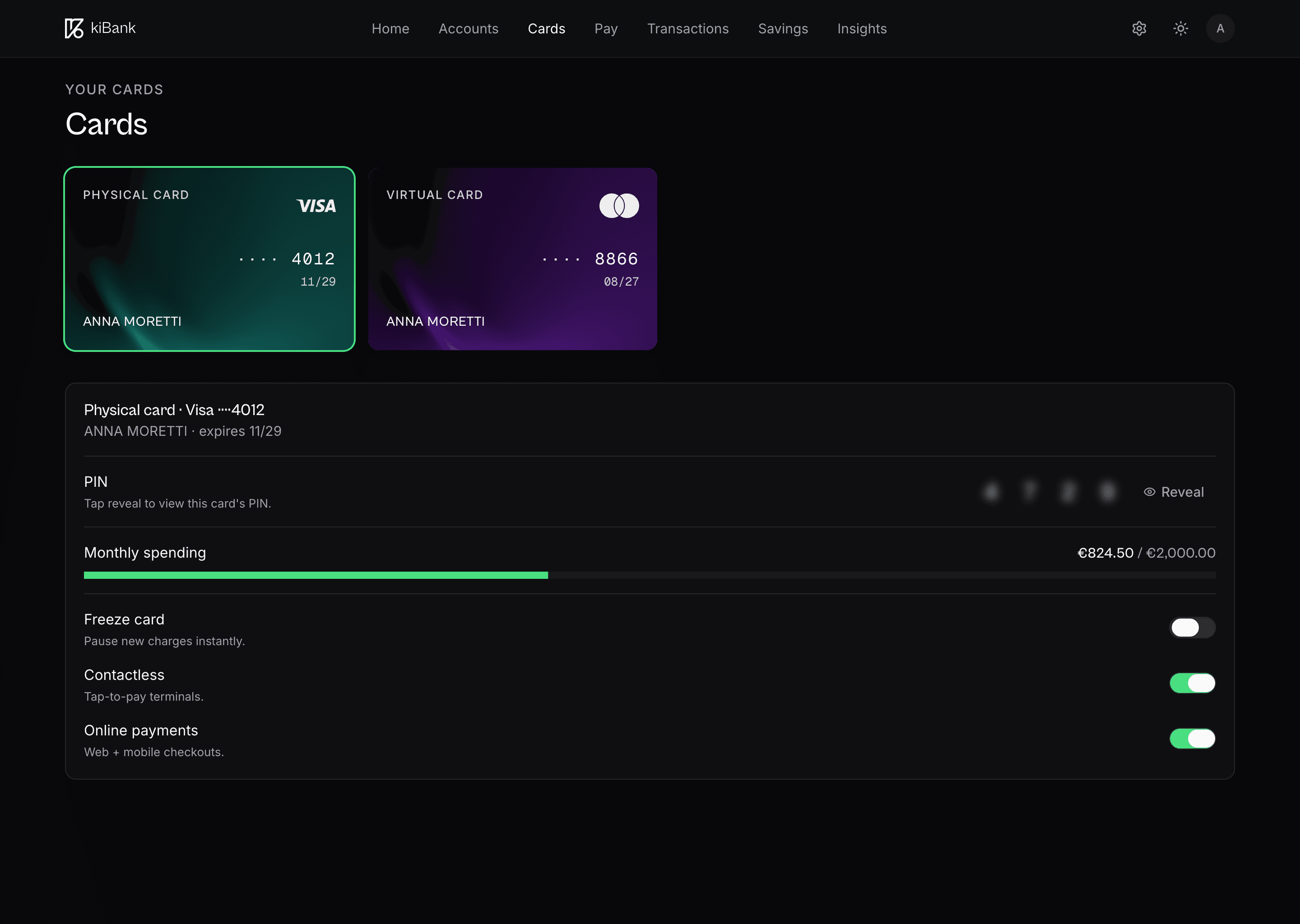
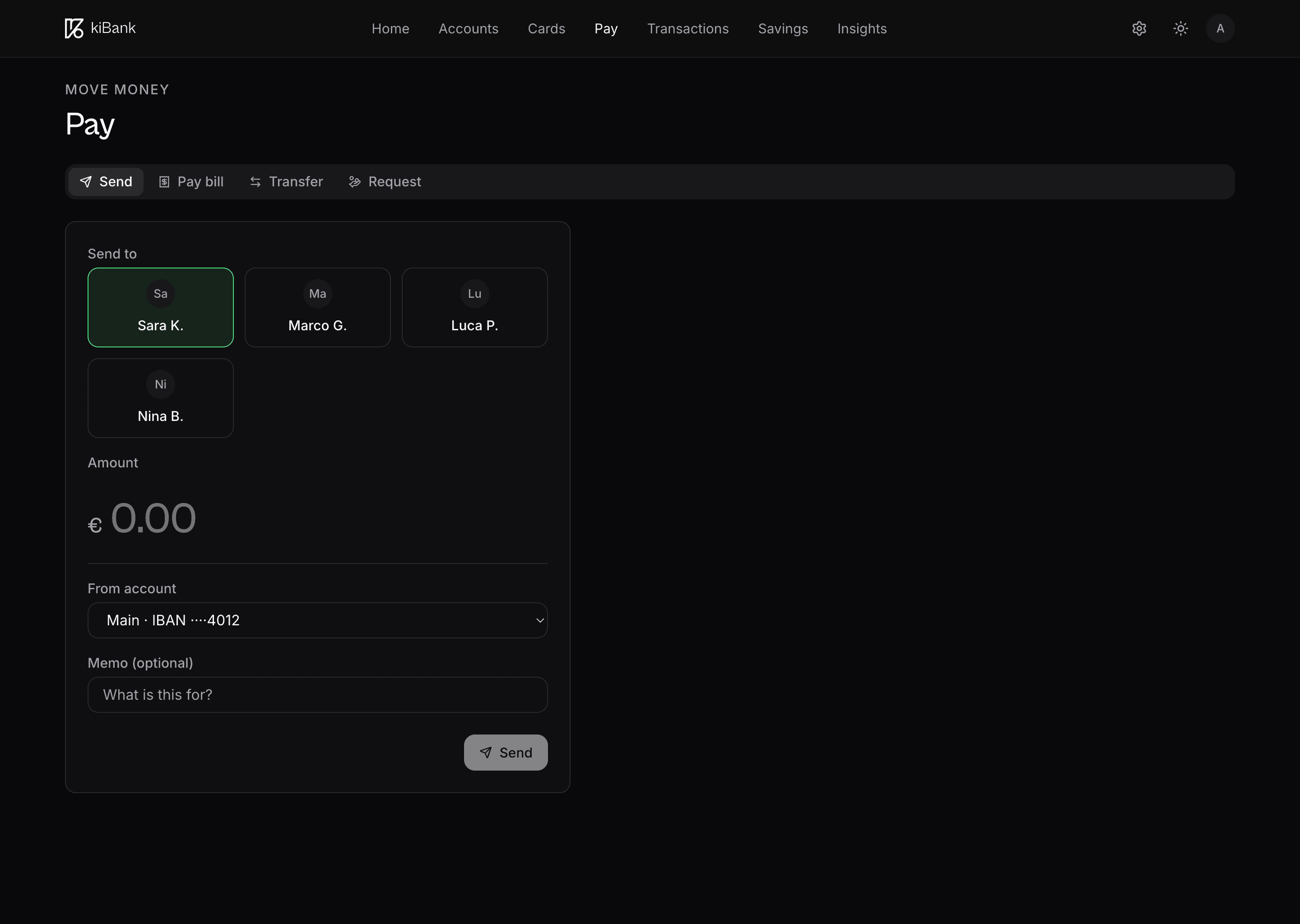
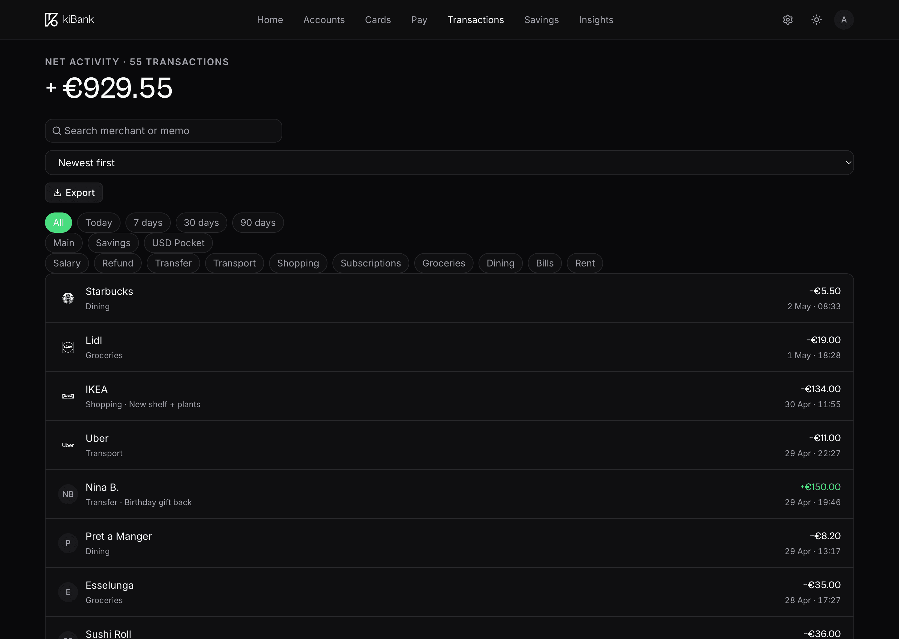
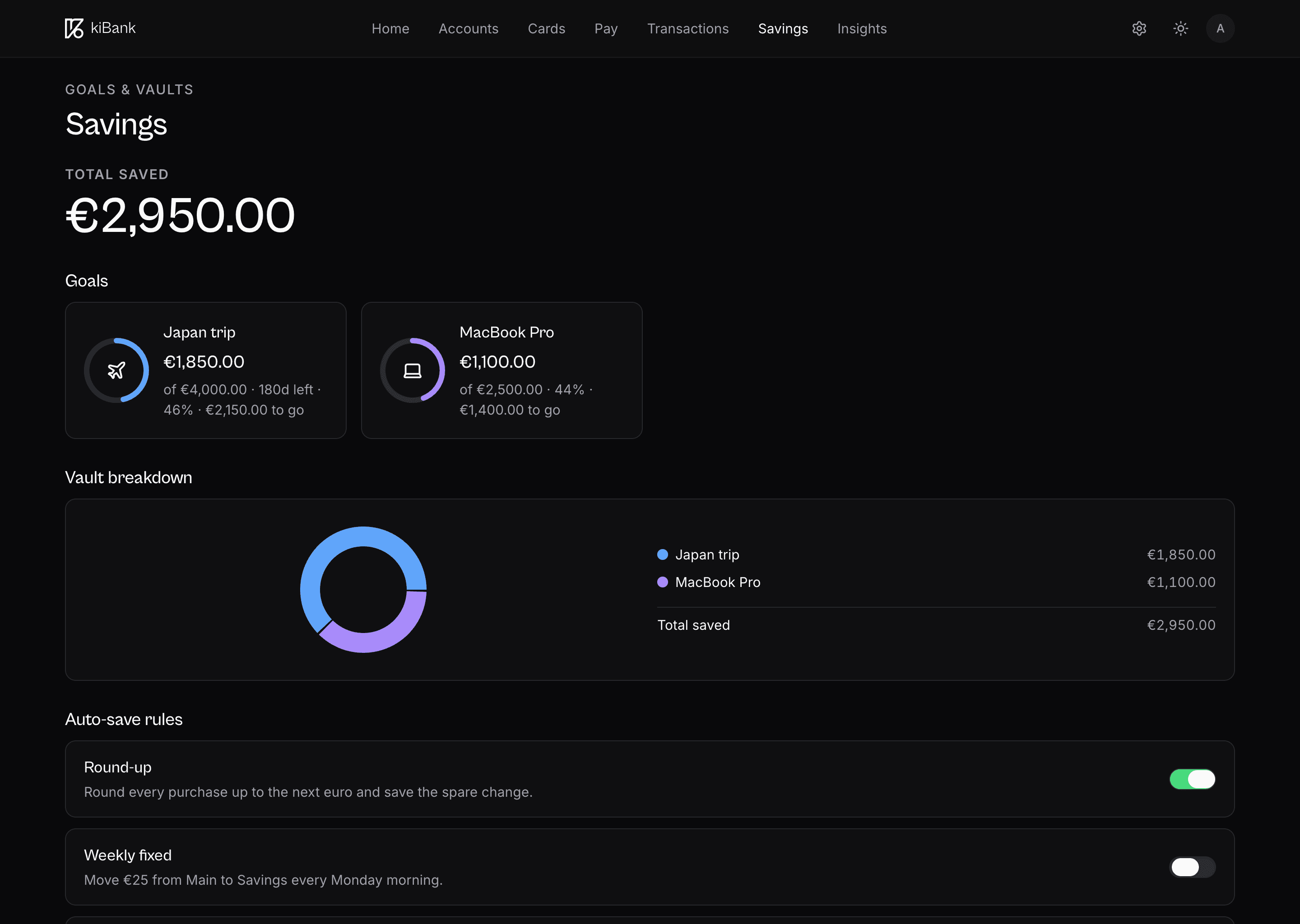
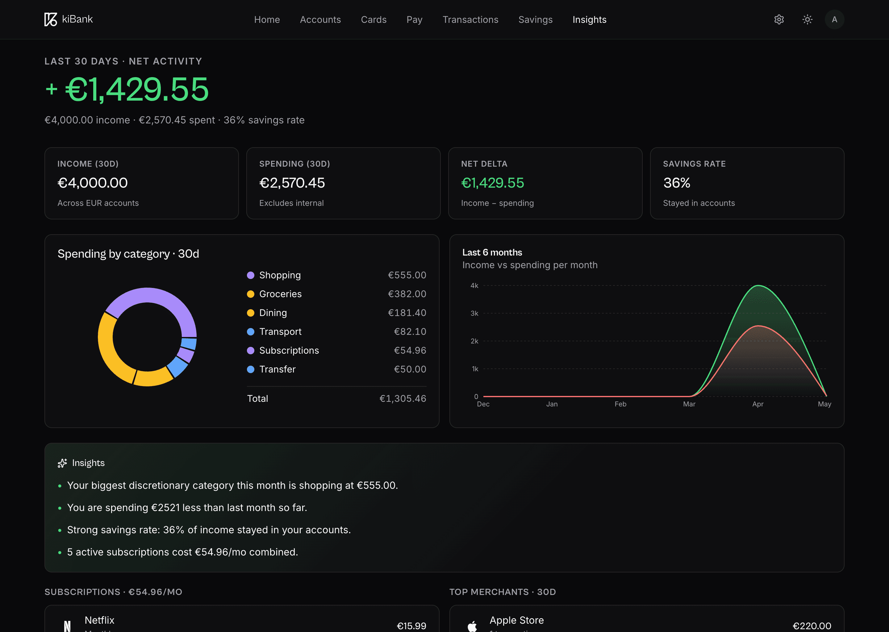
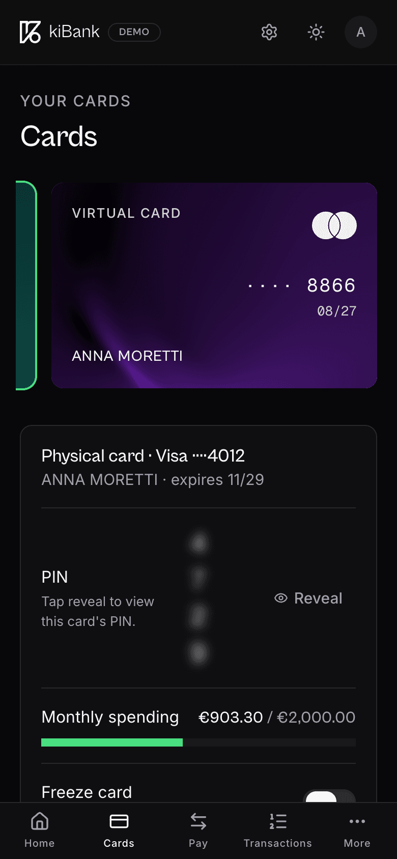
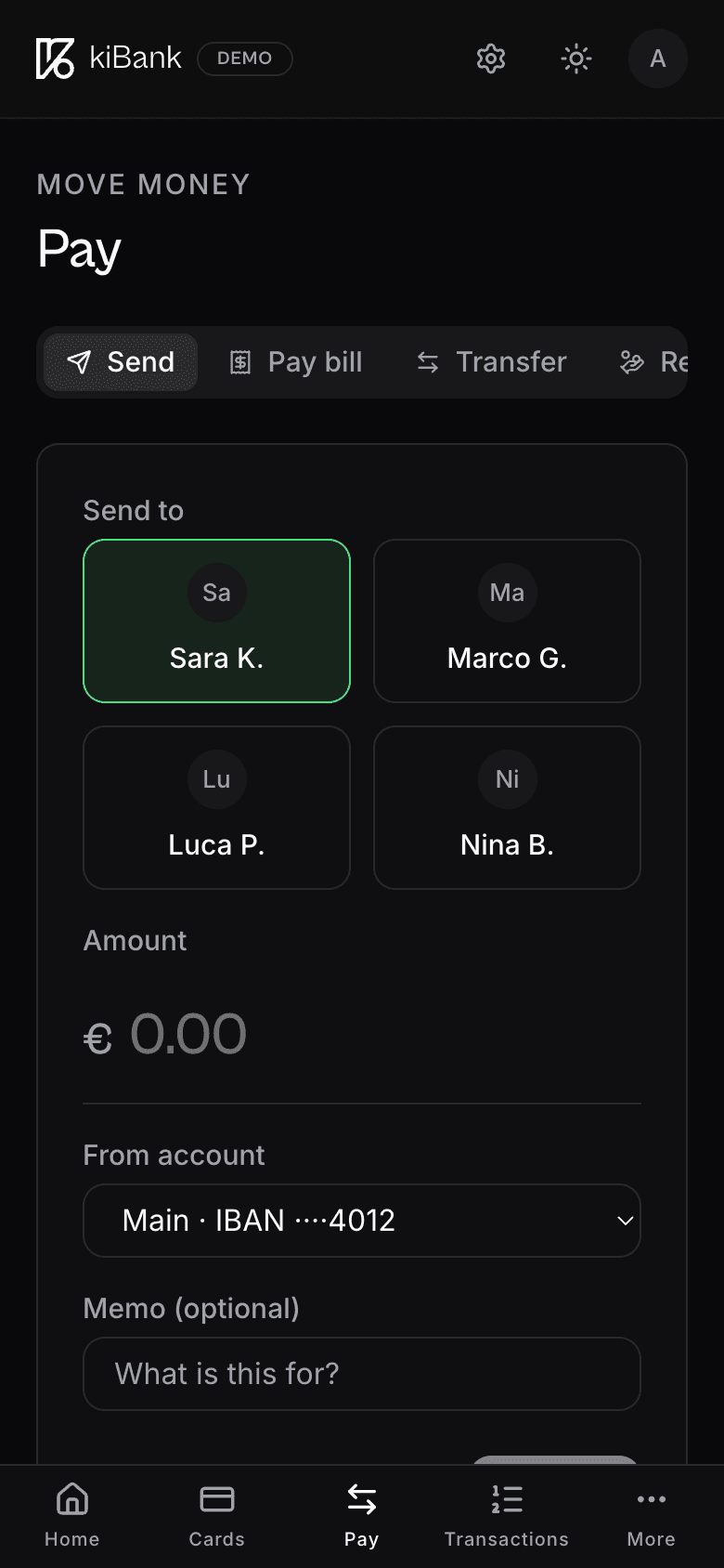
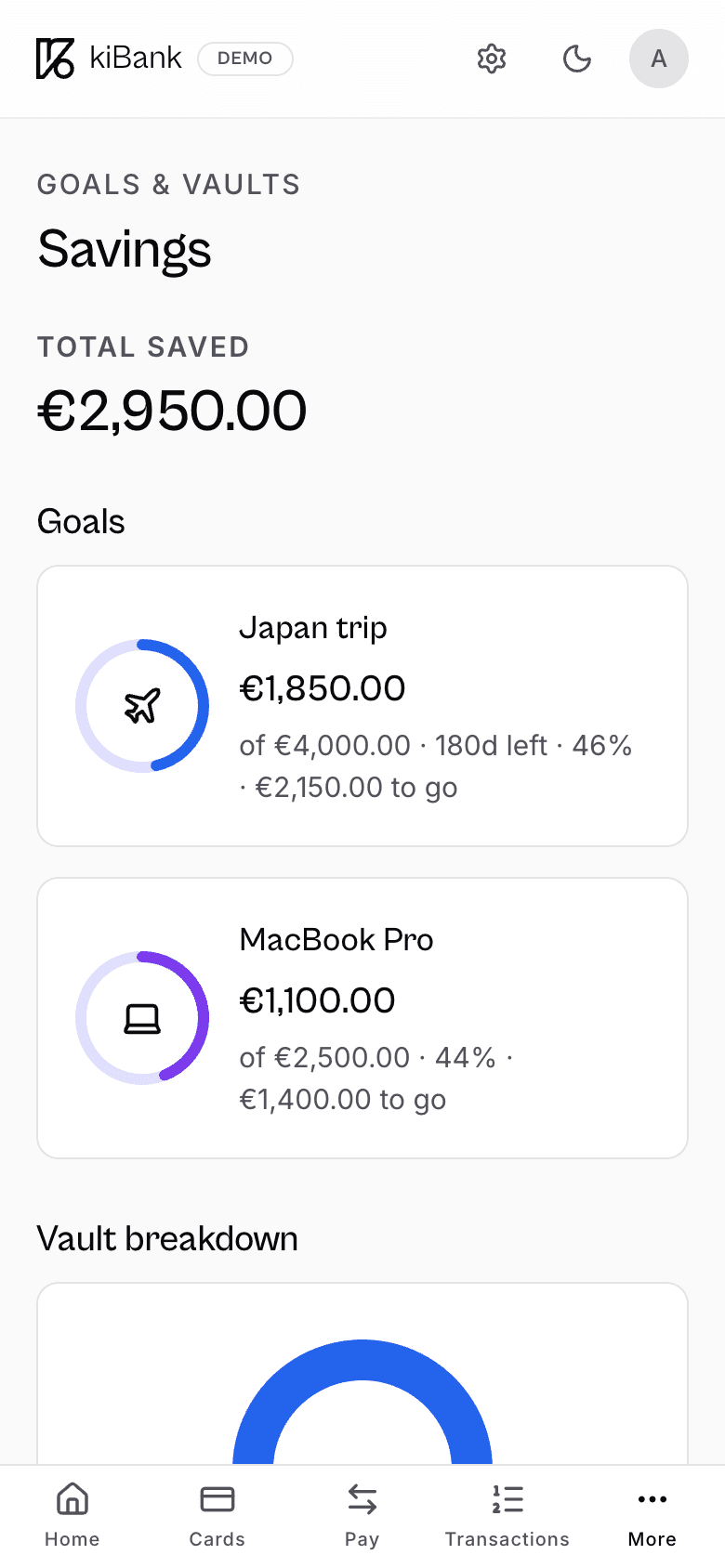
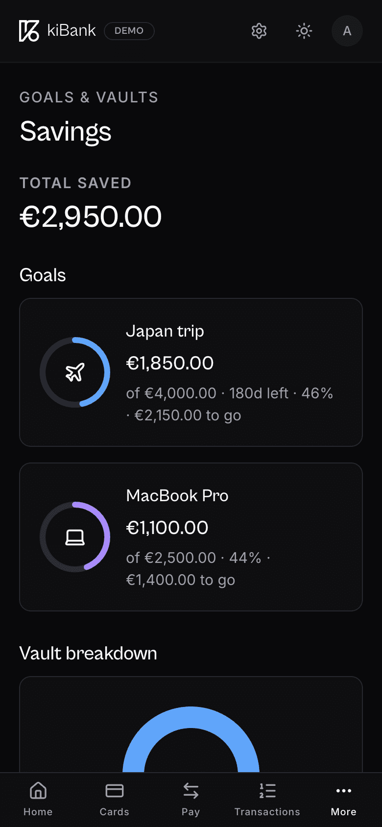
The app: every screen earns its place
Six screens carry the entire experience. The discipline shows: every tap is one decision deeper into a flow, never a sideways jump that costs context.
The component library powering it ships as a single package. One hundred and twenty components, two hundred design tokens, one accessibility pass. Light and dark themes share every layout, every spacing rule, every animation curve.
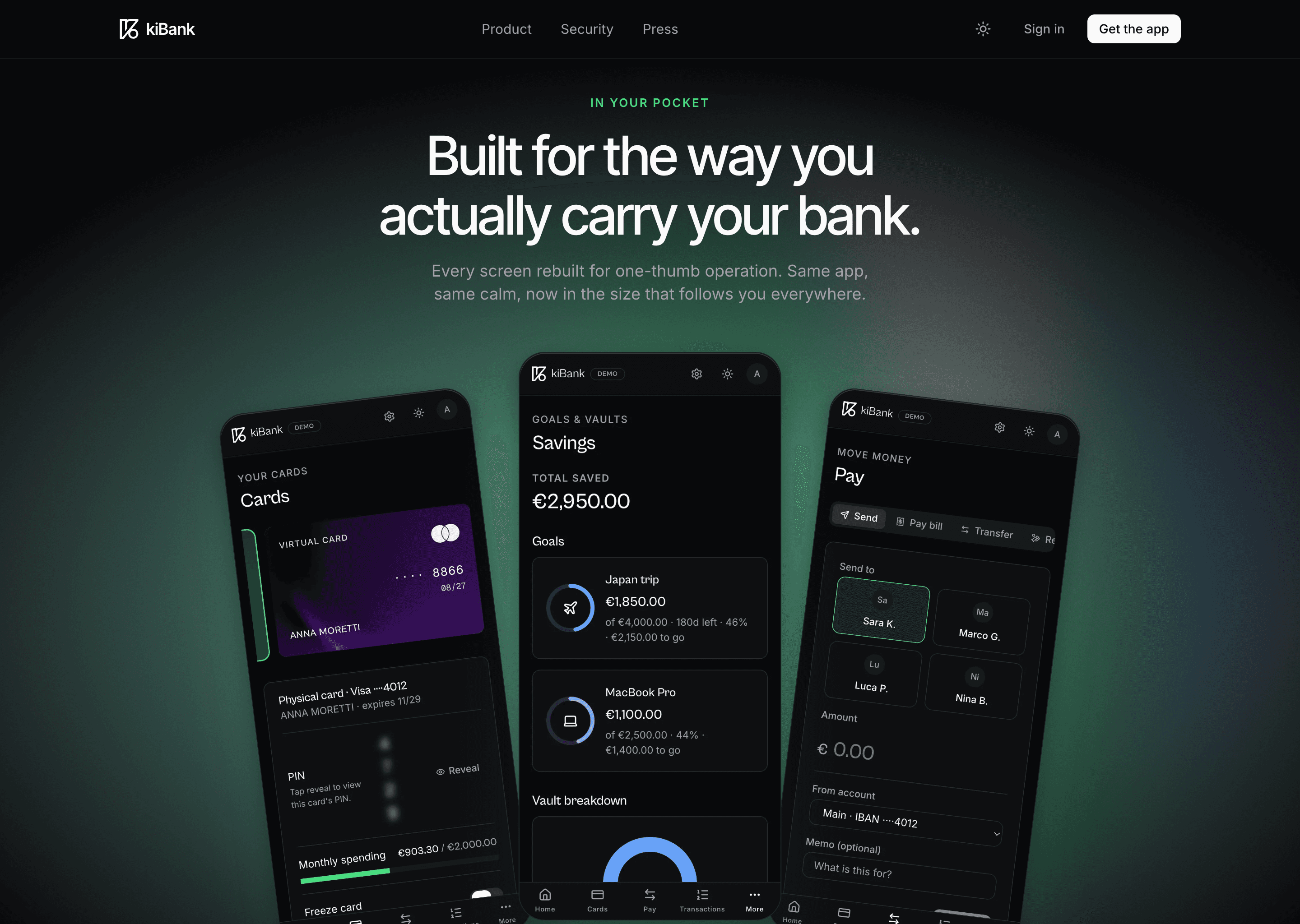
Mobile is the bank
Eighty-three percent of sessions happen on a phone, in transit, with one hand. The mobile design starts from a thumb arc, not from a wireframe. Tap targets are forty-four pixels minimum, with eight pixels of breathing room on every side.
The same component library renders the same screens. No re-skinning, no separate codepath. Theme switching costs zero round trips and survives a kill-and-relaunch.
The spine
- Next.js16
- React19
- TypeScript5
- Postgres16
- Supabase
- Redis
- Cloudflare R2
- Vercel Edge
- Node.js22
- Sentry
“They took brand, product and infrastructure and built them as a single team, with one roadmap and one quality standard. For us it was like having an internal team, with the execution speed of people who do this for a living.”
What changed
- +38%Landing to installVersus the previous landing, A/B over twelve weeks
- 72NPSUp from 41 in the legacy app
- 4.8App Store ratingAcross iOS and Google Play, 280k+ reviews
- +23%Year-over-year savings rateCustomers who use a named goal save 1.7x more
Want a build like this?
If you are scoping a new fintech product, or rebuilding one that got tangled along the way, we can help. We've done it before.
Start a conversation